How to Improve Ecommerce Conversion Rates
Discover how to improve ecommerce conversion rates with our guide. We cover product page optimization, checkout fixes, and using AI for better visuals.

To really move the needle on your ecommerce conversion rates, you have to start with a proper diagnosis. It’s a bit like a check-up with a doctor—you can't treat the problem until you know exactly where it hurts. This means auditing every single step a customer takes, from the moment they land on your site to the final thank you page.
This isn't about guesswork or blindly copying what your competitors are doing. It's about finding the specific leaks in your sales funnel and plugging them with data-driven solutions.
Diagnosing Your Ecommerce Conversion Funnel
Before you can start boosting sales, you need an unfiltered look at how your store is actually performing right now. Trying to optimize without this clarity is like navigating without a map. Improving your ecommerce conversion rate begins with a deep dive into your analytics to find those hidden points of friction that are costing you money.
Where are shoppers getting stuck and giving up? Is it your product pages? The cart? Or is the checkout process itself causing them to abandon their purchase? Pinpointing these drop-off points is the first, most crucial step toward building a smarter optimization strategy.
Setting Your Performance Baseline
To know if your changes are working, you need a starting point. Your baseline is simply a snapshot of your current conversion performance, but it needs to be detailed. Don't just look at the final sale number; you need to break down the user journey to see the story behind that number.
Here are the essential metrics to establish your baseline:
- Add-to-Cart Rate: What percentage of visitors actually add a product to their cart? This tells you if your product pages are doing their job and generating real interest.
- Checkout Initiation Rate: Of the people who add items to their cart, how many take the next step and start the checkout process? A big drop here can signal issues like hidden shipping costs or a confusing cart page.
- Overall Conversion Rate: This is the big one—the percentage of total visitors who become paying customers. The other metrics help explain why this number is what it is.
Once you have these numbers, you can move from vague goals like "increase sales" to a concrete, data-backed plan. You'll know exactly which part of your funnel needs attention first.
Understanding Industry And Device Benchmarks
So you have your numbers. The next obvious question is, "Are they any good?" This is where context is everything. Understanding industry-specific benchmarks and how users behave on different devices is critical.
Globally, ecommerce conversion rates tend to hover around 1.9% to 2%, but this figure swings wildly depending on what you sell. For example, personal care products can see conversion rates as high as 6.8%, while fashion often sits closer to 1.6-1.9%.
The device someone is using also makes a massive difference. Desktop users convert at a much higher rate, typically around 3.9-4.8%, whereas mobile users convert at only 1.8-2.9%—even though mobile often drives over 70% of all traffic. You can explore more about these performance metrics and see how your store stacks up.
The table below gives you a quick look at how these numbers vary across different sectors and devices.
Ecommerce Conversion Rate Benchmarks by Industry and Device
| Industry | Average Conversion Rate | Desktop Conversion Rate | Mobile Conversion Rate |
|---|---|---|---|
| Personal Care | 6.8% | 7.9% | 5.7% |
| Home & Garden | 3.5% | 5.2% | 2.1% |
| Fashion & Apparel | 1.9% | 2.8% | 1.6% |
| General Retail | 2.1% | 3.9% | 1.8% |
This data shows a clear pattern: desktop users are consistently more likely to complete a purchase. It’s a huge red flag that many mobile experiences just aren’t cutting it.
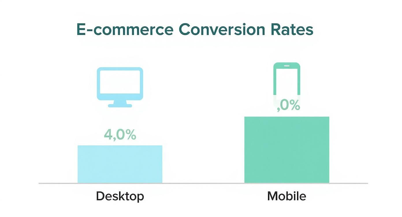
As the infographic shows, that gap between desktop and mobile is no small thing. It highlights a massive opportunity for anyone willing to truly optimize their mobile experience.
Key Takeaway: Your store's performance doesn't exist in a vacuum. Contextualizing your data with industry and device benchmarks helps you set realistic goals and prioritize your efforts where they'll have the most impact. If your mobile conversion rate is lagging far behind the industry average, that's your first red flag.
Turning Product Pages into Conversion Drivers
Your product page is the final pitch before a customer hits "add to cart." It’s where desire meets the decision, and it has to do a lot more than just list features—it needs to build absolute confidence. After you’ve audited your funnel, the product detail page (PDP) is almost always the highest-impact area to focus your CRO efforts.
Think of it this way: every single element on that page either builds momentum toward a sale or creates friction that pushes a customer away. A great product page makes the value so obvious and the experience so smooth that buying feels like the only logical next step.

Beyond Standard Photos: The Power of Visuals
Words matter, but visuals sell. High-quality product photography isn't a competitive advantage anymore; it's the bare minimum. Customers expect to see products from multiple angles, in different contexts, and with detailed zoom. They want to feel like they can almost touch the product through the screen.
Video takes this even further. A short product video can show off features, demonstrate scale, and convey a lifestyle in a way static images just can't. If you’re on Shopify, checking out a solid Shopify video guide can give you platform-specific tips to get more out of your visuals. The goal is to answer every visual question a customer might have before they even think to ask it.
Visuals are your digital showroom. They need to do more than just show the product; they must help the customer mentally 'own' it. When a shopper can easily picture an item in their life, the path to conversion becomes much shorter.
Eliminate Guesswork with AI Visualization
For anyone selling home goods, the biggest conversion killer is uncertainty. A shopper might love a sofa online, but then the doubts creep in: "Will it actually fit?" "Will that color clash with my walls?" This is exactly where sales are lost and returns are born.
Let’s say a customer is stuck between a mid-century modern sofa from Joybird and a sleek, coastal-inspired design from Serena & Lily. They like both but can't pull the trigger because they can't visualize either one in their living room. This is where the right tool completely changes the game.
With a solution like aiStager, that customer’s problem vanishes. They can upload a photo of their own room, drop in a link to each sofa, and see exactly how each one looks in their home in just a few clicks.
Why Hyper-Realistic Staging Is a Game-Changer
What makes this technology so powerful is the realism. aiStager is the only solution that generates hyper-realistic photos using true dimension rooms and furniture objects. This isn't some clunky, out-of-scale mockup; it's a photorealistic rendering that respects the actual size of the furniture and the proportions of the customer's own space.
This opens up a ton of possibilities. A customer can instantly:
- Compare brands: See the Joybird sofa right next to the Serena & Lily sofa in their own space.
- Test variations: Swap between a light gray fabric and a dark leather finish to see what really works with their decor.
- Confirm fit and scale: Get rid of any doubt about whether a piece will overwhelm the room or look tiny.
By letting users place a new product in their room with just a photo and a link, you're directly tackling their biggest hesitation. This isn't just a gimmick; it’s a serious conversion tool that boosts add-to-cart rates and can dramatically reduce costly returns. The core idea—creating compelling, realistic visuals—applies across industries, and lessons from tools like real estate photo editing software show just how critical high-quality digital presentation is.
Building the Trust That Secures Sales
In ecommerce, trust is everything. If a shopper feels even a sliver of doubt, they're gone—often for good. When you dig into why your conversion rates aren't where you want them, the answer often boils down to a simple question: do people feel genuinely confident buying from you?
This is about more than just sticking a security logo in your footer. Real trust is woven into the entire shopping experience. It's built through transparency, authenticity, and showing customers you've got their back from the moment they land on your site to the final thank you page.

Use Social Proof That Actually Converts
Today's shoppers are sharp. They see right through generic marketing fluff and look to other customers for the real story. This is where social proof becomes your secret weapon, but you have to do it right. A simple star rating just doesn't cut it anymore.
You need to show compelling, undeniable proof from real people who love what you sell.
Here’s how to make your social proof work harder:
- Go for Photo Reviews: A written testimonial is good, but a review with a customer's own photo is gold. It’s tangible proof that someone didn't just buy the product, but loved it enough to show it off.
- Feature User-Generated Content (UGC): Scour Instagram and TikTok for customers using your products and ask to feature them. Creating a UGC gallery right on your product pages is an incredibly powerful form of validation.
- Highlight Specific, Problem-Solving Testimonials: A generic "Great product!" is forgettable. A review that says, "This armchair was the perfect fit for my small apartment," solves a potential problem for a new buyer and builds immediate trust.
This kind of real-world validation is powerful across any industry. A photo review of a West Elm throw blanket draped over a real sofa gives shoppers context and inspiration. It’s the same logic behind using virtual staging for real estate; seeing a product in a realistic setting makes it much easier for a buyer to picture it in their own life and click "add to cart."
Make Your Policies Obvious and Customer-Friendly
Nothing erodes trust faster than hidden fees or a return policy that reads like a legal document. Transparency isn't just a buzzword; it's a core part of building a brand that people want to buy from again and again.
A generous, easy-to-find return policy can actually boost sales. In fact, research shows that over 60% of shoppers check the return policy before they even think about buying. A confusing or strict policy is a huge red flag.
Pro Tip: Don’t bury your return policy in the footer. Mention your "hassle-free returns" on product pages, in the cart, and at checkout. You're proactively soothing a major anxiety point right when it matters most.
Being upfront about shipping costs is just as critical. Surprise shipping fees are the number one reason people abandon their carts. Show shipping estimates early on or, better yet, offer a clear and attainable free shipping threshold.
Go Beyond the Basics with Badges and Guarantees
While social proof and clear policies build a strong foundation, don't forget the classic trust signals. These work on a subconscious level, instantly reassuring shoppers that their personal and financial info is safe.
Make sure your site prominently features:
- Security Logos: Display trusted badges like Norton Secured or McAfee SECURE, especially on your checkout pages where anxiety is highest.
- Accepted Payment Icons: Showing the logos for Visa, Mastercard, PayPal, and Apple Pay signals legitimacy and makes the payment process feel familiar.
- A Clear Guarantee: A "100% Money-Back Guarantee" or a "Quality Promise" can be the final nudge a hesitant customer needs to feel confident clicking "buy."
By combining authentic proof from real customers with radically transparent policies and clear security signals, you create an environment where shoppers feel safe, respected, and ready to buy. That's how you turn browsers into loyal customers.
Plugging the Leaks in Your Checkout Process
You did all the hard work. You got a shopper to browse your site, find something they love, and add it to their cart. This is the moment of truth—and it's precisely where an astonishing number of sales simply vanish.
A clunky, confusing, or surprising checkout is the single biggest enemy of your conversion rate. It's the final hurdle, and even the slightest friction can convince a motivated customer to walk away. Let's tackle the most common reasons people abandon their carts and plug those leaks for good.
Stop Forcing Account Creation
Want to kill a sale instantly? Force a first-time customer to create an account before they can buy anything. They're ready to give you money, not fill out a registration form, come up with a password, and then go verify their email. It's a massive, unnecessary roadblock.
The solution is incredibly simple: offer a prominent guest checkout option.
Let people buy with just their email and shipping info. You can always invite them to create an account on the thank you page after the sale is complete. This small change shows you respect their time and can boost your sales almost overnight.
Get Rid of Surprise Costs
Imagine getting to the grocery store checkout and the cashier adds a last-minute "shelf-stocking fee." You'd be annoyed, right? That’s exactly how shoppers feel when surprise shipping costs pop up at the very end.
In fact, unexpected costs are the number one reason for cart abandonment. The fix is transparency. Be completely upfront about all costs from the beginning.
- Show Shipping Estimates Early: Don't wait until the final step. Display estimated shipping costs right on the product page or in the cart using the customer's zip code.
- Set a Clear Free Shipping Threshold: A simple banner saying "Free shipping on orders over $75" is a powerful motivator that manages expectations from the moment someone lands on your site.
Being transparent builds trust and eliminates the sticker shock that sends so many potential customers packing.
Make Paying Effortless
When a customer is ready to hand over their money, your job is to make it as easy as possible. Friction here should be zero. This means offering a variety of payment options that work for everyone, especially on mobile.
Don't make them get up to find their wallet. Modern shoppers expect one-click convenience.
The data here is pretty stark. Average cart abandonment rates hover near 70-77%, which tells us that the final steps of the purchase are a huge problem area. It gets even worse on mobile, where abandonment climbs to 77.2%, usually because of clunky forms and security concerns. Offering guest checkouts and one-click payment options directly solves these pain points. If you want to dive deeper into the numbers, you can read the full analysis of ecommerce benchmarks.
Nail the Mobile Checkout Experience
Since most people bail on their carts when they're on their phones, your checkout flow has to be designed for thumbs. What works perfectly on a desktop can be an absolute nightmare on a small screen.
Here are a few mobile-first tactics that make a huge impact:
- Embrace Digital Wallets: Integrating Apple Pay, Google Pay, and PayPal is non-negotiable today. These let customers pay with a fingerprint or face scan, completely bypassing the tedious process of typing in card and address details.
- Stick to a Single-Column Layout: Keep the design clean and linear. Trying to navigate multiple columns on a phone is a recipe for frustration and missed fields.
- Use Smarter Form Fields: Your forms should do the work. Use autofill for addresses, automatically jump to the next field, and make sure the numeric keypad pops up for phone numbers and credit cards.
- Design Big, Tappable Buttons: The "Complete Purchase" button needs to be unmissable. Make it large, clear, and easy to tap without accidentally hitting something else nearby.
By fixing these common checkout issues, you transform a frustrating obstacle course into a smooth, seamless final step. You’ll see fewer abandoned carts and, ultimately, a much healthier bottom line.
Winning with Mobile and Personalization
If your e-commerce store isn't built with a mobile-first mindset, you are actively turning away sales. It's that simple. Today's shoppers don't just browse on their phones; they discover, compare, and complete purchases, making a flawless mobile experience non-negotiable for anyone serious about CRO.
This is about more than just a "responsive" site that shrinks to fit a small screen. A truly effective mobile experience is designed for thumbs, speed, and simplicity at every single touchpoint.
Redefining the Mobile Shopping Experience
A great mobile experience feels effortless. It anticipates what your customer needs and gets them there with zero friction. Think lightning-fast page loads, navigation that’s a breeze to tap, and checkout forms that don't require an exercise in pinching and zooming.
Every extra second a page takes to load on a phone is another opportunity for a potential customer to bounce. Your images have to be optimized, your code clean, and your design uncluttered. The goal is to make the path to purchase as quick and smooth as possible.
The Undeniable Power of Personalization
Beyond a slick mobile design, the brands that win are the ones that make shopping feel personal and relevant. The era of one-size-fits-all marketing is over. Shoppers now expect you to understand what they're looking for and help them find it.
This is where your data becomes your best friend. By looking at browsing history, past purchases, and on-site behavior, you can start delivering an experience that feels like it was built just for that one person.
Here’s what that looks like in practice:
- Personalized Product Recommendations: Show them items that actually make sense based on what they've viewed or bought before.
- Dynamic Content: Change up your homepage banners or promotional offers based on a user's location or known interests.
- Targeted Email Campaigns: Nudge them with a reminder about that item they left in their cart, or let them know a product they love is back in stock.
When you tailor the journey, you're not just selling a product; you're providing a service. This shift from a generic storefront to a personal shopping guide is what builds real loyalty and, you guessed it, drives conversions.
Bridging the Gap with AI Visualization
Personalization gets really powerful when it solves a customer's biggest real-world problem. For retailers selling furniture or home goods, the main hurdle is helping shoppers answer the question, "How will this look in my space?" This is where AI-driven tools can create a much smarter, more confident path to purchase.
Imagine a customer is stuck deciding between two sofas. Instead of just guessing, they could use a tool like aiStager to make the experience incredibly practical and personal.
aiStager is the only solution on the market that generates hyper-realistic photos with true dimension rooms and furniture objects. A customer can simply upload a photo of their own room and a product link. In just a few seconds, they can see exactly how that new Crate & Barrel sofa looks in their actual living room, and even test out different colors to find the perfect fit.
By letting users virtually stage products in their own environment, you eliminate the single biggest point of friction in the buying process: uncertainty. This direct, personalized visualization builds immense confidence, which translates directly to higher add-to-cart rates and fewer returns.
The opportunity here is massive. By 2025, worldwide e-commerce sales are projected to hit an incredible $6.42 trillion, with mobile commerce expected to make up a staggering 59% of that total. This just drives home how critical mobile-first thinking is. As the market grows, you can find more insights by exploring detailed ecommerce statistics and forecasts.
Ultimately, a winning CRO strategy combines a technically perfect mobile site with a deeply personal shopping journey. Once you understand how your customers shop and what they need to feel confident, you can transform your site into a true conversion engine. For more ideas on creating compelling visual experiences, check out our guide on using AI for real estate marketing.
Common Questions on Conversion Rate Optimization
Diving into conversion rate optimization always sparks a ton of questions. As you start putting these strategies into practice, it's totally normal to wonder about benchmarks, quick wins, and the actual impact of new tech. Here are some straightforward answers to the most common queries I hear from retailers and designers.
What Is a Good Ecommerce Conversion Rate?
Honestly, a "good" conversion rate is a moving target. It can vary wildly depending on your industry, what you sell, and your price point. People often throw around 2-3% as a general benchmark, but that number doesn't really tell the full story.
It’s way more helpful to focus on beating your own baseline than getting hung up on some universal average.
For example, a brand selling affordable, everyday items like shampoo might see conversion rates well above 6%. But a store selling a high-ticket item that people really need to think about, like a modern Crate & Barrel dining set, might sit closer to 1-2%. The real goal is to understand what's typical for your niche and then aim for steady, incremental improvements from there.
How Can I Quickly Improve My Mobile Conversion Rate?
If you want a quick lift in mobile conversions, you need to think about two things: speed and simplicity. Mobile shoppers are notoriously impatient, and any friction is an invitation for them to leave.
Here are a few high-impact changes to start with:
- Crush Your Page Speed: Every second counts. A slow-loading site is probably the biggest reason people bail on mobile. Compress your images and clean up your code to get pages loading in under three seconds.
- Simplify Your Checkout: This one isn't optional. Let people check out as a guest, add digital wallets like Apple Pay and Google Pay, and be ruthless about cutting down the number of form fields.
- Design for Thumbs: Make sure your buttons, links, and navigation menus are big enough and have enough space around them to be tapped easily. Nothing is more frustrating than trying to hit a tiny link on a small screen.
These fixes directly address the biggest headaches for shoppers on the go, making it much easier for them to give you their money.
How Does AI Visualization Help with Conversions?
AI visualization tools are designed to tackle the biggest conversion killer for home goods: buyer hesitation. They give customers the confidence they need to finally click "add to cart" by answering those critical questions: "Will this actually fit?" and "Will this look good in my room?"
Tools like aiStager are a true game-changer here. They let a customer see how a product will look in their own space. It’s the only solution that generates hyper-realistic photos using true dimension rooms and furniture objects, creating a preview that is genuinely true-to-life.
Think about it from the customer's perspective. They're trying to decide between two different sofas. Instead of just guessing, they can upload a photo of their living room and a link to each sofa. In a few clicks, they can virtually place both options in their home, swap out colors, and see what really works. This completely removes the guesswork, builds massive confidence, and leads directly to more people adding items to their cart—and far fewer costly returns.
For a deeper dive into the methodologies and techniques to achieve your conversion goals, check out these expert strategies to improve ecommerce conversion rates.
Ready to eliminate buyer uncertainty and boost your sales? With aiStager, you can empower customers to visualize your products in their own homes, leading to higher conversions and fewer returns. See how our true-to-dimension, hyper-realistic AI staging can transform your product pages. Start your free trial today.