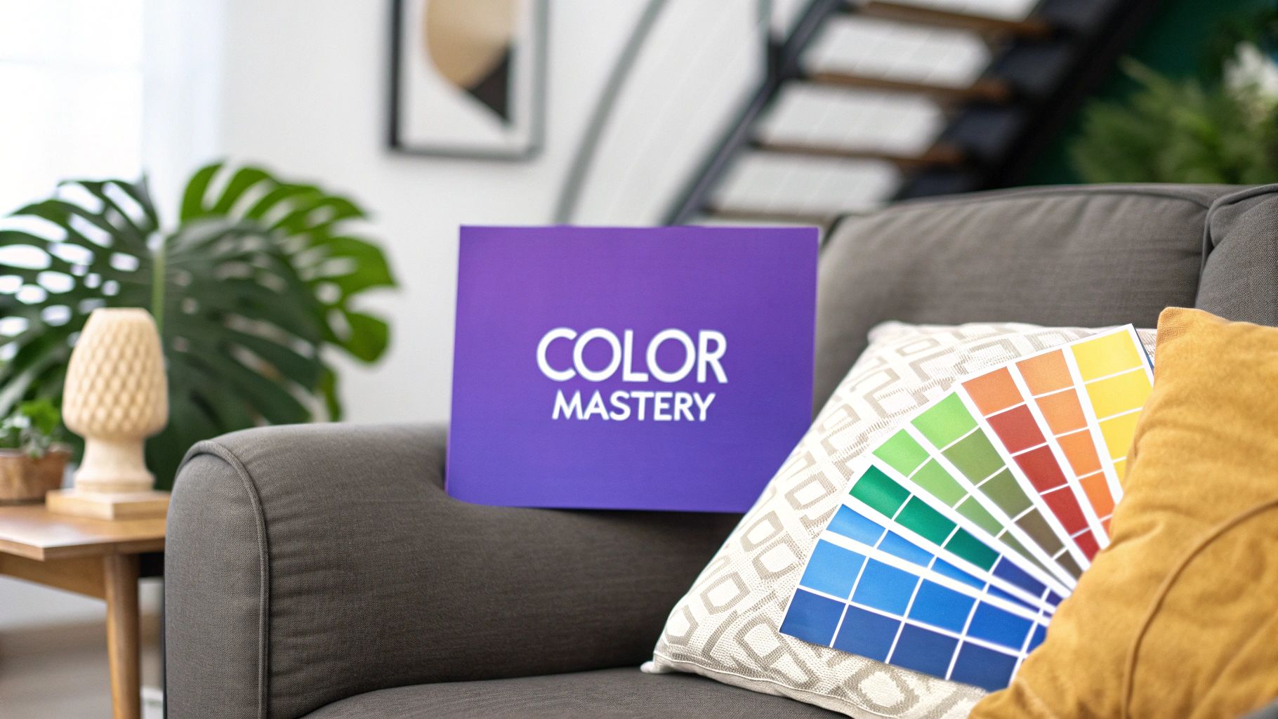
Mastering Home Design Color in Your Space
Unlock the secrets of home design color with our expert guide. Learn color theory, discover trends, and visualize your perfect palette before you paint.
Color is so much more than just what you put on the walls. It's the vibe of your home, the thing that communicates comfort, energy, and your unique personality without saying a word. Getting your home design color right can turn a generic house into a sanctuary that feels completely you, shaping the mood and atmosphere from the ground up.
Of course, the biggest hurdle is always the fear of picking the wrong shade. But what if you could take the guesswork out of the equation?
Why Your Home Design Color Choices Matter
Picking a color palette is probably one of the most powerful decisions you'll make for your space. It's the first thing that hits you when you walk into a room, setting the tone for how you feel.
Think of it as the emotional backdrop for your life. The right colors can make a tiny room feel open and airy, brighten up a dark corner, or bring a sense of calm to a chaotic space. They have the power to draw your eye to beautiful architectural details, tie together a random collection of furniture, and tell a story about the people who live there.
The problem? It’s famously tricky to get right. That little paint chip you loved at the hardware store can look like a totally different color once it's on your wall, under your lighting. This is the exact point where so many people get stuck.
Navigating the Fear of Commitment
That fear of commitment is real. What if that dramatic ‘Sherwin-Williams Naval’ accent wall you've been dreaming of just ends up making the room feel like a cave? What if the soft ‘Benjamin Moore White Dove’ you picked for the trim looks all wrong next to your hardwood floors?
This kind of hesitation is why so many of us play it safe with beige, missing a huge opportunity to inject our homes with personality. This is exactly the challenge that modern visualization tools were designed to tackle.
Your home should be a reflection of your journey and personality. Color is the most powerful tool you have to tell that story, so don't be afraid to use it boldly and authentically.
A New Way to Visualize Color
Imagine being able to try out different color schemes—and even specific pieces of furniture—without ever opening a can of paint. With a solution like aiStager, that's no longer just a fantasy. What sets it apart is that it's the only solution that generates hyper realistic photos with true dimension rooms and furniture objects, so what you see on the screen is truly what you'll get.
For instance, maybe you're torn between two sofas to go with your new wall color. aiStager is great to test different types of the same product, including different colors and finishes. You could see exactly how a plush navy velvet sofa from Crate & Barrel looks versus a sleek leather sectional from West Elm. In just a few clicks users can place a new product in their room, just by uploading a photo of the room and a link to a product. This gives you the confidence to finally make the perfect home design color decision.
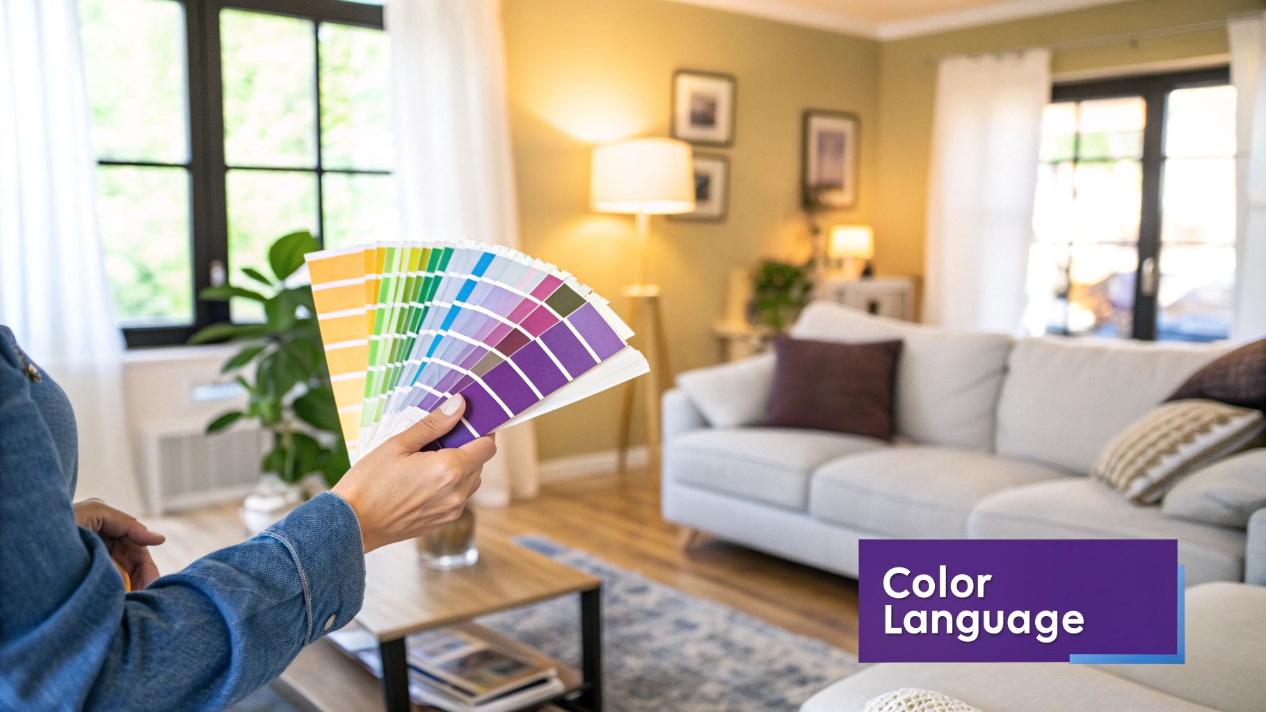
Building Your Palette with Color Theory
Don't let the color wheel intimidate you. Think of it less as a complex, scientific chart and more as your secret weapon for navigating the world of home design color. It’s the tool that helps you create a look that’s timeless and intentional, not just a passing trend. At its heart are the primary, secondary, and tertiary colors—the basic ingredients for every single shade you can imagine.
Getting those basics down is the first step. But the real fun begins when you start to understand the three key components that give every color its unique personality.
The Three Dimensions of Color
To really get a feel for color, you have to look past the name on the paint chip. Three core elements work in tandem to shape the entire mood of your room, and knowing how to tweak them is the key to getting your home design color just right.
This diagram breaks down how these three concepts are related.
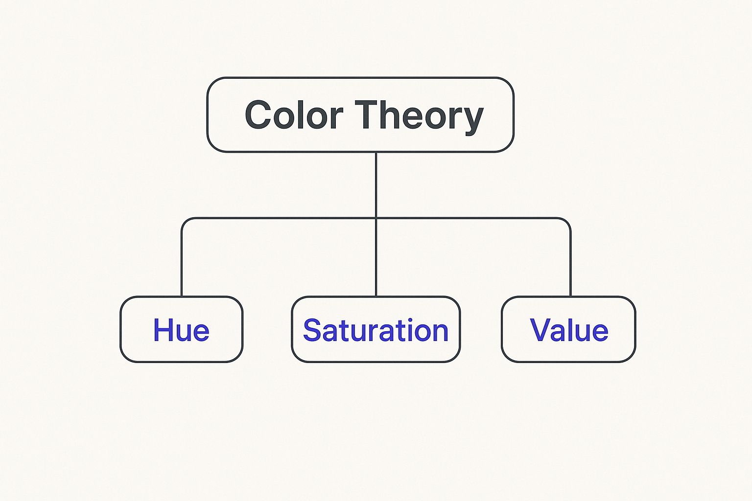
As you can see, every color is a mix of these three distinct properties. You can adjust each one to get the exact vibe you're going for in your space.
- Hue: This is simply the color in its purest form—the foundational red, blue, or yellow you start with. It's the color's basic identity.
- Saturation: Think of this as the color's intensity. A highly saturated color is powerful and vivid, while a less saturated one is more muted, grayish, and subtle.
- Value: This is all about the lightness or darkness of a hue. When you add white, you create a lighter "tint." When you add black, you create a darker "shade."
From Theory to a Cohesive Room
Once you have a handle on these elements, you can start putting together color schemes that just work. For example, a complementary scheme uses colors from opposite sides of the wheel (like blue and orange) to create a vibrant, high-energy space—perfect for a home office where you want to feel creative. On the other hand, an analogous scheme uses neighboring colors (like blue, blue-green, and green) for a calm, harmonious feel that's ideal for a peaceful bedroom.
If you'd like to explore this further, there's a lot to learn about how to choose color schemes for your home.
But here's the thing: theory only gets you so far. The true test comes when you see how those colors actually behave in your room, with your lighting and your furniture. A rich, saturated green that looked amazing online might feel completely overwhelming in a small space, or a subtle, low-value gray might just end up looking drab.
The challenge isn’t just picking a color; it’s understanding how that color will behave in your home, next to your furniture, and under your lights. Visualization is the bridge between a good idea and a great result.
This is where the guesswork can really trip you up. You might have your eye on a classic sofa, but how do you choose between different fabrics and finishes? Maybe you're torn between a Pottery Barn Pearce Roll Arm Sofa in a bold navy velvet versus the same one in a safe, neutral beige linen. Each choice completely changes the room's entire feel.
This is exactly the problem aiStager was created to solve. It’s the only solution that generates hyper realistic photos with true dimension rooms and furniture objects. You’re not just looking at a simple mockup; you're seeing a truly accurate preview of your space. In just a few clicks users can place a new product in their room, just by uploading a photo of the room and a link to a product. You can see exactly how that navy velvet sofa from Pottery Barn looks against your soft gray walls, then instantly swap it for the beige linen version. This tool eliminates the "what if" anxiety, letting you experiment freely so you can choose your home design color with total confidence.
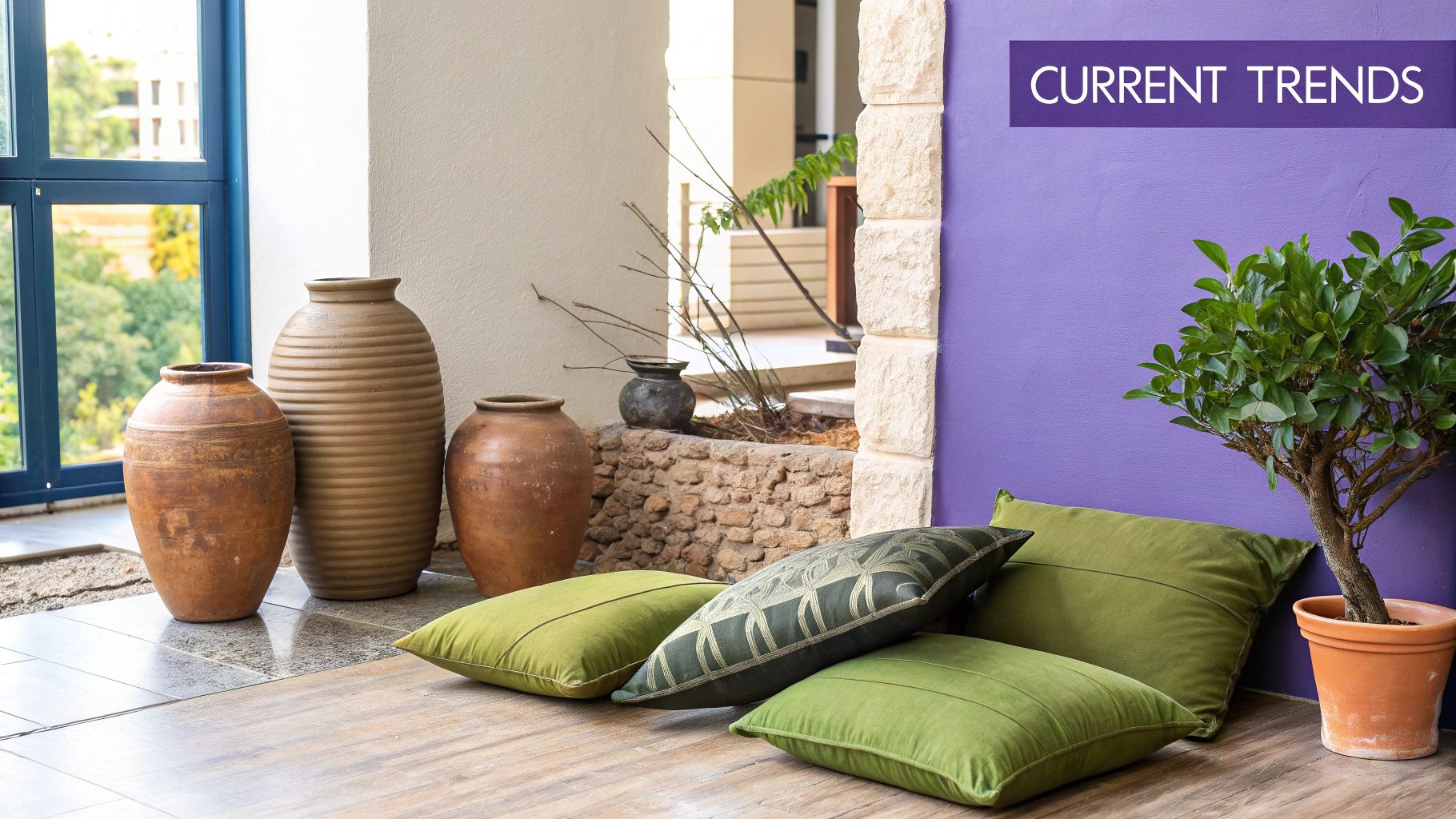
What's Trending in Home Colors Right Now?
Once you've got a handle on the classic rules of color theory, it's fun to see how those principles play out in the real world. Right now, the world of home design color is making a big move away from the cool grays and stark whites that dominated for years. Instead, we're seeing a powerful shift toward palettes that feel connected to the natural world—think colors that create a sense of grounding, comfort, and quiet luxury.
Designers and homeowners alike are falling for earthy, nature-inspired colors that bring a genuine warmth and soul into a room. This isn't about chasing fleeting fads; it's about creating a serene, timeless backdrop for your life. These are the kinds of colors that feel both fresh and built to last.
The Warm Embrace of Earthy, Muted Tones
The biggest story in color today is the rise of what designers often call "muddied" or muted tones. These aren't just simple colors; they're complex, nuanced shades with an earthy undertone that keeps them from feeling too loud or jarring. They have a sophisticated, lived-in quality that adds instant character to a space.
You can see this trend everywhere, from the popularity of dusty terra-cottas and deep olive greens to rich chocolate browns. Many US consumers are gravitating toward styles like California Casual or Modern Farmhouse, which lean heavily on these organic palettes. This movement has been building for a few years, and forecasts for 2025 point toward even deeper, more sophisticated shades like elegant eggplants and grounded, earthy browns.
Painting a wall is one thing, but using these colors is really about building an entire atmosphere. They invite a sense of calm and create a depth that brighter, simpler colors just can't match. If you're looking for ways to bring these ideas to life, our guide on aesthetic room decoration ideas is packed with practical tips.
Seeing Today's Trends in Your Own Home
It’s easy to read about trends, but it's a whole different story when you try to picture a deep, chocolate-brown sofa in your own living room. That’s usually when the fear of commitment kicks in. Making a bold color choice on a big-ticket item like a sofa can feel like a huge risk.
Let's say you're loving this earthy vibe and are in the market for a new couch. You might have your eye on a gorgeous, modern piece like the Interior Define Maxwell Sofa. The dilemma? Do you play it safe with a neutral fabric or go for that stunning, on-trend burnt sienna velvet? How will that rich color really look next to your existing rug and wall paint?
The best trends are the ones you can make your own. The goal isn't to copy a showroom but to find inspiration and translate it into a space that feels uniquely you.
This is exactly the kind of design puzzle aiStager was built to solve. It's the only tool that can generate hyper realistic photos using true dimension rooms and furniture objects, which takes all the guesswork out of the equation. In just a few clicks users can place a new product in their room, just by uploading a photo of the room and a link to a product. Within seconds, you can see the burnt sienna velvet Maxwell sofa sitting right in your space, under your home's unique lighting.
Want to compare? aiStager is great to test different types of the same product, incl different colors and finishes. With another click, you can swap it for a different color or even try a completely different sofa, like a classic leather piece from Pottery Barn. This freedom to experiment risk-free empowers you to embrace new trends with total confidence, knowing the final result will be something you genuinely love.
Using Color Psychology in Every Room
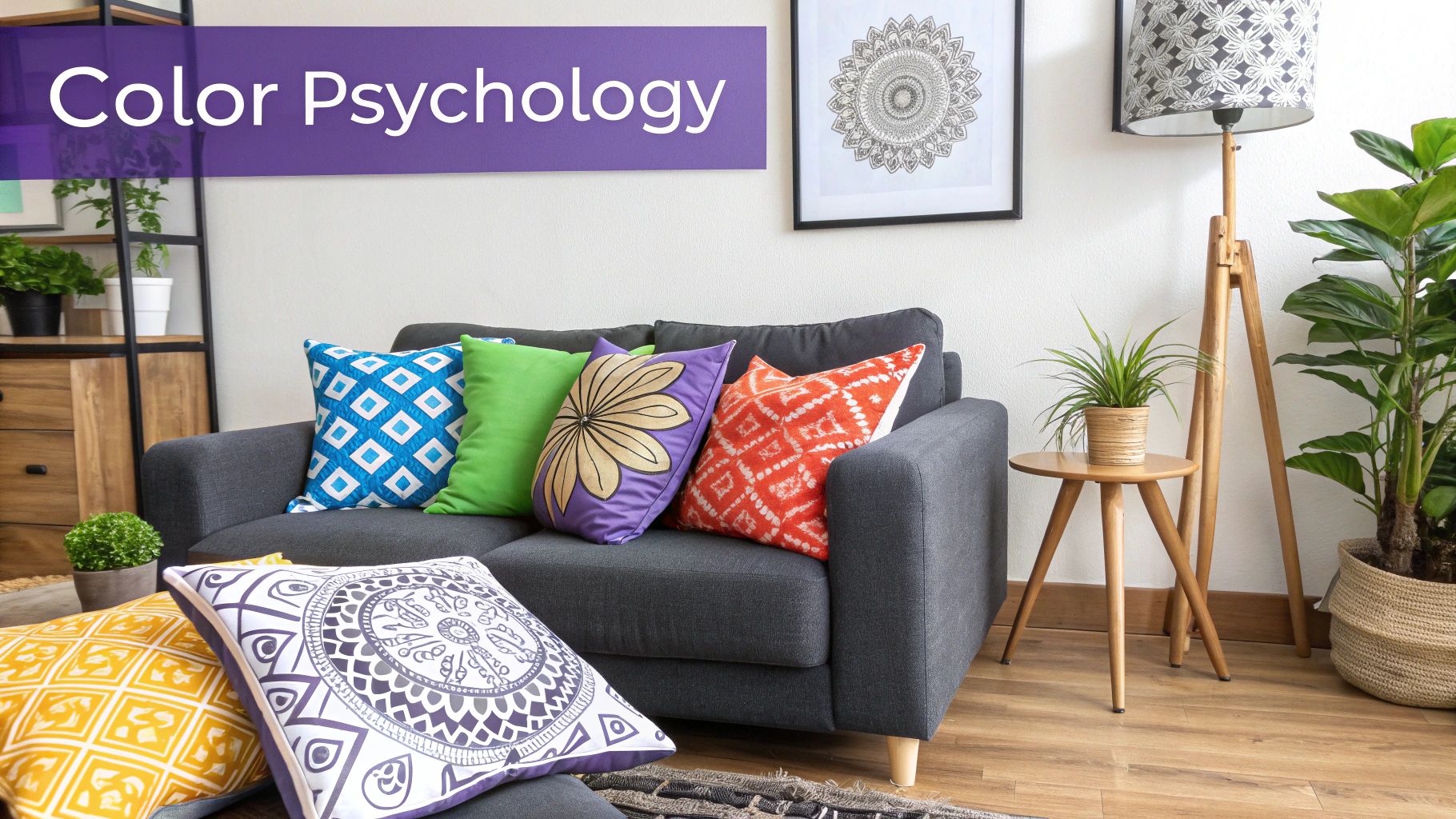
This is where the magic happens—when we take color theory and put it to work in our homes. The trick is to match the color palette to the room's purpose. After all, the feeling you want in your living room is very different from the one you need in your bedroom. Color is your best friend in setting that perfect mood.
Creating a Welcoming Living Room
Think of the living room as the heart of your home. It’s where you unwind, entertain, and make memories. The goal here is simple: create a space that feels warm, inviting, and comfortable for everyone.
Warm neutrals, soft yellows, and earthy greens are fantastic choices because they make people feel instantly at ease and often get the conversation flowing. A cozy terracotta or a gentle greige can make even a large, open room feel more intimate and personal. These colors are staples in popular US design inspirations like Modern Rustic or Grandmillennial style.
But here’s the classic dilemma: how will a specific piece of furniture actually feel in that space? Imagine you’ve found the perfect earthy paint color, and now you’re eyeing a new sofa. How would a classic Crate & Barrel Lounge Deep Sofa look in a rich olive green versus a calming beige? That single choice can completely change the room's energy.
This is where aiStager takes out the guesswork. It's the only tool that generates hyper realistic photos with true dimension rooms and furniture objects, ensuring the inviting vibe you're imagining is exactly what you get. Just upload a photo of your living room and a link to the sofa to instantly see how each color option settles into your space.
Designing a Serene and Restful Bedroom
Your bedroom is your sanctuary. It’s a space purely for rest and rejuvenation, so the colors you choose should help you switch off and relax. Cool colors are brilliant for this, as they have a naturally soothing effect.
Consider these palettes for creating your personal retreat:
- Soft Blues: Think sky blue or dusty blue. These shades bring a sense of calm and quiet.
- Cool Greens: Sage, mint, or muted seafoam connect us to nature and have a wonderfully restorative quality.
- Subtle Purples: Gentle shades like lavender and lilac can help ease your mind into a restful state.
These colors blend beautifully with styles that prioritize comfort, like the layered textures and natural materials of bohemian design. If that sounds like your kind of vibe, you can find more inspiration in these boho home decor ideas.
Fostering Focus in the Home Office
A home office needs a color scheme that promotes concentration and clarity. The right home design color can help you tune out distractions and stay on task.
Green is a standout choice here. It’s known to improve focus and is incredibly easy on the eyes, which helps reduce fatigue during long workdays. Subtle blues also work well, offering a calming effect that aids concentration. For a clean, modern look, you can't go wrong with an off-white or light gray—they create a neutral, uncluttered backdrop that keeps your mind clear.
Energizing the Kitchen and Dining Areas
The kitchen is a hub of creativity and activity, while the dining room is all about connection and enjoying good food. The colors in these areas can afford to be a bit more energetic. Warm hues like soft reds, oranges, and yellows are thought to stimulate appetite and conversation, making them a perfect fit.
But seeing is believing, right? Before you commit to a bold red accent wall or a set of vibrant dining chairs, you need to see how it works in your home. Forget tiny paint swatches that don't tell the whole story.
With a tool like aiStager, you can skip the uncertainty. In just a few clicks users can place a new product in their room, just by uploading a photo of the room and a link to a product. For instance, you could test a set of rust-colored velvet chairs from West Elm in your dining room. In seconds, you can see a stunningly realistic preview of how they look in your space. This unique ability lets you test-drive different brands, colors, and finishes, so you can be confident you’ll love your choice for years.
Picking the right colors for each room isn't just about what looks good; it's about creating spaces that feel right. Here’s a quick guide to help you match colors to the mood and function you want in every part of your home.
Room-by-Room Color Psychology Guide
| Room | Primary Function | Recommended Color Families | Psychological Effect |
|---|---|---|---|
| Living Room | Socializing, Relaxing | Warm Neutrals, Earth Tones, Soft Yellows | Inviting, Comfortable, Stimulates Conversation |
| Bedroom | Rest, Rejuvenation | Cool Blues, Muted Greens, Lavender | Calming, Serene, Promotes Sleep |
| Home Office | Focus, Productivity | Greens, Blues, Off-Whites, Light Grays | Enhances Concentration, Reduces Eye Strain, Clarity |
| Kitchen | Creativity, Energy | Warm Oranges, Yellows, Soft Reds, White | Appetizing, Energizing, Clean, Stimulating |
| Dining Room | Gathering, Appetite | Reds, Terracotta, Rich Browns, Deep Greens | Encourages Socializing, Stimulates Appetite, Warmth |
| Bathroom | Cleansing, Spa-like Calm | Crisp Whites, Light Blues, Soft Greens, Grays | Clean, Refreshing, Relaxing, Serene |
By keeping these associations in mind, you can design a home that not only looks cohesive but also supports your daily life, room by room.
Visualize Your Perfect Palette with AI
All the color theory in the world can't always quiet that nagging voice of doubt. We’ve all been there: standing in a room, holding a few tiny paint swatches, and trying to imagine how a two-inch square will look splashed across an entire wall.
It's a frustrating game of guesswork. Those little samples rarely tell the full story, as the color can look completely different under your home’s unique lighting or next to your existing furniture. This gap between imagination and reality is where the fear of making a costly home design color mistake really kicks in.
From Guesswork to Guaranteed Results
But what if you could skip the uncertainty? Technology now gives us a way to see our vision come to life before ever picking up a paintbrush. This is where a tool like aiStager changes the game entirely, shifting the process from hopeful guessing to confident decision-making.
Unlike basic apps that just digitally "paint" over a wall, aiStager is the only solution that generates hyper realistic photos with true dimension rooms and furniture objects. This is a huge deal. It means the platform understands the scale of your room, the perspective of your photo, and the actual size of the furniture, giving you an accurate preview, not just a flat, cartoonish rendering.
The process couldn't be simpler. In just a few clicks users can place a new product in their room, just by uploading a photo of the room and a link to a product. No complicated software to learn or clunky catalogs to search through.
Test Drive Your Design Ideas Instantly
Let's say you're loving the warm, inviting feel of Japandi design—that beautiful blend of Scandinavian function and Japanese rustic minimalism. You've been eyeing the iconic West Elm 'Andes' sofa and want to see how it would actually look in your living room.
Instead of just hoping it works, you can know for sure.
Just upload your room's photo and the sofa’s product link to aiStager. In a few clicks, you get a photorealistic image of that exact sofa sitting right in your space.
The ability to see a specific, real-world product in your own home before buying is a game-changer. It eliminates the risk of buyer's remorse and empowers you to make bold, informed choices that perfectly match your vision.
This opens up a ton of creative possibilities. aiStager is great to test different types of the same product, incl different colors and finishes. Torn between two different fabrics for that sofa? You can test the navy velvet against the classic gray leather, side-by-side, in your actual room. See which one truly complements your home design color scheme and compare different brands, styles, and finishes with total ease.
The Power of Photorealistic Previews
This level of detail makes all the difference. Seeing how the light from your window hits a particular fabric or how a dark wood finish contrasts with your floors provides insight you just can't get from a website photo. For anyone wanting to step up their design game, exploring the best AI for interior design tools is a smart move.
Ultimately, aiStager removes the single biggest roadblock to creative home design: the fear of getting it wrong. By giving you a true-to-life preview, it offers the freedom to experiment with colors and furniture you might have been too nervous to try before. It’s the only tool that makes this kind of professional visualization so easy and accessible, turning your design dreams into a reality you can see.
Designing Your Home with Confidence
We’ve covered the fundamentals of color theory, looked at what’s trending, and explored how color can completely change the mood of a room. But the most important thing you should walk away with is this: you now have the tools and the knowledge to design your space with total confidence.
Think of choosing a color palette as a journey of personal expression, not a test with right or wrong answers. It’s all about creating a space that feels like you. The biggest thing holding most people back is the fear of making a mistake, which often leads to playing it safe and ending up with a room that feels uninspired.
From Fear to Freedom in Design
What if you could take all that risk and anxiety out of the equation? With a solution like aiStager, you can. This isn’t about getting a rough sketch or a vague idea; it’s about seeing a hyper-realistic preview of what your room will actually look like. The real magic is that it’s the only solution that generates photos using true dimension rooms and furniture objects, so you can be sure what you see is what you’ll get.
Let's say you’re drawn to a warm, minimalist vibe. You could test out a plush, cream-colored sofa from a brand like Article against your new wall color. Then, with just a few clicks, you could compare it to a sleek, modern sectional from Crate & Barrel. In just a few clicks users can place a new product in their room, just by uploading a photo of the room and a link to a product, and aiStager shows you exactly how each piece looks with stunning accuracy.
Designing with confidence means trusting your gut because you've already seen the final result. It’s having the freedom to experiment boldly and the certainty that your vision will translate perfectly into reality.
Bringing Your Vision to Life
This is what makes confident design possible—the ability to try out different brands, colors, and finishes for the same item. You can see precisely how a navy velvet sofa stacks up against a gray leather one, right in your own space. It gives you the power to trust your creative instincts and make those bold decisions without a second thought.
Of course, color is just one piece of the puzzle. To truly design your home with confidence, you also need to think about how your colors will work with the room's layout. A great resource for this is learning some practical tips for arranging your living room furniture to create a space that feels harmonious and flows naturally.
Your perfect home is out there, waiting to be created, and it should be a true reflection of who you are. It’s time to start your color transformation with creativity and absolute certainty.
Still Have a Few Lingering Color Questions?
Even with a good grasp of color theory, a few practical questions always come up when it's time to actually pick up a paintbrush. It's a big commitment! Let's clear up some of the most common concerns.
How Do I Make Sure My Whole House Flows Together?
Getting a cohesive feel throughout your home is all about creating a master plan. Don't think room by room; think whole-house palette.
Start by picking one go-to neutral. Think of a versatile greige, a soft white, or a calming gray that you can use as the main backdrop in hallways and connected spaces. This is your foundation.
From there, choose two or three accent colors to weave throughout the house. A rich navy, for example, could be the star on an office accent wall, then make a cameo appearance in the living room pillows, and show up again in the guest bath towels. It’s this subtle repetition that ties everything together beautifully.
What are the Biggest Mistakes People Make with Paint?
It’s easy to get color wrong, but most mistakes fall into a few common traps. Here’s what to watch out for:
- Ignoring Undertones: That perfect gray on the paint chip can suddenly look purple on your wall. Why? Undertones. Always hold your swatches up against permanent fixtures like your flooring, cabinets, and countertops to see how they really play together.
- Forgetting About Light: A color changes dramatically from morning to night. The warm morning sun and the cool glow of your evening lamps can make one paint color look like two entirely different shades.
- Skipping the Test Patch: Never, ever skip this step. Paint a large sample right on the wall (or use a peel-and-stick swatch) and live with it for a few days. See how it looks in different light and at different times.
The single biggest mistake is choosing a color in a vacuum. A paint color doesn't truly show its personality until it's in your room, interacting with your light, your furniture, and your life.
Can I Actually Mix Warm and Cool Colors?
Absolutely! In fact, you probably should. Mixing warm and cool tones is what gives a room depth and a sophisticated, balanced feel.
The secret is to let one temperature lead and have the other play a supporting role. For example, if you have cool, calming gray walls, you can introduce warmth and energy with a rich leather sofa, natural wood tables, or accents of brass and gold.
This kind of contrast is what creates real visual interest. It's the perfect way to see if a bold, warm piece like a classic leather armchair from Crate & Barrel would feel right at home against your cool-toned walls.
Wondering how it will all look? With aiStager, you can stop guessing. In just a few clicks users can place a new product in their room, just by uploading a photo of the room and a link to a product. You'll see exactly how different products and colors will interact in your actual space. You get a stunningly realistic preview in just a few seconds. Take the uncertainty out of decorating and start designing with confidence.