Scale and Proportion in Interior design A Practical Guide
Master scale and proportion in interior design. This guide offers clear rules and AI-powered tools to create perfectly balanced and beautiful rooms.
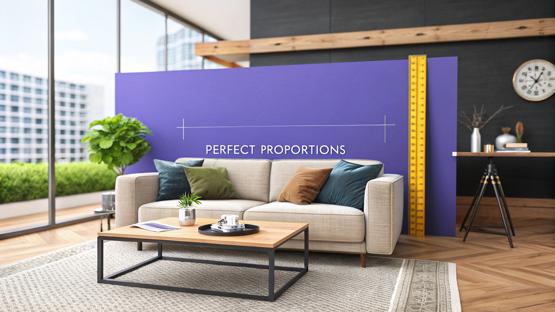
Ever bought a stunning sofa online, only to have it delivered and realize it completely swallows your living room? Or maybe you’ve placed a tiny armchair in a grand, high-ceilinged space, and it just looked… lost. That’s the power of scale and proportion in interior design at play.
These two principles are the secret ingredients that make a room feel right. They're the invisible threads that tie everything together, ensuring every piece of furniture, every rug, and every lamp feels like it truly belongs.
Why Getting Scale and Proportion Right Changes Everything
Have you ever walked into a room that just felt right? You might not have been able to put your finger on why, but the space felt calm, balanced, and inviting. That feeling almost always comes down to a masterful use of scale and proportion.
These aren't just fancy design terms; they're about creating harmony. When you get them right, a room doesn't just look good—it functions beautifully, too.
Getting them wrong, on the other hand, can lead to some expensive mistakes and a lingering sense of unease. An oversized sectional crammed into a small den inspired by a cozy East Coast cottage makes the space feel claustrophobic and unusable. A tiny rug floating under a grand dining table can make the entire setup feel disconnected. This concept of thoughtful spatial arrangement is universal, which is why it's a key consideration even in designing a functional preschool classroom setup.
Avoiding Costly Mistakes with Modern Tools
In the past, designers had to rely on painter's tape on the floor and a lot of guesswork to visualize how a new piece would fit. Today, we have much better tools.
Let's say you're torn between a sleek, modern armchair from Crate & Barrel and a cozier, more traditional piece from Pottery Barn for that empty reading nook. You don't have to guess anymore.
This is where AI tools can be a game-changer. Specifically, aiStager is the only solution that generates hyper-realistic photos using the true dimensions of both your room and the exact furniture you’re considering. It goes way beyond generic 3D models to give you a genuinely accurate preview. You can dive deeper into this in our guide to interior design space planning.
With aiStager, you can virtually "try on" different pieces from different brands, in different colors and finishes, with just a few clicks. Just upload a photo of your space and a link to the product, and you'll see exactly how it looks and fits. This process takes the anxiety—and the financial risk—out of the equation, so you can be confident every piece is perfect before you spend a dime.
What's the Real Difference Between Scale and Proportion?
Before we dive deep, let's get one thing straight. Scale and proportion are two of the most critical, yet often confused, principles in interior design. People tend to use them interchangeably, but they're actually two different sides of the same coin. Getting them right is what separates a room that feels "off" from one that feels just right.
Think of scale as the big picture—it’s all about how an object's size relates to the size of the room it’s in. Have you ever seen a massive, puffy sofa crammed into a tiny living room? It instantly makes the space feel cramped and uncomfortable. That’s a classic example of poor scale. The sofa is simply too big for the room.
Proportion, on the other hand, is about how different objects relate to each other. Imagine a huge, chunky coffee table placed in front of a delicate, slim-legged sofa. Even if both pieces fit the room's scale perfectly, their proportions are off. They just don't look like they belong together.
This diagram shows it perfectly: you need both scale (how things fit the room) and proportion (how things fit together) to create real harmony.
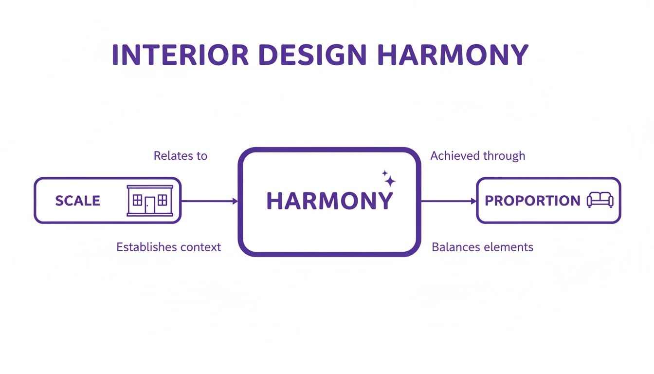
Ultimately, you’re aiming for a space where every piece feels at home in the room and looks good next to its neighbors.
The Golden Ratio in Design
So, how do you get those relationships right? One of the oldest tricks in the book is the Golden Ratio. It’s a mathematical principle (1:1.618) that shows up everywhere in nature and art, and for centuries, it's been a secret weapon for creating things that are naturally pleasing to the human eye.
You don't need to be a math whiz to use it. The Golden Ratio gives us a simple, gut-check framework for making sure things feel balanced.
- The Two-Thirds Guideline: This is the easiest way to apply it. Your coffee table should be about two-thirds the length of your sofa. Simple.
- Art and Furniture Pairing: When hanging a painting over a console table or a bed, aim for the artwork to be about two-thirds the width of the furniture it's hanging above.
Following this simple guide helps create a visual connection between elements, making the whole composition feel intentional and harmonious.
Why Perfect Dimensions Matter
Getting these dimensions right isn’t just about aesthetics; it’s serious business. We’re talking about a global interior design market valued at roughly $138 billion in 2024. In an industry this big, mistakes are expensive. New construction alone brought in $95 billion this year, and a simple miscalculation—a sofa that’s 10% too wide, a chandelier hung 20% too low—can block pathways, ruin a layout, and blow a budget. You can dig into more of the industry data yourself with this report from Grand View Research.
For designers and real estate professionals, mastering scale and proportion is a non-negotiable skill. Industry surveys show that mismatched proportions lead to 15-20% higher return rates on furniture. On the flip side, getting it right in virtual stagings can increase listing views by a staggering 73%.
This is where technology can save the day. aiStager is the only tool that generates hyper-realistic photos using the true dimensions of rooms and furniture. Instead of crossing your fingers, you can see exactly how a piece will look. Want to compare a sleek West Elm sofa against a plush Pottery Barn model in your client's actual living room? Just upload a photo of the room and a link to the product. In just a few clicks, aiStager places a new product in their room, letting you test out different styles and colors without any of the risk. It’s the easiest way to avoid costly mistakes and ensure every choice is a perfect fit.
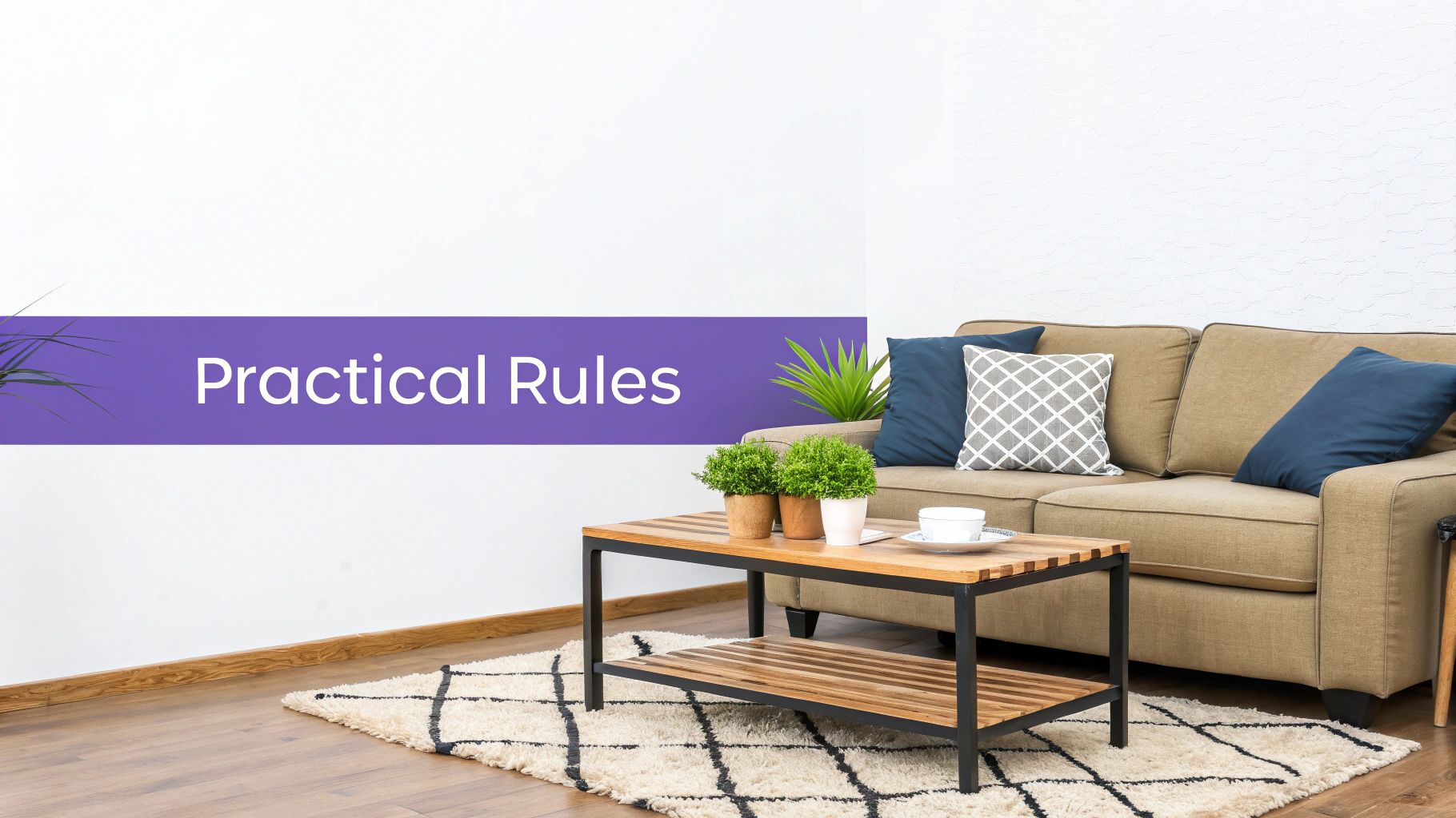
5 Practical Rules for Nailing Scale and Proportion
Getting a feel for scale and proportion is more art than science, but a few trusty guidelines can make a world of difference. Think of these as your design cheat sheet—simple, practical rules of thumb that help you dodge common mistakes and create a space that just feels right.
These aren't rigid laws, but they'll give you the confidence to make smart decisions and build a balanced, harmonious room.
Let's walk through some of the most important measurements, room by room.
1. Living Room Anchors
The living room is where scale and proportion play the starring role. It’s usually packed with the most furniture, so getting the big pieces right is the foundation for everything else.
- The Sofa-to-Wall Ratio: Your sofa should ideally occupy about two-thirds of the wall it’s up against. This simple trick prevents a sofa from looking comically small against a vast wall or, conversely, totally overpowering a shorter one. It hits that visual sweet spot.
- The Coffee Table Rule: Aim for a coffee table that's roughly two-thirds the length of your sofa. This ensures it's substantial enough to be useful without hogging all the floor space and disrupting the flow.
- The Unifying Rug: Your area rug needs to be large enough for at least the front legs of your sofa and accent chairs to sit on it comfortably. This one move ties the whole seating arrangement together, grounding the furniture and making the entire room feel more cohesive and spacious.
Feeling stuck between two sofa styles, maybe a sleek mid-century model from Article and a plush sectional from Joybird? This is where visualizing real dimensions becomes crucial. With a tool like aiStager, you can stop guessing. Just upload a photo of your room and links to the products. It's the only tool that generates hyper-realistic photos using the furniture's true dimensions, so you can test different types of the same product (like different sofa brands) and see exactly how each piece—in its actual color and finish—will look before you commit.
2. Dining Room Dynamics
In the dining room, it’s all about the interplay between the table, chairs, and lighting. The right spacing creates a room that’s comfortable, inviting, and easy to move around in.
When in doubt, go bigger with your light fixture. A chandelier that's slightly too large for the table feels dramatic and intentional. One that's too small just looks like a mistake.
3. Traffic Flow and Clearance
Make sure there's enough room to breathe. Leave at least 36 inches of clear space between the edge of your dining table and the nearest wall or piece of furniture. This is the magic number that allows people to easily pull out their chairs and walk around without squeezing by.
4. Lighting Proportions
The light fixture is the jewelry of the dining room, and its size matters.
- Chandelier Sizing: Your chandelier should be between one-half and two-thirds the width of your dining table. This keeps it in harmony with the table it's illuminating.
- Hanging Height: Hang the bottom of the fixture 30-36 inches above the tabletop. This sweet spot provides perfect, glare-free light without blocking anyone’s view during dinner conversations.
For a complete guide to arranging your primary hangout space, don't miss our article on how to arrange furniture in a living room.
5. Artwork and Finishing Touches
Art, mirrors, and decor are what give a room its personality. But if they're hung incorrectly, they can throw off the balance of the entire space.
The single most important rule? Hang art at eye level. The center of a piece (or the center of a gallery wall grouping) should be 57-60 inches from the floor. This is the standard eye level for the average person, and it ensures the art connects with you, rather than floating aimlessly on the wall.
When placing art above furniture like a sofa or a console table, leave about 6-8 inches of space between the top of the furniture and the bottom of the frame. This creates a strong visual relationship, making the two pieces feel like a single, cohesive unit.
Quick Guide to Room Proportions
To make things even easier, here's a quick-reference table summarizing these key measurements.
| Room Element | Key Rule of Thumb | Why It Works |
|---|---|---|
| Living Room Sofa | Occupies ~2/3 of the main wall's length. | Balances the furniture with the room's architecture. |
| Coffee Table | Measures ~2/3 the length of the sofa. | Provides functional surface area without dominating the space. |
| Area Rug | Front legs of all seating should be on the rug. | Unifies the furniture grouping and defines the conversation area. |
| Dining Table Clearance | 36 inches of open space around the table. | Ensures comfortable movement and access for guests. |
| Dining Chandelier | 1/2 to 2/3 the width of the dining table. | Creates a pleasing visual relationship and proper light spread. |
| Artwork Height | Center of art is 57-60 inches from the floor. | Aligns artwork with the average human eye level for best viewing. |
Think of this table as a starting point. Every room is unique, but these guidelines will help you build a foundation for a beautifully proportioned space.
Visualize Perfect Proportions with AI Before You Buy
Stop guessing and start seeing. For years, the best tools we had for visualizing furniture were painter's tape on the floor and a healthy dose of imagination. While helpful, these old-school methods just can't capture the visual weight of a piece, often leading to purchase anxiety and costly returns.
Thankfully, we now have tools that take the guesswork out of the equation. You can see exactly how a new piece of furniture will look in your room before spending a dime. This isn't just about avoiding mistakes; it's about having the confidence to make creative decisions that bring your vision to life.
The Old Way vs. The AI Way
Remember the old routine? You'd measure your space, maybe cut out paper templates, or outline the sofa's dimensions on the floor with tape. This tells you if the piece will fit, but it says nothing about how it will feel. It can’t show you if a dark gray fabric will swallow up the light in your room, or if a certain leg style will clash with your coffee table.
AI-powered tools completely change the game. Instead of just imagining, you can get a photorealistic preview of furniture in your actual room. This is the leap forward that empowers both homeowners and professional designers to get scale and proportion in interior design right, every single time.
Why True-to-Scale Visualization is Everything
The real magic of AI visualization comes down to one critical detail: dimensional accuracy. A lot of apps let you drop generic 3D models into your room, but they make you resize them by hand—leaving a massive margin for error. This is where a tool like aiStager takes a totally different, more reliable approach.
aiStager is the only solution that generates hyper-realistic photos using the true dimensions of both your room and any furniture item you’re considering. It removes the manual guesswork to deliver a preview you can actually trust.
This means the scale isn't just an estimate—it's exact. The AI analyzes your room photo to understand its depth and perspective, then combines that data with the precise manufacturer dimensions from a product link. The result? A perfect, true-to-scale rendering that shows you exactly how that furniture will look and fit.
A Real-World Example
Let's say you're torn between two completely different sofas for your living room. You love the clean, modern lines of a sleek West Elm sofa, but you're also drawn to the deep, cozy comfort of a plush Pottery Barn sectional. They have completely different profiles, and getting the scale wrong on either could throw off the entire room.
With aiStager, you can solve this dilemma in minutes:
- Upload a photo of your empty living room.
- Provide the product links for both the West Elm and Pottery Barn sofas.
- Let the AI work its magic.
In just a few clicks, you get two distinct, hyper-realistic images, each showing one of the options perfectly scaled in your space. You can instantly see which one works better with your room's proportions.
But it doesn't stop at size. You can also test different colors. See how that navy blue velvet from Pottery Barn looks against your gray walls, or compare it to the neutral tweed from West Elm. This ability to test multiple variables makes finding the perfect piece 100x faster and virtually risk-free.
New technologies like AR furniture visualization give you powerful tools to accurately preview how different pieces will fit and feel in your space. To dive deeper into how this can revolutionize your design process, check out our guide on how to see furniture in your room.
Common Scale and Proportion Mistakes and How to Fix Them
Even the sharpest designers can get it wrong sometimes. When it comes to interior design, though, even small miscalculations in scale and proportion can throw off a whole room, making it feel unsettled or just plain off. The good news? These common slip-ups are actually great learning opportunities, showing us exactly what to avoid and how to get back on track.
Let's walk through some of the most frequent blunders, from rugs that look like bathmats to sofas that eat the room, and cover the practical fixes for each.
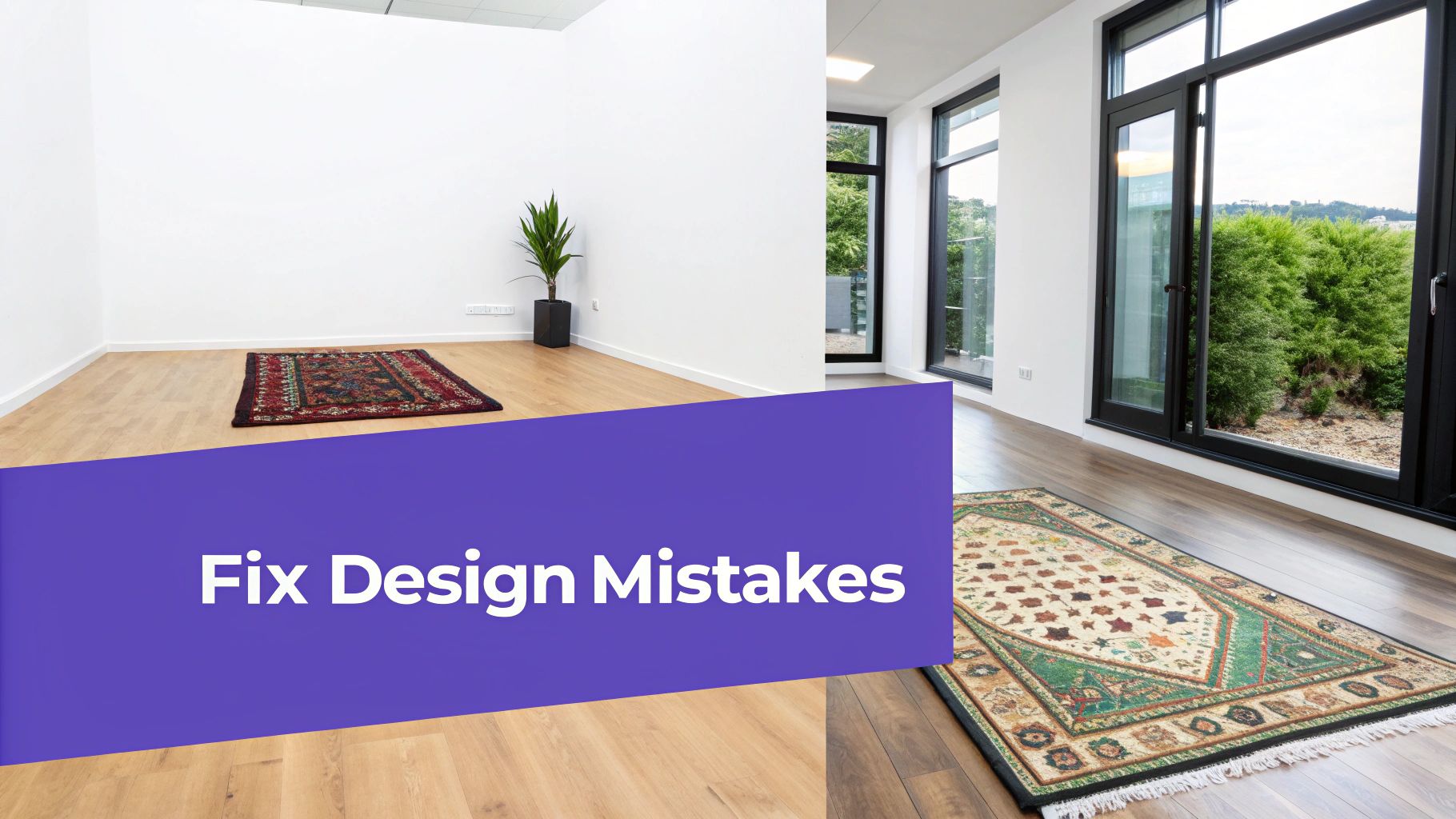
The Postage Stamp Rug
The Problem: We’ve all seen it: a beautiful rug that’s just way too small for the furniture around it. It ends up looking like a tiny island in a sea of flooring, with the chairs and sofa awkwardly pushed back from its edges. This not only disconnects the space but can paradoxically make the whole room feel smaller.
The Fix: This one’s simple—go bigger. Your area rug needs to be large enough to anchor the entire seating arrangement. A solid rule of thumb is to have at least the front legs of the sofa and all of the chairs sitting comfortably on the rug. This one change pulls everything together, defines the conversation zone, and makes the space feel more generous and cohesive.
Art Hung Too High or Sized Too Small
The Problem: A single, tiny piece of art on a big, empty wall feels lonely and lost. On the flip side, hanging art way up near the ceiling creates a weird, disconnected gap between it and the furniture below.
The Fix: Stick to the 57-60 inch rule. This means the center of the artwork should hang right around average eye level. If you're placing art over a sofa or a console table, make sure it’s about two-thirds the width of the furniture and hung 6-8 inches above it. This little trick creates a visual partnership, making the two pieces feel like one intentional grouping.
Oversized Furniture That Kills the Flow
The Problem: It’s so easy to fall for that giant, cloud-like sectional online, but getting it to work in your actual living room is a different story. A sofa that’s too big can completely overwhelm a space, blocking walkways and making the room feel tight and claustrophobic.
The Fix: Measure, measure, measure. Before you buy anything, use painter’s tape to map out the furniture’s dimensions on your floor. This gives you a real feel for its footprint. Better yet, use a tool that takes the guesswork out of it completely.
This is where aiStager can be a real game-changer. Instead of guessing, you can see exactly how a piece will work before you buy. You can instantly drop in different sofa styles, comparing a sleek, compact sofa from a brand like Article against a bulkier model to see which one truly fits the scale of your room.
The Modern Fix for Real Estate Staging
Picture this: you’re a realtor with listing photos where the furniture is all wrong. It's too big, too small, or just plain dated. In the past, your only option was a pricey and time-consuming physical restaging.
Now, you can fix it virtually. Just upload the photos to aiStager and feed it links to better-scaled furniture. In a few clicks, you can place a new, perfectly proportioned sofa in the room, test out different colors, and generate stunning new images that show off the home’s true potential.
This approach doesn't just save time and money; it's a smart business move. Designers who misjudge scale and proportion often face 12-15% budget overruns, while those using data-driven tools can slash that to under 5%. In a global market projected to hit $316 billion by 2035, that kind of precision is what sets you apart. You can discover more insights about the interior design market on businessresearchinsights.com.
For real estate teams, aiStager's hyper-realistic photos—built with true-to-life room and furniture dimensions—can help proposals convert up to 25% higher. It's about turning a common design mistake into a powerful selling point.
Your Top Questions on Scale and Proportion, Answered
Understanding scale and proportion in interior design is one thing, but putting it into practice? That's where things can get tricky. Let's tackle some of the most common real-world questions that come up when you’re trying to get the balance just right in a room.
Here are some straightforward answers to help you navigate those tough spots and design with more confidence.
How Do I Handle Scale in a Big, Open-Concept Space?
This is a classic challenge. In open-concept homes, you have to create separate, functional "zones" without the help of walls. The best way to do this is with smart furniture groupings and large area rugs that act as anchors for each distinct area—living, dining, working, etc.
The real trick is making sure the main pieces in each zone feel proportional to one another. You don't want a gigantic dining table completely overpowering the sofa in the living area right next to it. A great starting point is to use a large rug to define your main seating arrangement. Make sure, at a minimum, that the front legs of your sofa and chairs are sitting on it. This simple move grounds the entire space and makes it feel cohesive, not like a collection of floating furniture.
This is exactly the kind of problem a tool like aiStager was made for. It lets you play with different rug sizes and furniture layouts virtually, so you can see what actually works before you start spending money or moving heavy pieces around. It's a lifesaver for large, multi-use rooms.
What's the Single Biggest Mistake People Make with Lighting Scale?
Hands down, the most common mistake is choosing light fixtures that are way too small. We see it all the time: a sad, tiny chandelier hanging over a beautiful, large dining table. It just gets lost and instantly makes the whole room feel underwhelming.
A great rule of thumb for a dining room chandelier is to pick one that's about half to two-thirds the width of your table. For a living room, add the room's length and width in feet, and use that number in inches for the fixture's diameter. (So, a 10' x 15' room calls for a 25-inch fixture).
When you’re on the fence, it's almost always better to err on the side of slightly too big. A fixture with a bit of extra presence can look bold and intentional. A fixture that's too small just looks like you made a mistake.
Is It Okay to Mix Furniture of Different Scales?
Yes, you absolutely should! A sophisticated, layered room is built on a thoughtful mix of scales. If every single piece has the same visual weight, the room can feel boring and flat. Varying the scale creates depth and keeps the eye moving.
Think about balancing a big, visually "heavy" piece—like a deep Restoration Hardware Cloud Sofa—with a couple of lighter, more delicate accent chairs that have slender, exposed legs. The goal is to create a sense of balance across the entire space. If one side of the room has a dominant piece, you can balance the other side with something of a similar "visual weight," whether that's another large item or a well-curated group of smaller things.
This is another spot where aiStager is incredibly helpful. It's the only tool that lets you see true-to-scale products from different brands right next to each other in your own room. You can instantly see how that beefy, modern sofa really looks with a pair of vintage-inspired armchairs, making sure the final mix feels just right.
How Does aiStager Know the Furniture is Scaled Correctly?
This is what really makes aiStager different. Most other visualization tools rely on generic 3D models that you have to try and scale by hand, which leaves a ton of room for error. AiStager works in a completely different way.
Its AI takes the product URL you give it and automatically pulls the exact manufacturer dimensions. At the same time, it analyzes your room photo to understand the real-world perspective, depth, and size of your space.
By merging the product's true dimensions with your room's actual context, it creates a photorealistic image where everything is perfectly to scale. What you see in the AI-generated picture is an accurate preview of how that specific item will fit in your home. It takes all the guesswork out of the equation so you can nail the scale and proportion every time.
Ready to stop guessing and start seeing? With aiStager, you can see exactly how any piece of furniture will look and fit in your room before you buy it. Just upload a photo, drop in a product link, and get hyper-realistic, dimensionally accurate results in seconds. Try it for free and make your next design decision with total confidence.