A Designer's Guide to the Vaporwave Color Palette for Interiors
Unlock the nostalgic power of the vaporwave color palette. Learn to use neon pastels and retro vibes to create stunning interior designs that stand out.
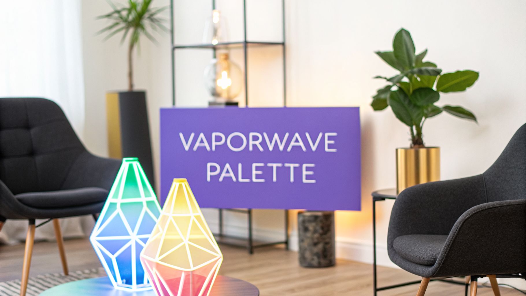
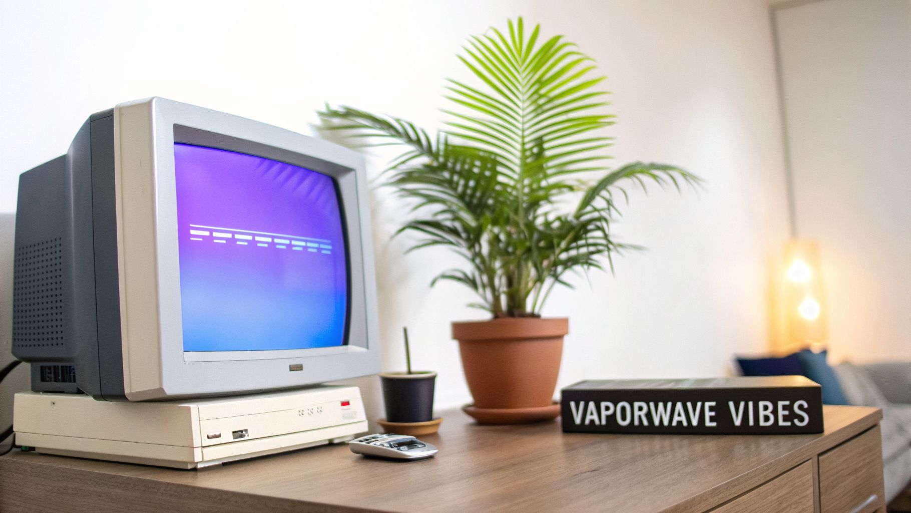
A vaporwave color palette is a surreal, nostalgic mix of glowing pastels. Think hot pink, electric blue, teal, and shimmering purples, all drenched in a neon glow. It’s the feeling of a 1980s Miami sunset bleeding into the early digital age of chunky computer graphics and VHS tapes.
What Is the Vaporwave Color Palette?
Ever feel nostalgic for a future that never quite happened? That’s the heart of the vaporwave aesthetic. When you bring these colors into a room, you're creating a space that feels both strangely familiar and wonderfully futuristic. It’s like painting with light and memory.
This guide will walk you through exactly how to master this unique look. We’ll break down the core colors and show you how to apply them, so you can turn any room into a retro-digital dreamscape.
The Core Colors
The vaporwave look is built on a foundation of specific glowing pastels and deep, contrasting darks. These colors work together to create that signature dreamy, retro-tech vibe.
Here’s a breakdown of the essential colors that define the aesthetic, along with their HEX/RGB codes and what they bring to the table.
| Color Name | HEX Code | RGB Value | Vibe & Association |
|---|---|---|---|
| Neon Pink | #FF69B4 |
(255, 105, 180) |
The quintessential vaporwave color. Energetic, vibrant. |
| Electric Blue | #00FFFF |
(0, 255, 255) |
Represents digital screens, water, and glowing grids. |
| Lush Purple | #8A2BE2 |
(138, 43, 226) |
Adds depth, mystery, and a touch of dusk or twilight. |
| Pastel Teal | #008080 |
(0, 128, 128) |
A softer, calming tone that balances the brighter neons. |
| Sunset Gold | #FFD700 |
(255, 215, 0) |
Evokes sunsets, luxury, and classic 80s motifs. |
| Deep Black | #000000 |
(0, 0, 0) |
Used for contrast, making the neon colors pop intensely. |
Understanding these individual colors is the first step. The real magic happens when you start combining them to build out a full, immersive space.
The Origins of a Digital Dream
Born around 2010, the vaporwave palette isn't just a random collection of bright colors. It was a reaction, a visual sigh for a simpler, more analog past viewed through a digital lens. By 2026, it had cemented itself as a major design influence, especially for its bold yet dreamy interiors.
The look pulls from a very specific set of 80s and 90s influences:
- The pixelated charm of early computer graphics and video games.
- The iconic neon glow of Miami nightlife signs.
- That fuzzy, saturated, slightly distorted look of an old VHS tape.
Pastel pinks are a huge part of this, showing up in roughly 90% of classic vaporwave art. When paired with teal and purple, you get that quintessential retro-futuristic vibe. It’s this mix of soft pastels and sharp neons that makes retro-futurism interior design feel so alive and compelling. Before jumping in, it's always smart to review the fundamentals, and this is an expert's guide to the perfect color palette that I often recommend.
Bring Vaporwave from Concept to Reality
It's one thing to love the idea of a vaporwave room; it’s another to actually visualize it. That bold mix of colors can be intimidating. How do you know if a pink velvet sofa will work, or if it will just look out of place?
This is where a tool like aiStager really shines. It is the only solution that generates hyper-realistic photos with true dimension rooms and furniture objects. Instead of guessing, you can see how specific pieces will look in your actual space. Just upload a picture of the room and a link to a product—like a sofa from a favorite brand—and in just a few clicks you can place the new product in the room and test out different colors, textures, and combinations without any commitment.
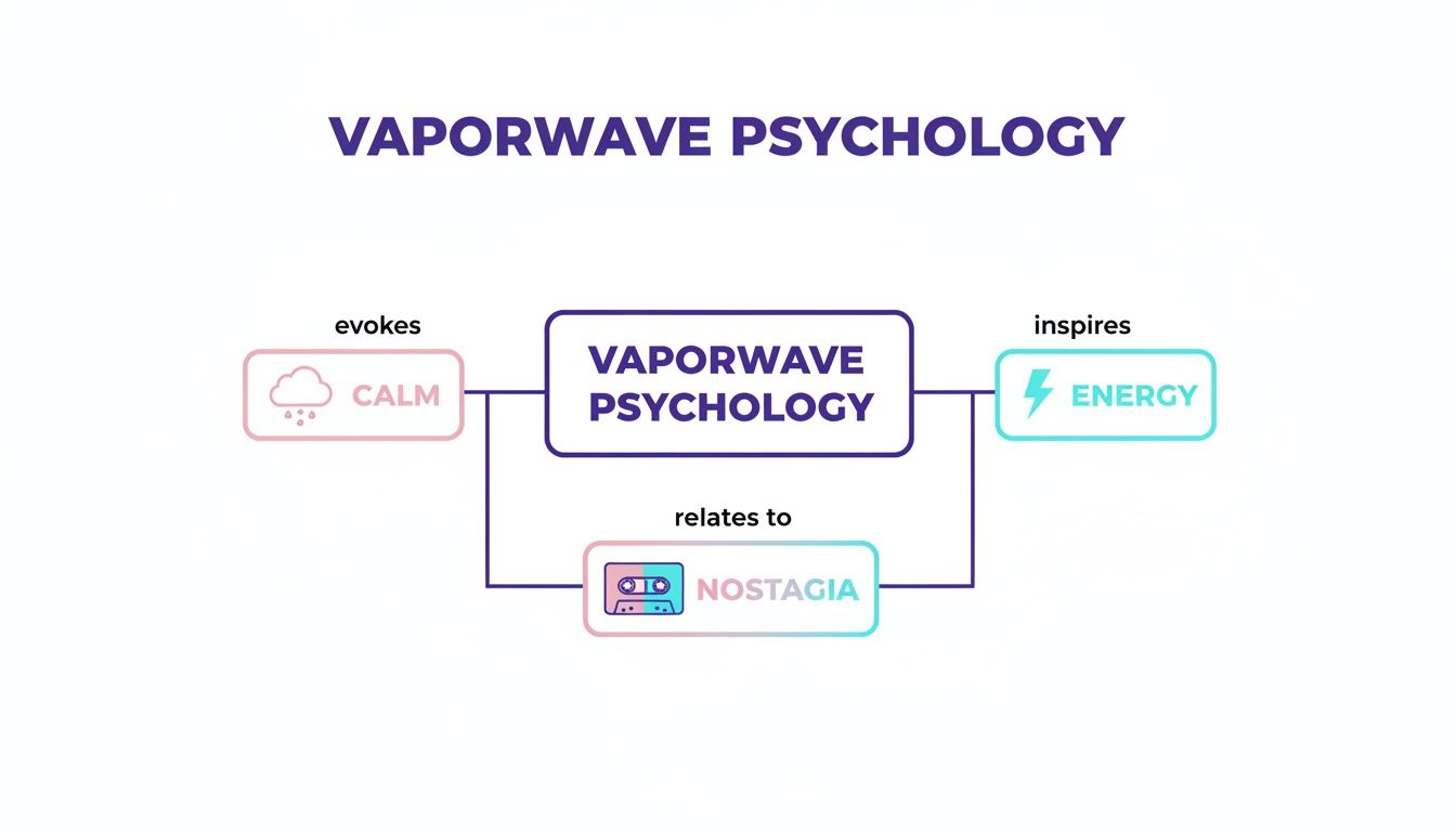
The Psychology of Using Vaporwave Colors
Ever wondered what makes a vaporwave room feel so… different? It's not just the colors themselves, but the strange and wonderful emotional cocktail they mix. At its heart, the aesthetic pulls you in two directions at once: it calms you down with soft pastels and simultaneously jolts you awake with bright neons.
Think about the soft, hazy pastels—those dreamy lavenders, mint greens, and dusty sky blues. They feel gentle, almost like a fond memory you can't quite place. In a room, these shades create a sense of peace and quiet introspection. They're the colors of a personal sanctuary, perfect for helping you unwind and escape the noise.
Creating an Emotional Juxtaposition
Then, you have the other side of the coin: the unapologetically bright neons. We’re talking hot pink, electric cyan, and glowing magenta that practically hum with energy. These colors are all about excitement, grabbing your attention and sparking a feeling of futuristic, rebellious fun. They feel alive and full of possibility.
The real magic happens when these two worlds collide. When you splash an energetic neon against a calm pastel backdrop, you get this amazing feeling of surreal nostalgia. It’s a comfortable sort of melancholy, a mood that feels both familiar and like something from another dimension. This emotional push-and-pull is what makes vaporwave impossible to ignore and gives you the power to design a room that tells a truly unique story.
This is where you, as a designer, can really play with mood. A bedroom leaning heavily on soft teal and lavender gradients can become the ultimate tranquil escape. On the other hand, a living room with pops of hot pink against a dark, moody wall suddenly feels social and buzzing with creative energy.
Testing Emotional Impact with Virtual Staging
Let's be honest, committing to a bold palette like this can feel like a gamble. How can you be sure that magenta accent wall will feel energizing instead of just… loud? This is exactly where aiStager can save the day. It’s the only platform out there that creates hyper-realistic photos where even the furniture and rooms have true dimension, letting you test these psychological triggers in just a few clicks. If you're curious to learn more, we have a whole post exploring how home design color choices influence mood.
For example, imagine you’re staging a living room and can't decide on the sofa. Is a calming pastel blue sofa from a brand like Article the right move, or would a vibrant pink version of the same model create more excitement? With aiStager, you don't have to guess. Just upload a photo of the empty room and a link to the product. You can instantly see how different colors, brands, and finishes change the entire emotional vibe before you spend a dime.
Curated Palettes for Your Next Design Project
Alright, let's get practical. A great vaporwave palette isn't just a random assortment of pinks and blues—it’s about crafting a specific feeling. Are you going for a dreamy, nostalgic bedroom or a living room buzzing with retro-futuristic energy? These palettes are designed to give you a solid foundation for either direction.
Sometimes, all it takes is a single, perfect piece to anchor the entire room. Take something like this Blush Pastel Abstract Geometric Patterned Modern Rug. A rug like this can tie everything together, giving you a clear direction for the rest of your design choices.
It’s all about balancing different emotional cues. You’re often mixing colors that create a sense of calm with others that inject energy, all wrapped in a layer of nostalgia.
This blend is what makes the vaporwave aesthetic so uniquely captivating for interior spaces.
Mallsoft Dream Palette
This palette captures that soft, hazy feeling of a half-remembered dream. It’s perfect for creating a serene space like a bedroom or a quiet reading nook where you want to unwind. Think of the filtered light in an empty 1990s shopping mall after hours.
- Soft Pink (#FFC0CB): A fantastic choice for a main wall color or a large sofa. It creates a gentle, soothing base to build upon.
- Mint Green (#98FF98): Use this for accent pillows, throws, or smaller decor items. It adds a cool, refreshing pop without being overwhelming.
- Lavender (#E6E6FA): Perfect for bedding, curtains, or even a small accent chair to really lean into that dreamlike mood.
- Creamy White (#FFFDD0): Apply this to trim, shelving, or lighting fixtures. It keeps the space feeling bright, open, and airy.
Digital Sunset Palette
If you’re ready to make a statement, the Digital Sunset palette is all about high-contrast energy. It uses fiery magentas and deep purples to create the look of a pixelated sunset over a digital skyline. This is a fantastic choice for a living room or creative studio.
It's no secret that pink and blue are the heart and soul of this style. In fact, when you look at classic vaporwave art, pink shows up in about 95% of compositions. It's almost always paired with glowing backgrounds that pull your focus, much like how you’d use strategic lighting in a room.
The real challenge with a bold palette like this is imagining how it will actually look in your space. This is where a tool like aiStager becomes your secret weapon. It’s the only solution out there that generates hyper-realistic photos using the true dimensions of your room and the furniture you’re considering. It completely removes the guesswork.
Worried that a fiery magenta sofa from Joybird might be too much? Curious if a deeper purple version from Crate & Barrel would work better? Just upload a photo of your room, paste the product links, and see for yourself. In a few clicks, you can test drive different brands, colors, and finishes to see exactly how your vision comes to life.
Visualizing Your Design with AI Staging
It’s one thing to fall in love with a vaporwave color palette on a mood board, but actually committing to it in a real room? That’s a whole different story. The high-contrast, unapologetically bold nature of these colors can make anyone hesitate. This is where you can bridge the gap between a great idea and a photorealistic preview that shows you exactly what you’re getting into.
With a tool like aiStager, you can bring any vaporwave concept to life. The whole process kicks off with a simple photo of your room. From there, you can stop guessing whether a piece of furniture will work and start seeing it in just a few seconds.
Turning Product Links into Photorealistic Previews
Imagine you’ve found the perfect furniture to anchor your design. Maybe it's a sleek, pink velvet sofa that has that perfect retro-luxe vibe, or a glassy, futuristic acrylic coffee table from CB2 that just nails the digital aesthetic. In the past, trying to visualize these pieces meant spending hours wrestling with complicated design software.
Now, you just paste the product link. This is where aiStager really shines. It’s the only tool out there that generates hyper-realistic photos with true dimension rooms and furniture objects. The AI doesn’t just paste a flat cutout; it renders a dimensionally-aware, true-to-scale model of the exact product right in your space. It even gets the lighting and shadows right, adapting them to your room's conditions.
This workflow completely takes the guesswork out of the equation. You get results that are often impossible to tell apart from a professional photoshoot, which is a game-changer for client presentations, real estate listings, or even just building your own confidence. It's the ultimate way to de-risk a bold creative choice.
Comparing Brands and Finishes Instantly
One of the most practical ways to use this is for A/B testing different products. Getting the tones just right is everything in a vaporwave palette, and aiStager is perfect for trying out different versions of an item, including different colors and materials.
Let’s say you’re staging a living room and can’t decide between two armchairs. You can simply upload a photo of the room and drop in a product link. In a few clicks, you can see how a teal armchair from West Elm stacks up against a lush purple one from the same collection, right in the same spot.
- Test Multiple Brands: Pit a sofa from Joybird against a similar style from Crate & Barrel.
- Experiment with Finishes: See if a table with chrome legs looks better than one with a matte black finish.
- Perfect Your Palette: Instantly see how that magenta rug really interacts with a cyan sofa.
This quick, iterative process lets you fine-tune your vaporwave colors with incredible precision, freeing you from the limits of store catalogs or slow 3D modeling. If you want to learn more about this approach, check out our guide on using AI interior design tools to visualize your home. This technology gives you the power to make bolder, better-informed decisions, ensuring every single element comes together for a stunning final look.
Styling Different Rooms with Vaporwave Elements
Now for the fun part: bringing these ideas to life in a way that creates stunning, livable spaces that feel both nostalgic and new. The trick is to adapt the core vaporwave palette to fit the unique function and mood of each room.
You’ll be surprised at how flexible this aesthetic really is, working just as well in a bold living room as it does in a serene bedroom. Imagine a Miami-inspired sunroom, for example. You could use pastel-colored lounge chairs set against a backdrop of lush indoor plants to create a bright, relaxing atmosphere that feels like a permanent vacation.
The Living Room Statement
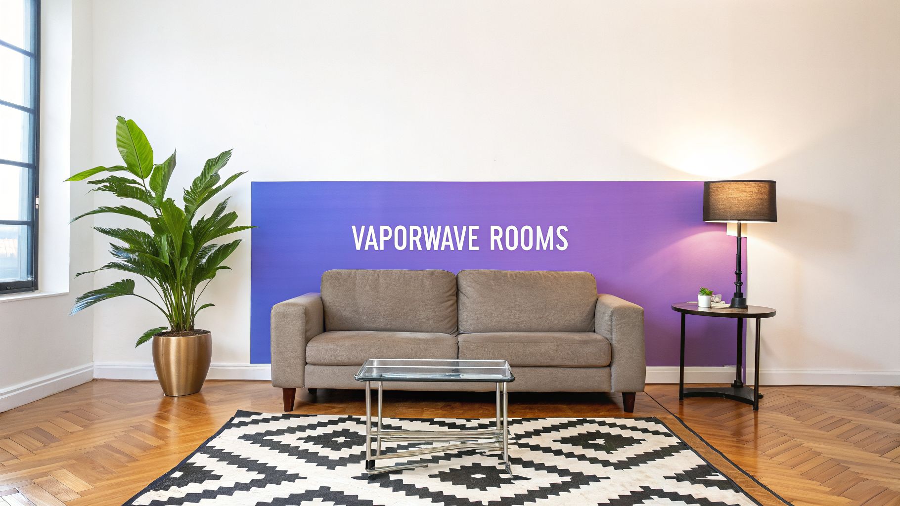
In the living room, this is your chance to make a real statement. A bold magenta sofa can act as a fantastic centerpiece. The key to keeping the look sophisticated is to balance that vibrant color with sleek chrome accents and a minimalist glass coffee table. That contrast between plush, colorful fabric and hard, reflective surfaces is pure vaporwave.
Bedroom and Office Ideas
When it comes to the bedroom, you can dial it back for a softer feel. Think about creating a "sunset gradient" accent wall behind the bed with dreamy shades of pastel pink and warm lavender. This approach gives you that distinct vaporwave vibe without overwhelming the senses, turning the room into the perfect tranquil sanctuary.
For a home office or game room, it's time to lean into the retro-futurism. This is the ideal space to play with neon LED light strips that trace the lines of a desk or shelving. To tie it all together, add a rug with a geometric pattern. The result is an environment that feels both focused and creatively energized.
The growing popularity of this aesthetic is impossible to miss. That signature palette of pastel pinks, cyans, and purples has gained massive traction, with some trend reports even calling it a top design influence. This surge is deeply tied to a collective nostalgia for the 80s and 90s. In fact, cyan and magenta appear in around 75% of vaporwave-related visuals, blending retro-tech with futuristic interiors. You can dive deeper into its cultural impact through extensive community-driven trend analysis.
Test Your Vision in Seconds with aiStager
Of course, translating these concepts from your head to a real room can be a challenge. This is where a tool like aiStager becomes your secret weapon, as it’s the only solution generating hyper-realistic photos with true-to-life rooms and furniture. Instead of just imagining how a space might look, you can actually see it in seconds.
For example, you can show a client exactly how an empty space transforms by adding a purple area rug from Pottery Barn and some vibrant cyan throw pillows. The platform lets you instantly compare different products, like testing various sofa brands or seeing how different colors and finishes completely change a room’s feel.
With just a few clicks, you can drop a new product into a room by uploading a photo of the space and a link to the product. It makes experimenting with the vaporwave color palette incredibly easy, so you can be sure your final design is perfect before you commit to any physical changes.
Answering Your Vaporwave Design Questions
Alright, let's get practical. You've seen the aesthetic, you know the colors, but a few real-world questions always pop up when it's time to actually apply this style to a room. As a designer or real estate pro, you need to know it's going to work. Let's tackle the big ones.
Is the Vaporwave Style Too Niche for Mainstream Real Estate?
This is the number one concern I hear, and it’s a fair one. The full-on, glowing neon grid look is a lot. But nobody says you have to go all in.
The trick is to use vaporwave as a strategic tool to make a property unforgettable. Instead of painting a whole room magenta, think about a single, stylish accent wall. Or, for virtual staging, drop in some eye-catching digital art or vibrant throw pillows. You're not creating a theme park; you're signaling a cool, creative vibe that resonates with modern buyers, especially in competitive urban markets.
Think of it as a highlight, not a takeover. A few well-placed elements can create that retro-futuristic mood and generate buzz, all without alienating buyers who prefer a more traditional look.
How Can I Quickly Test Different Vaporwave Furniture Items?
So, how do you experiment with this look without committing to a truckload of pink furniture? In the past, this was a massive headache. You’d spend hours in Photoshop trying to make a product photo look right, or get bogged down in clunky 3D modeling software.
There’s a much better way now.
The answer is aiStager. It’s the only tool that creates hyper-realistic photos using true-to-scale models of actual rooms and furniture. All you need is a photo of your space and a product link from an online store like Wayfair or a premium brand.
Wondering how a pink sofa from Joybird stacks up against a blue one from Crate & Barrel? Just upload your room photo and paste the product links. The AI generates photorealistic, dimensionally accurate images of each piece in your space. This lets you compare different brands, colors, and finishes side-by-side in seconds to find the perfect fit.
What Materials Best Complement Vaporwave Colors?
Getting the materials right is just as important as the color. The textures you choose are what complete that retro-futuristic feeling, either by amplifying the neon glow or adding a layer of unexpected softness.
For that sleek, high-tech vibe, look for materials that play with light:
- High-Gloss Surfaces: Think lacquered cabinets or reflective side tables that bounce the room's colors around.
- Chrome and Polished Metals: The cool shine of chrome chair legs or a metal floor lamp gives you that distinctly '80s-inspired, futuristic edge.
- Acrylic and Lucite: Furniture made from transparent or colored acrylic feels wonderfully light and almost digital, adding to the dreamlike quality of the space.
On the flip side, you’ll want to bring in some luxurious comfort to balance out all those hard, shiny surfaces. Plush velvets in rich jewel tones—like a deep magenta or purple—add instant sophistication. You can also weave in geometric patterns from the '80s and '90s through area rugs or artwork.
Again, this is where a tool like aiStager shines. You can actually see how a chrome-legged table from a specific US brand looks next to a velvet pink chair, making sure your material and color choices work in perfect harmony before you spend a dime.
Ready to stop guessing and start seeing what's possible? With aiStager, you can bring any vaporwave palette to life in your own room. Test real products from any online store and get hyper-realistic results that look just like a professional photoshoot. Start creating your dream space today.