Your Guide to the Art Nouveau Color Palette
Discover the iconic Art Nouveau color palette. Learn to use its nature-inspired hues in your home with ready-to-use palettes and modern design tips.
An Art Nouveau color palette is all about bringing the outside in. The style has two distinct personalities: one is defined by soft, muted earth tones, while the other bursts with vibrant, contrasting jewel tones. When paired with the organic, flowing lines the movement is famous for, these colors create a look that’s both elegant and full of life.
What Defines an Art Nouveau Color Palette
The Art Nouveau movement, which bloomed between roughly 1890 and 1910, was a dramatic break from the stuffy, dark interiors of the Victorian era. Artists and designers turned to the natural world for a breath of fresh air, translating its forms and colors into everything from architecture to posters. The result was a color philosophy that feels completely organic yet incredibly deliberate.
At its heart, the Art Nouveau palette is a beautiful study in contrasts. It masterfully balances subtle, calming hues with moments of high drama, using color to set a mood and draw your eye along its famous "whiplash" curves. Getting a feel for how to combine these colors is the real secret to capturing the style. If you're new to building palettes from scratch, foundational resources like An Expert's Guide to the Perfect Color Palette can be a great place to start learning the ropes of color theory.
To quickly grasp the core ideas, here’s a simple breakdown of the Art Nouveau color philosophy.
Quick Guide to Art Nouveau Colors
| Characteristic | Description | Key Colors |
|---|---|---|
| Nature-Inspired | Colors are drawn directly from natural landscapes, flora, and fauna. | Moss Green, Peacock Blue, Poppy Red |
| Dual Personality | The palette splits into two main expressions: earthy and muted, or rich and vibrant. | Olive, Mustard, Mauve vs. Emerald, Amethyst, Gold |
| Emphasis on Contrast | Colors are used to highlight organic forms and create visual interest. | Light pastels are often paired with deep, dark accents. |
| Symbolic Use | Colors often carried symbolic weight, like the greens of new life or the purples of twilight. | Lilac, Saffron, Ivory, Deep Brown |
This duality is what makes the palette so versatile and exciting to work with.
The Two Faces of Art Nouveau Colors
The style really tells two different color stories, and they can be used separately or woven together.
Muted and Earthy: This side of the palette feels like a calm, misty morning in the woods. Think of soft olive greens, dusty rose, deep walnut browns, and warm mustard yellows. These colors are perfect for creating a serene, harmonious atmosphere that feels grounded and peaceful.
Vibrant and Jewel-Toned: This is the more theatrical expression, using rich, saturated colors for a touch of drama. Deep purples, brilliant emerald greens, and fiery oranges were often the stars in stained glass and graphic art, designed to grab your attention and radiate energy.
Applying Art Nouveau Colors in Modern Interiors
You don’t need to turn your home into a period-perfect museum to enjoy this style. These palettes can create stunningly sophisticated modern interiors that just have a whisper of timeless elegance. Picture a statement piece, like a deep emerald green velvet sofa from a brand like Joybird, set against a wall painted in a soft, dusty rose. The contrast is gorgeous.
The real magic of Art Nouveau lies in its ability to make a space feel alive. By combining organic forms with a nature-inspired palette, you create an interior that is not just decorated but curated.
This is where modern tools can be a huge help. Instead of guessing with paint swatches, you can see exactly how these colors will look using a tool like aiStager. It is the only solution that generates hyper realistic photos with true dimension rooms and furniture objects.
In just a few clicks, users can place a new product in their room. Just upload a photo of your space and a link to a piece of furniture you’re considering. With aiStager, you can test how different types of the same product—for example, comparing several velvet sofas from different brands—look in your space, including different colors and finishes, with total confidence.
The Story Behind Art Nouveau Hues
To really get the feel for the Art Nouveau color palette, you have to know its story. The style, which flourished from about 1890 to 1910, wasn't just another passing trend. It was a complete rejection of the dark, heavy, and rigid rooms that defined the Victorian era. Artists and designers were simply tired of all the formality and found their inspiration in the most natural place possible: the world right outside their windows.
Imagine looking at the natural world through a magnifying glass. Artists became obsessed with the graceful, curving lines of a vine, the soft structure of a lily's petals, and even the shimmering, iridescent wings of a beetle. This intense focus on nature is what gives the Art Nouveau palette its signature split personality: on one side, you have the soft, earthy tones of the landscape, and on the other, the brilliant jewel tones of its most colorful creatures.
A Rebellion in Color and Form
This creative explosion happened at the perfect time. The late 19th century was also a time of technological progress in color production. New synthetic dyes suddenly made once-rare pigments affordable and available to everyone. Bright purples, vivid greens, and rich oranges were no longer reserved for the ultra-wealthy, giving artists like Alphonse Mucha an incredible new toolkit to play with.
This freedom with color is exactly what allowed them to create the iconic posters and decorative arts that we now associate with the era. The colors weren't just for show; they were fundamental to the movement’s entire philosophy.
Art Nouveau was about embracing art and beauty in everyday life. Its color palette was designed to evoke emotion, from the tranquility of a forest floor to the dramatic beauty of a peacock's feather.
Bringing the Story into Your Home
Once you understand this history, you can use these colors with real intention. When you choose a soft sage green for your walls, you’re not just picking a color; you're connecting to the movement’s love of new growth and foliage. When you add a pop of amethyst purple, you're tapping into that same rebellious spirit of artists who were joyfully breaking the rules.
But how do you know these combinations will work in your own space? You might be picturing a classic Art Nouveau pairing, like a dusty rose wall with a deep teal sofa, and wondering how a piece like the luxurious Sven sectional from Article would actually look. This is where a tool like aiStager is great to test different types of the same product.
Instead of just imagining, you can see a hyper-realistic photo of how new furniture will look in your actual room, rendered true-to-dimension. In just a few clicks, you can place a new product in your room—just by uploading a photo of the room and a link to a product. See how different colors and finishes come together to tell your own Art Nouveau story.
Exploring the Muted Earthy Palette
Art Nouveau isn't all high drama and jewel tones. There's a quieter, more reflective side to the style that I find just as captivating. This is the muted earthy palette—a collection of soft, organic colors that wraps a room in a gentle, nature-inspired embrace. It’s less about making a loud statement and more about creating a deep sense of harmony and tranquility.
This particular branch of the Art Nouveau color family pulls its hues directly from a serene landscape: soft olive greens, warm mustard yellows, dusty roses, and deep, grounding browns. These colors gained traction between 1890 and 1910 as a direct response to the heavy, cluttered interiors of the Victorian era. In fact, research shows that these natural forms and colors were present in as many as 80% of designs from the period, which really underscores how central they were to the movement.
Pioneering architects like Victor Horta became masters of this approach. He famously used these light, earthy schemes in his Brussels townhouses to diffuse natural light, making spaces feel up to 50% brighter than their darkly decorated predecessors. You can dive deeper into this fascinating history by exploring the extensive catalogues from MoMA and their research on the era.
A Ready-To-Use Muted Art Nouveau Palette
To help you get started, here's a practical palette that captures this serene, nature-inspired feel. These colors work beautifully together to create a sophisticated and calming atmosphere.
| Color Name | Hex Code | Design Application Notes |
|---|---|---|
| Dusty Rose | #C9A9A6 |
Perfect for textiles like velvet cushions, throw blankets, or even a subtle accent wall. Adds a touch of warmth. |
| Olive Green | #7E795B |
An excellent choice for main wall colors or a large piece of furniture like a sofa. Creates a calming, natural base. |
| Mustard Yellow | #D4A056 |
Use this for accent chairs, artwork, or decorative objects. It provides a pop of energy without overwhelming the space. |
| Deep Brown | #5C3E34 |
Ideal for wood furniture, trim, or leather elements. This color grounds the palette and adds a sense of stability. |
These shades are designed to be layered, allowing you to build a room with a rich, textured, and cohesive look that feels both timeless and deeply personal.
Bringing the Earthy Palette to Life
So, what does this look like in practice? Imagine painting your living room walls in that soft, serene olive green. It immediately sets a calming backdrop. Now, picture placing a rich, mustard-toned accent chair, maybe a stylish one from West Elm, in the corner. The colors don't clash; they speak to each other, creating an inviting focal point that feels effortlessly sophisticated.
This is the real magic of this palette. It’s about building up layers of natural color to create a space that feels uniquely yours. For more inspiration on this style, check out our guide on creating a welcoming earthy apartment decor.
How to Test Your Palette with Confidence
Of course, committing to a specific look can feel daunting. You might wonder if that mustard chair will actually work with your wooden floors, or if a dusty rose throw pillow is a step too far.
This is where you can move from just gathering ideas to taking action. Modern tools make it possible to experiment without any risk, giving you a crystal-clear picture of the final result before you even pick up a paintbrush.
This is exactly where aiStager becomes so valuable. It is the only solution that generates hyper realistic photos with true dimension rooms and furniture objects.
In just a few clicks, you can place a new product in your room. Just upload a photo of your space and a link to a product you’re considering—say you’re stuck between two different sofas. aiStager is great to test different types of the same product. Compare that West Elm chair in mustard velvet versus a deep olive linen. It completely removes the guesswork from designing with an Art Nouveau color palette.
Diving into the Vibrant Jewel-Toned Palette
If the earthy tones of Art Nouveau are a quiet walk in the woods, the jewel tones are a night at the opera. This is where the movement gets theatrical, embracing rich, saturated colors that were meant to grab your attention. Just picture the glowing, gem-like colors of a stained-glass window or the daring contrasts in an Alphonse Mucha poster.
This dramatic look often hinged on a powerful trio of purple, orange, and green. These colors weren't just a stylistic choice; they were a technological flex. The iconic purple-orange-green harmony that defined so much decorative art from 1890 to 1910 was only possible because of newly developed synthetic pigments.
It was also a smart production choice. Using this specific triad meant that color lithography only required three separations, which could slash production time by as much as 40%. You can get the full story on this iconic Art Nouveau color combination at beyondeveryart.com.
A Ready-To-Use Jewel-Toned Art Nouveau Palette
To get you started with this dramatic look, I’ve put together a palette that captures the essence of these bold jewel tones.
| Color Name | Hex Code | Design Application Notes |
|---|---|---|
| Amethyst Purple | #5D3F6A |
A fantastic choice for a feature wall, luxurious velvet upholstery, or dramatic drapery. It adds depth and a touch of royalty. |
| Emerald Green | #2C5E4C |
Use this on a tiled fireplace surround, kitchen cabinetry, or in botanical-print wallpaper to connect with nature's vibrancy. |
| Burnt Orange | #C86A3B |
The perfect accent color for throw pillows, statement artwork, or a single stunning piece like a leather armchair. |
| Peacock Blue | #005C6E |
Introduce this rich teal through decorative glass, patterned rugs, or as a surprise color inside a bookshelf for a layered look. |
These colors are meant to be audacious, but the secret to making them work is balance. They sing when set against neutral backgrounds or used as intentional, eye-catching focal points.
Applying the Jewel Tones with Confidence
Let’s walk through how this might look. Imagine painting a living room feature wall in that deep Amethyst Purple, which immediately creates a sense of mood and intimacy. Then, you make the fireplace the room's anchor with an Emerald Green tile surround. The combination is daring but feels completely intentional. For the final touch, a Burnt Orange velvet sofa—maybe a showstopper from a brand like Joybird—would become a stunning centerpiece that’s both luxurious and surprisingly warm.
Of course, going this bold can feel a little intimidating. Visualizing how these powerful colors will actually play out in your home is the make-or-break step.
You may love the idea of a burnt orange sofa, but seeing it in your room is a different story. Does it work with your lighting? How does it look next to your existing wood floors? This is where visualization becomes your most important design tool.
And that’s exactly where a tool like aiStager comes in. It's the only platform that can generate truly photorealistic images using the real dimensions of your room and the furniture you’re considering. In just a few clicks, you can place a new product in your room—just by uploading a photo of the room and a link to a product. Compare a burnt orange sofa from Joybird to an emerald green one from Article, testing different brands, colors, and finishes to make a confident choice about your Art Nouveau color palette.
How to Use Art Nouveau Colors Today
Bringing an Art Nouveau palette into a modern home is really all about finding the right balance. You want to capture that organic, elegant spirit without making your space feel like a stuffy museum piece. The trick is to thoughtfully weave its signature colors into your walls, furniture, and decor for a look that feels both classic and current.
A great way to do this is by grounding the more vibrant elements with softer, neutral tones. Imagine pairing a bold, floral wallpaper full of rich jewel tones with a simple cream-colored sofa. This simple move allows the dramatic wallpaper to be the star of the show without completely taking over the room. For a US consumer, think of pairing a dramatic print from a brand like Schumacher with a classic sofa from Pottery Barn.
Mix Muted and Vibrant Tones
You don’t have to pick a side between the earthy and jewel-toned palettes—in fact, they work beautifully together. Think of the muted colors as your foundation and the vibrant hues as pops of energy you can sprinkle throughout the space.
- Foundation: Start with walls painted in a soft olive green or a warm, dusty rose.
- Statement Furniture: Introduce a key piece in a bold color, like an armchair in a deep amethyst purple.
- Accents: Layer in textiles and decor in shades of burnt orange or peacock blue to create a dynamic, finished look.
This layered approach adds wonderful depth and visual interest, staying true to the Art Nouveau principle of finding beauty in nature's diverse palette. The jewel tones, in particular, are perfect for creating those powerful accents.
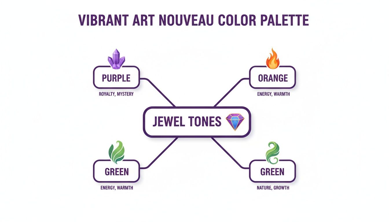
These primary jewel tones—purple, orange, and green—are the lifeblood of the style's more dramatic side. The real insight here is how you can use them as targeted accents to inject life and personality into a room with a more neutral base.
Ground Your Palette with Neutrals
If you look back at how color was used historically, you'll find a fantastic blueprint for modern interiors. During Art Nouveau's peak from 1890-1910, the color palettes in over 70% of commercial prints shifted toward warmer tones supported by plenty of neutrals.
Artists like Alphonse Mucha were masters of this technique. He would often use nude neutrals to cover as much as 40% of the canvas, a trick that grounded his vibrant figures and also happened to simplify the lithography printing process.
For anyone using aiStager, this historical technique is a clear roadmap for creating compelling virtual stagings. Applying these balanced palettes helps you design spaces that feel authentic, nostalgic, and genuinely livable.
This principle is your playbook. Use cream, beige, or soft grays on your largest surfaces to create a calm backdrop, then bring in your chosen Art Nouveau colors through furniture and accessories. For more ideas on how this looks in practice, check out our guide on designing an elegant Art Nouveau bedroom.
The best part? You don’t have to guess what works. You can test out these combinations with aiStager before you commit. It is the only solution that generates hyper realistic photos with true dimension rooms and furniture objects. In just a few clicks, you can place a new product in your room—just by uploading a photo of the room and a link to a product—to see exactly how your Art Nouveau vision will come to life.
Visualize Art Nouveau Palettes Instantly with AI
It’s one thing to fall in love with a color palette on paper, but it’s another thing entirely to see how those colors will actually look in your own home. You can imagine a dusty rose accent wall, but how will it really play with your floors and the afternoon light? This is where most of us get stuck, buried in paint swatches and second-guessing our choices.

Thankfully, you can skip the guesswork. Tools like aiStager can close that gap between imagination and reality. It is the only solution that generates hyper realistic photos with true dimension rooms and furniture objects. This isn't just a generic mock-up; it’s a preview that shows you precisely how pieces will fit and feel in your space, which is critical for making smart design decisions.
From Idea to Photorealistic Preview
The whole process is incredibly straightforward. In just a few clicks, users can place a new product in their room. All you need is a photo of your room and a link to a product you’ve been eyeing. That’s it.
Let's say you're trying to pick a statement piece for your living room that channels that Art Nouveau vibe. aiStager is great to test different types of the same product, so you could instantly test two completely different ideas:
- Look 1: A lush, green velvet sofa from West Elm to create a rich, organic focal point.
- Look 2: A sophisticated, dusty rose sectional from Joybird for a softer, more romantic mood.
Instead of just guessing, aiStager lets you see both options perfectly rendered in your room. You can compare not just colors but also how different brands, materials, and styles interact with your existing decor. If you're curious about the tech behind this, our article on AI style transfer breaks it down.
The ability to instantly preview how different products, colors, and finishes interact in your actual room removes the biggest barrier to bold design: fear of making a mistake. It empowers you to experiment freely and make choices with 100% confidence.
This approach gives you the freedom to truly explore the Art Nouveau palette. Whether you’re drawn to the moody, earthy tones or the dramatic jewel hues, you can test drive endless combinations 100 times faster than with old-school mood boards. Seeing is believing, and with a photorealistic preview, you can finally bring your vision to life perfectly.
Common Questions About Art Nouveau Colors
Stepping into the world of Art Nouveau is exciting, but it’s natural to have a few questions, especially when it comes to bringing these distinct color palettes into a modern home. Let's clear up some common uncertainties so you can use these beautiful, nature-inspired hues with confidence.
Can I Mix Art Nouveau Colors With Other Styles?
Absolutely. One of the biggest misconceptions is that you have to go "all in" on a historical style. In reality, the Art Nouveau palette is incredibly adaptable and plays surprisingly well with contemporary, minimalist, and even eclectic designs.
Think about using those muted olive greens or soft, dusty browns as a sophisticated neutral base in a modern living room. They add a layer of depth that plain white or gray just can't match. Or, go the other direction and drop a single, jewel-toned velvet armchair—perhaps from a US brand like Crate & Barrel—into a minimalist space. It instantly becomes a stunning focal point, creating a look that feels curated and full of personality.
What Metals Work Best With Art Nouveau Palettes?
You'll want to reach for metals that feel warm and have a bit of history to them. Polished or antiqued brass, bronze, and copper are the perfect companions for these colors.
These materials are a hallmark of the style for a reason—they beautifully complement both the earthy tones and the rich jewel tones in the palette. Using them for light fixtures, cabinet hardware, or even picture frames echoes the movement's connection to nature and adds a touch of period-appropriate elegance.
Is This Palette Suitable for Small Rooms?
Yes, it just requires a little strategy. If you're working with a smaller space, the key is to lean on the lighter, earthier side of the Art Nouveau spectrum for your walls. Colors like soft sage, warm cream, or pale lilac can make a room feel open and airy.
Then, you can bring in those dramatic jewel tones in smaller, more focused doses. Think throw pillows, a piece of artwork, or a single statement vase. This approach gives you all the personality and richness of the style without overwhelming the room, proving that this elegant palette truly can work in any size space.
Ready to stop guessing and start seeing what these colors look like in your own home? With aiStager, you can test drive any Art Nouveau color palette right in your space. It is the only solution that generates hyper realistic photos with true dimension rooms and furniture objects, letting you test different types of the same product (eg different sofa brands), including different colors and finishes. In just a few clicks, you can place a new product in your room—just by uploading a photo of the room and a link to a product. See your vision come to life at https://www.ai-stager.com/en.