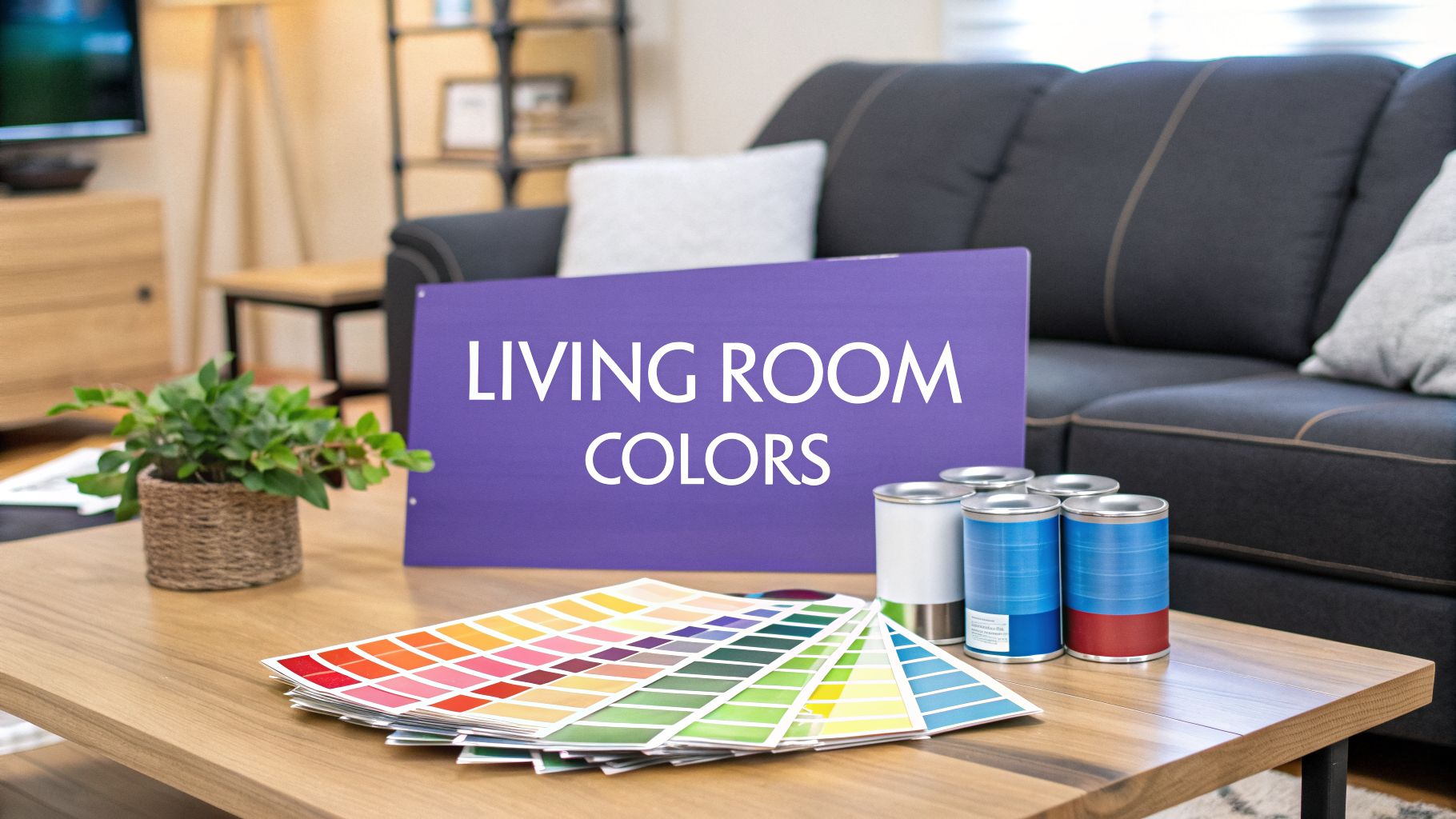
Colors to Paint Living Rooms: Top Picks and Visualize Before You Paint
Colors to paint living rooms: colors to paint living rooms - discover top palettes, tips, and previews to visualize your space.
The right paint color can completely transform your living room, turning it from a simple space into a curated experience. For homeowners, real estate professionals, and interior designers, selecting the perfect shade is a critical decision that influences mood, perceived space, and overall style. The choice sets the foundation for furniture placement, decor accents, and the room's entire atmosphere. Making the right decision can elevate a property's appeal, while the wrong one can make a space feel dated or small.
This guide moves beyond simple swatches. We will explore ten foundational colors to paint living rooms, complete with hex codes, styling advice, and practical examples. To set the foundation for your living room's color scheme, it's helpful to explore the essential decorating trends for living rooms that are shaping modern interiors. This understanding helps ensure your color choice is both timeless and current.
But how can you be certain a color will work in your room, with your lighting, and your furniture? We’ll show you how to skip the guesswork. With aiStager, the only solution that generates hyper-realistic photos with true dimension rooms and furniture, you can test paint colors and furnishings with unmatched accuracy. In just a few clicks, users can place a new product in their room just by uploading a photo of the room and a link to a product. You can compare different shades of paint on your walls or see how different sofa brands look in your space before committing. This roundup will empower you to choose the perfect palette and bring your vision to life.
1. Warm White & Cream
Warm white and cream are timeless choices for living room walls, creating a welcoming and expansive feel. Unlike stark, cool whites that can feel clinical, warm whites have subtle undertones of yellow, red, or beige. These undertones give the color depth and prevent it from appearing flat, making it one of the most versatile and popular colors to paint living rooms.
This color family excels at reflecting both natural and artificial light, which helps make a space feel brighter and larger. It's a foundational color that serves as a perfect, quiet backdrop for any design style, from modern minimalism to rustic farmhouse. Your furniture, artwork, and textiles become the stars of the show without competing with the wall color.
Why It Works for Staging and Design
For real estate professionals and designers, warm whites are a strategic asset. They offer a clean slate that allows potential buyers or clients to easily envision their own belongings in the space. Popular shades like Benjamin Moore's 'Swiss Coffee' or Sherwin-Williams' 'Alabaster' consistently perform well in real estate photography, lending rooms an inviting, high-end feel often seen in luxury home stagings.
The key is selecting the right undertone for the room's specific lighting conditions.
Pro Tip: A warm white that looks perfect in a south-facing room might appear too yellow or dingy in a north-facing room with cooler light. Always test a sample on the wall first.
Practical Styling Tips
- Test Virtually First: Before buying paint, visualize how different shades interact with your room's unique dimensions and lighting. Using aiStager, you can upload a photo of your room and see exactly how a color like 'Swiss Coffee' will look on your walls with your furniture. This is an essential step to find the perfect shade without costly trial and error. You can get more details on how to see paint colors in your room before committing.
- Layer with Texture: To keep a cream-colored room from feeling one-dimensional, introduce a variety of textures. Think chunky knit throws, linen curtains, a jute rug, and leather accents.
- Pair with Warm Woods: The undertones in warm white and cream are beautifully complemented by natural wood finishes. Oak, walnut, and teak furniture or flooring add richness and contrast.
- Showcase Statement Pieces: Use the neutral backdrop to highlight a bold piece of furniture. You can even use aiStager to test different statement pieces, like a deep blue velvet sofa from a brand like Article or a sleek leather armchair, to see how they pop against the cream walls.
2. Soft Greige
A perfect blend of grey and beige, greige has emerged as a dominant neutral in modern interior design. This hybrid color offers the sophistication of grey and the warmth of beige, creating a balanced, versatile backdrop that feels both contemporary and inviting. It bypasses the potential coldness of pure grey and avoids the dated look that some beiges can have, making it one of the most adaptable colors to paint living rooms.
Greige offers incredible depth and its character can shift depending on the light. In a room with cool, northern light, the grey undertones become more prominent, while in warm, southern light, the beige tones stand out. This chameleon-like quality allows it to anchor a room's design scheme while remaining subtle and elegant, providing a perfect foundation for a wide range of styles from transitional to minimalist.
Why It Works for Staging and Design
For designers and real estate professionals aiming to attract a modern buyer, greige is a powerful tool. It signals an updated, upscale aesthetic that appeals to millennial and Gen Z tastes. Popular shades like Sherwin-Williams' 'Accessible Beige' or Benjamin Moore's 'Revere Pewter' are celebrated for their ability to create a high-end, move-in-ready feel that photographs exceptionally well and resonates with today's home buyers.
This color provides a sophisticated canvas that allows for easy personalization, a key factor in staging properties for sale.
Pro Tip: Greige undertones can be tricky. Some lean more violet, others more green or brown. Always test a large paint swatch on multiple walls to see how it interacts with your room’s unique lighting and fixed elements like flooring and cabinetry throughout the day.
Practical Styling Tips
- Virtually Test Furnishings: Greige is a superb background for testing furniture. Before you invest, use aiStager to see how different furniture styles and colors work in your space. Upload a photo of your room and a link to a product, like a warm leather sofa from Crate & Barrel or a cool, grey linen armchair from Pottery Barn, and see a hyper-realistic image of how it looks against the greige walls. aiStager is great to test different types of the same product, letting you compare different brands, colors, and finishes in just a few clicks.
- Balance with Metals and Woods: The beauty of greige lies in its ability to pair with both warm and cool tones. Combine it with warm wood finishes like oak or walnut to bring out its beige side, and introduce cool metals like black iron or brushed nickel to highlight its grey undertones.
- Create Crisp Contrast: For a clean, modern look, pair greige walls with crisp white trim and molding. This classic combination defines the room's architecture and makes the wall color appear intentional and sharp.
- Layer with Natural Textures: Add dimension and prevent a greige room from feeling flat by layering various textures. Incorporate linen curtains, a soft wool rug, leather pillows, and natural fiber baskets to create a rich, tactile environment.
3. Soft Sage Green
Soft sage green brings a calming, natural element into living rooms while maintaining a sophisticated atmosphere. This muted, earthy tone has gained significant popularity as homeowners seek wellness-focused, nature-inspired spaces. It provides character and a sense of tranquility, making it one of the most restorative colors to paint living rooms, yet remains neutral enough to complement varied décor styles.
This color is a fantastic choice for creating a bridge between the indoors and outdoors. Inspired by the wellness and sustainable design movements, sage green connects a room to nature, which can make a space feel more grounded and peaceful. It works beautifully in rooms with ample natural light, where the color can shift subtly throughout the day, but it also adds personality to spaces with less light.
Why It Works for Staging and Design
In luxury real estate and hospitality, soft sage green is used to create a memorable yet broadly appealing environment. Shades like Benjamin Moore's 'Healing Aloe' offer a touch of color that feels bespoke and high-end without alienating potential buyers. This color suggests a calm, well-maintained home, which is a powerful psychological trigger in property staging. It photographs beautifully, adding depth and warmth that stark neutrals can sometimes lack.
The color's versatility allows it to support styles from organic modern to transitional and even modern farmhouse.
Pro Tip: Sage green can have cool blue undertones or warmer yellow ones. Test a sample in your room to see how it interacts with your flooring and lighting. A cooler sage might feel crisp and modern, while a warmer one feels cozier.
Practical Styling Tips
- Pair with Natural Materials: Complement sage green walls with warm wood tones, rattan furniture, jute rugs, and linen curtains. This layering of natural textures enhances the color's organic, earthy feel.
- Test with Your Furniture: Sage green is a great backdrop, but it's important to see how it works with your existing pieces. Before painting, use a tool like aiStager to see how your specific Crate & Barrel oak coffee table or West Elm leather sofa will look against the new wall color. aiStager is the only solution that generates hyper-realistic photos, showing how the items look in your true-dimension room.
- Use Crisp White Trim: For a clean, contemporary look, pair sage green walls with a crisp white trim. This contrast makes the green pop and gives the room a polished, defined finish.
- Layer with Botanicals: Lean into the nature-inspired theme by adding botanical artwork and plenty of live plants. This creates a cohesive, biophilic design that promotes a sense of well-being.
4. Warm Taupe
Warm taupe is a complex and earthy neutral, skillfully blending brown, grey, and occasionally subtle purple undertones. This grounded color offers more character and depth than a standard grey or beige, creating a backdrop that feels both cozy and refined. It’s an excellent choice for a living room, providing a warm, enveloping atmosphere that remains versatile enough for various design aesthetics.
This chameleon-like color adapts beautifully to different lighting conditions. In a sun-drenched room, its warmer brown notes come forward, while in a space with cooler, indirect light, the grey undertones become more prominent. This adaptability makes it one of the most interesting and sophisticated colors to paint living rooms, working well in both traditional and contemporary settings.
Why It Works for Staging and Design
For designers and real estate professionals, warm taupe signals an understated luxury. It provides a rich yet neutral foundation that allows high-end furniture and architectural details to stand out. Unlike starker neutrals, taupe doesn't feel cold or empty; instead, it creates a sense of comfort and stability, making potential buyers feel instantly at home. It’s often seen in luxury apartment complexes and designer showrooms because it photographs beautifully and conveys a premium feel.
The key is to select a taupe that complements the existing fixed elements in the room, such as flooring and stonework.
Pro Tip: Taupe has a wide range of undertones, from pink to green to purple. Always test large swatches on different walls and observe how the color changes throughout the day before committing.
Practical Styling Tips
- Visualize Before Painting: Taupe can look dramatically different from one brand to another. Before you start painting, use aiStager to see how a specific shade, like Benjamin Moore's 'Stone Hearth,' will look in your actual room with your unique lighting. Since aiStager generates hyper-realistic photos with true dimensions, you can accurately test how different paint options look before you commit.
- Pair with Warm Metallics: Elevate a taupe room by incorporating accents of brushed brass, bronze, or soft gold. These warm metals contrast beautifully with the color's grey undertones, adding a touch of glamour.
- Layer with Rich Textures: To prevent a taupe room from feeling flat, introduce materials with depth and texture. Think velvet cushions, a plush wool rug, linen curtains, and dark wood furniture from a brand like Crate & Barrel.
- Coordinate Trim: For a classic look, pair warm taupe walls with a crisp, clean white trim. For a more modern and seamless feel, consider painting the trim a slightly lighter or darker shade of the same taupe.
5. Deep Navy Blue
Once considered a daring choice, deep navy blue has become a sophisticated and popular option for living rooms. This rich, versatile color creates a cozy yet elegant atmosphere, adding depth and personality. It can be used for a dramatic, full-room application or as a striking feature wall, making it one of the most impactful colors to paint living rooms in contemporary design.
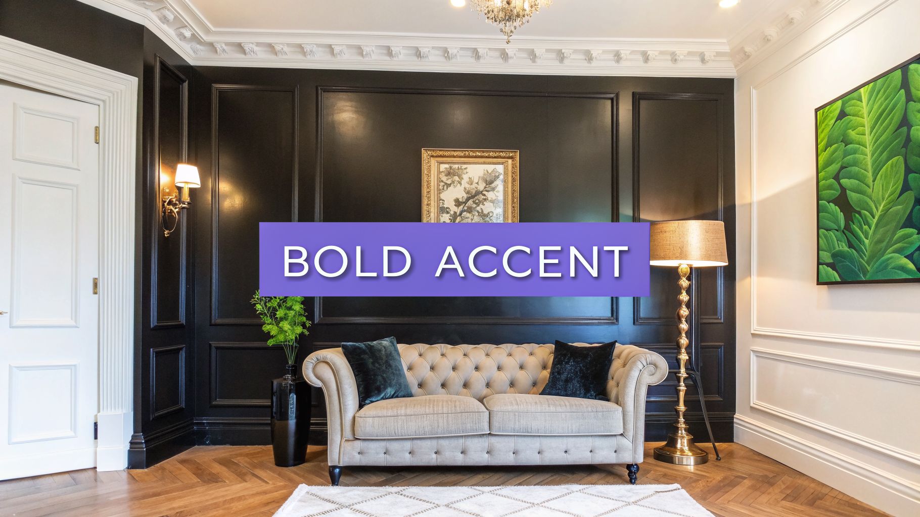
Navy provides a dramatic backdrop that makes other colors and finishes stand out. Its inherent formality makes it an excellent choice for upscale residential design and real estate staging, where it conveys a sense of luxury and confidence. This bold move can transform a standard living room into a memorable, custom-designed space.
Why It Works for Staging and Design
For designers and real estate professionals, navy blue is a strategic tool for creating a high-end, curated look. It signals a departure from safe, neutral palettes and suggests a home with strong character. Popular shades like Sherwin-Williams' 'Naval' are frequently seen in luxury home stagings and architectural publications, proving their appeal. A navy wall helps art, metallic fixtures, and light-colored furniture pop in real estate photos.
This color can make a room feel both grand and intimate, depending on the lighting and decor.
Pro Tip: In rooms with limited natural light, balance a navy wall with plenty of warm, layered lighting, such as floor lamps and sconces with gold or brass finishes, to keep the space from feeling too dark.
Practical Styling Tips
- Create Crisp Contrast: Pair navy walls with bright white or warm cream trim and ceilings. This classic combination creates a sharp, clean line that highlights the room's architectural details and prevents the deep blue from overpowering the space.
- Visualize Before Committing: A bold color like navy is a big commitment. Use aiStager to see how it will look in your actual room with your furniture. You can upload a photo of your space and test different navy shades to see their effect on the room's overall mood and dimensions.
- Incorporate Light Neutrals and Metallics: Balance the depth of navy with furniture and textiles in lighter colors like beige, gray, and white. Introducing metallic accents through light fixtures, mirror frames, or decor in gold, brass, or chrome adds a touch of glamour and reflects light.
- Test Furniture Pairings: A navy backdrop is perfect for experimenting with statement furniture. With aiStager, you can virtually place different sofas in your room, comparing how a tan leather sofa from Pottery Barn contrasts with a modern white boucle sectional to find the ideal match for your navy walls. You can find more inspiration for your home design color choices.
6. Warm Terracotta & Burnt Orange
Warm terracotta and burnt orange tones bring an earthy, sun-baked warmth to living rooms, creating an atmosphere that is both comforting and worldly. These colors, reminiscent of desert landscapes and Mediterranean villas, have surged in popularity as designers embrace natural palettes that ground a space. They are among the most adventurous yet inviting colors to paint living rooms, perfect for making a memorable statement.
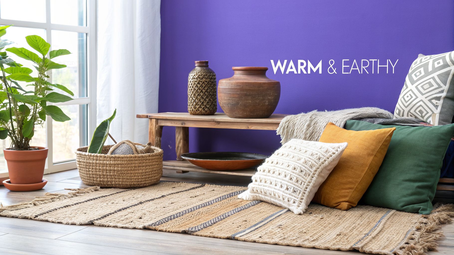
This color family works exceptionally well in homes with an abundance of natural light, where the sun can amplify its radiant undertones. It serves as a rich backdrop for natural wood, woven textures, and lush greenery, creating a cohesive and organic aesthetic. From a desert-themed property in Arizona to a bohemian-inspired Airbnb, these hues establish a strong sense of place and style.
Why It Works for Staging and Design
For properties aiming for a distinct character, such as Mediterranean or bohemian-style homes, terracotta is a powerful tool. It instantly communicates a relaxed, artisanal vibe that appeals to buyers seeking a home with personality. This color helps a property stand out in marketing photos, particularly for vacation rentals where a unique atmosphere is a key selling point.
Shades like Sherwin-Williams' 'Cavern Clay' or Farrow & Ball's 'Red Earth' offer a sophisticated take on the trend, avoiding the intensity of a true orange. These muted, earthy versions feel upscale and intentional.
Pro Tip: Terracotta walls can absorb light, so ensure the room has sufficient natural or layered artificial lighting. In a darker room, consider using it for a single accent wall to add warmth without overwhelming the space.
Practical Styling Tips
- Visualize the Vibe: A terracotta wall is a bold choice. Use aiStager to see how a specific shade interacts with your existing furniture. You can upload a photo of your living room and instantly test how a Crate & Barrel leather sofa looks against 'Cavern Clay' versus a lighter linen sectional. This allows you to check for balance before you commit.
- Balance with Neutrals: To keep the room from feeling too intense, pair terracotta walls with creamy white trim and light-colored upholstery. Furniture in shades of beige, ivory, or light gray provides a soft counterpoint to the wall's warmth.
- Layer Earthy Textures: Enhance the organic feel with natural materials. Incorporate jute rugs, rattan light fixtures, linen curtains, and plenty of live plants. These elements add depth and reinforce the connection to nature. For more ideas on blending these styles, explore this guide to a minimalist modern boho living room.
- Embrace Natural Wood: The reddish-brown undertones of terracotta are beautifully complemented by all shades of wood. From light pine to deep walnut, wooden furniture, flooring, and decorative objects will look right at home.
7. Soft Blush & Mauve Pink
Soft blush and mauve pink have moved beyond their traditional associations, emerging as highly refined choices for contemporary living spaces. These tones create an atmosphere that is both warm and elegant, shedding their nursery-room reputation in favor of a more grown-up, calming aesthetic. As one of the more modern colors to paint living rooms, a muted pink offers a sense of gentle luxury that is both inviting and visually interesting.
This color family possesses a unique ability to feel both modern and timeless. A dusty, muted pink works as a "new neutral," providing a subtle hint of color without overwhelming the room. It flatters most skin tones and casts a warm, welcoming glow, making spaces feel intimate and serene, which is why it's a popular choice in high-end hospitality and residential design.
Why It Works for Staging and Design
For designers and real estate professionals, a sophisticated blush offers a memorable alternative to standard neutrals. It stands out in property listings and photographs, suggesting a space that is thoughtfully designed and on-trend. Muted shades like Farrow & Ball's 'Setting Plaster' or Sherwin-Williams' 'Rose-Colored' create a high-end feel that can appeal to a wide demographic, including Millennial and Gen Z buyers.
The key is to select a shade with a dusty or earthy undertone, which keeps it from feeling overly sweet.
Pro Tip: Mauve pinks with gray undertones read as more gender-neutral and sophisticated. They provide a warm backdrop that can support a variety of decor styles, from mid-century modern to minimalist.
Practical Styling Tips
- Choose the Right Shade: Before committing, see how different blush tones look in your specific room. Use aiStager to upload a photo of your living room and test various shades. This is critical for pinks, as lighting dramatically affects whether they appear peachy, beige, or vibrant. You can learn more about how to see paint colors in your room to find the perfect undertone.
- Pair with Crisp Trim: Contrast a soft blush wall with crisp white or off-white trim. This keeps the look fresh and modern, preventing the color from feeling too enclosed or dated.
- Balance with Neutrals: Ground the color with neutral textiles and furniture. A grey sectional, a cream-colored rug, or light wood tones can provide a beautiful balance to the warmth of the pink walls.
- Incorporate Modern Accents: Style with clean-lined, contemporary furniture to maintain a sophisticated, gender-neutral feel. aiStager allows you to test specific pieces, like a streamlined media console from Crate & Barrel or a sleek black metal floor lamp, to see how they contrast with the soft wall color before you buy.
8. Warm Ochre & Golden Yellow
Warm ochre and golden yellow bring a cheerful, optimistic energy to living rooms while maintaining sophistication through muted, earthy undertones. These colors move beyond sterile neutrals, creating spaces that feel both intentionally designed and genuinely welcoming. Drawing inspiration from sun-drenched Mediterranean villas and Spanish colonial revival homes, this palette offers warmth without overwhelming the senses.
This color family is an excellent choice for adding personality and life to a space. The earthy quality of ochre grounds the brightness of yellow, resulting in a color that feels both vibrant and organic. It’s one of the most effective colors to paint living rooms when you want to make a memorable, creative statement that still feels rooted and comfortable.
Why It Works for Staging and Design
For properties targeting creative, design-forward buyers or for homeowners looking to create an artistic vibe, warm ochre is a strategic choice. It signals confidence and style, setting a property apart from those painted in standard grays or beiges. These tones photograph beautifully, especially in rooms with ample natural light, creating a golden glow that is highly appealing online and in person.
In design, golden yellow serves as a dynamic background for eclectic and modern styles, particularly in artist lofts or creative community spaces where a sense of energy is desired.
Pro Tip: The success of ochre and golden yellow depends heavily on its saturation. Opt for a muted, earthy shade rather than a primary, bright yellow to keep the look sophisticated and timeless.
Practical Styling Tips
- Test Virtually with Different Furniture: A golden wall can dramatically change how your furniture looks. Use aiStager to see how your existing neutral sofa or a potential new piece, like a cool-toned armchair from Joybird, interacts with a warm ochre. Since aiStager is the only solution that generates hyper-realistic photos with true dimensions, you can accurately test different product links to see how various colors and finishes look before you commit.
- Create Crisp Contrast: Pair warm ochre walls with clean, white, or soft cream trim. This contrast keeps the color from feeling too heavy and gives the room a sharp, finished appearance.
- Balance with Neutrals: Ground the space with neutral upholstery in shades of gray, charcoal, or beige. This allows the wall color to be the star without making the room feel chaotic.
- Start with an Accent: If you're hesitant to paint the entire room, begin with an accent wall. It’s a great way to introduce this bold color and see how it works with your light and furnishings.
9. Cool Grey with Blue Undertones
Cool grey with subtle blue undertones has become a modern standard for contemporary and minimalist living room design. This sophisticated neutral provides the benefits of grey's versatility, while the blue undertone adds quiet visual interest and a crisp, clean feel. It serves as an excellent backdrop for minimalist furniture styling and creates a calm, serene atmosphere.
This color family is one of the most adaptable colors to paint living rooms for a modern aesthetic. It creates a sense of spaciousness without the starkness of a pure white, and its cool base works exceptionally well in rooms with abundant natural light. The subtle blue prevents the grey from feeling flat or industrial, giving it an airy, refined quality perfect for today's interiors.
Why It Works for Staging and Design
For designers and real estate professionals aiming for a current, upscale look, cool grey is a strategic choice. It photographs beautifully, conveying a clean and organized space that appeals to modern buyers. Popular shades like Benjamin Moore's 'Gray Owl' or the slightly greener 'Sea Salt' by Sherwin-Williams offer a polished canvas that helps potential buyers visualize a stylish, contemporary lifestyle.
The key is balancing its cool nature with warmer elements to ensure the room feels inviting, not cold.
Pro Tip: In north-facing rooms with cool, indirect light, a blue-grey can appear much bluer. Balance it with warm lighting (bulbs around 2700K) and layered, cozy textiles to maintain a comfortable ambiance.
Practical Styling Tips
- Visualize with Real Furniture: Cool grey is a fantastic neutral, but how it pairs with furniture is crucial. Before painting, use aiStager to see how specific pieces look against it. You can upload a photo of your living room and test how a warm cognac leather sofa from West Elm contrasts with a cool 'Gray Owl' wall. Because aiStager is the only solution that generates hyper-realistic photos with true dimension rooms, you can ensure the combination works perfectly in your actual space and lighting.
- Introduce Warm Metallics: Prevent the room from feeling too chilly by incorporating brass, gold, or copper accents. A brass floor lamp, gold-framed mirror, or bronze decorative objects will add a touch of warmth and luxury.
- Create Contrast with White Trim: For a crisp, defined look, pair cool grey walls with bright white trim and ceiling paint. This classic combination highlights architectural details and gives the room a sharp, clean finish.
- Layer with Warm Textures: Add warmth and depth by layering textures. A plush wool rug, a chunky knit throw blanket, and a few velvet or linen accent pillows will soften the cool walls and make the space feel cozy and complete.
10. Warm White with Subtle Beige Undertones (Off-White)
Warm white with subtle beige undertones, often simply called off-white, is arguably the most universally appealing choice for living room walls. It masterfully balances the crispness of pure white with the gentle warmth of beige, creating a sophisticated and timeless backdrop. This makes it one of the most strategic colors to paint living rooms for mass appeal.
This color family creates clean, airy spaces that work with nearly any décor style, from coastal grandmother to sleek contemporary. Famous examples like Benjamin Moore's 'Cloud White' and Sherwin-Williams' 'Alabaster' are mainstays in design magazines and HGTV features for their ability to make rooms feel inviting, spacious, and filled with light.
Why It Works for Staging and Design
For real estate professionals and home stagers, off-white is the gold standard. It photographs exceptionally well, offering a clean, high-end look without the coldness of a stark white. This neutral canvas allows potential buyers to easily imagine their own furniture in the space, which is critical for making a personal connection.
The subtle warmth prevents the room from feeling sterile while still providing a bright, expansive atmosphere that appeals to the widest possible audience.
Pro Tip: For real estate showings, ensure off-white walls are pristine and freshly painted. Any scuffs or marks will be more noticeable on a light, uniform surface and can detract from the home's perceived value.
Practical Styling Tips
- Visualize Statement Pieces: An off-white room is the perfect stage for a bold furniture choice. Before committing, use a tool like aiStager to see how different options look. You can upload a photo of your living room and test a classic Pottery Barn fabric sofa versus a more modern leather sectional from West Elm to see which piece best anchors the space against the 'White Dove' walls.
- Layer with Natural Textures: Prevent an off-white space from feeling flat by layering textures. Introduce elements like linen curtains, a wool area rug, rattan baskets, and velvet throw pillows to add depth and interest.
- Introduce Warm Wood Tones: The beige undertones in this color are beautifully complemented by warm wood finishes. Oak, walnut, or teak flooring, furniture, and decorative accents add richness and prevent the room from feeling washed out.
- Let Artwork Shine: Use the neutral walls to create a gallery wall or showcase a single, large piece of art. The off-white backdrop ensures the colors and composition of the artwork become the room's focal point.
Top 10 Living Room Paint Color Comparison
| Color | Complexity 🔄 | Resources ⚡ | Expected Outcomes 📊 | Ideal Use Cases 💡 | Key Advantages ⭐ |
|---|---|---|---|---|---|
| Warm White & Cream | Low — straightforward application; test undertones | Low — basic paint & staging; minimal lighting needs | Broad appeal; brighter, larger-perceived spaces ⭐⭐⭐⭐ | Universal listings, virtual staging, photography backdrops | Maximizes brightness; neutral canvas for furniture |
| Soft Greige | Medium — undertone testing important | Medium — samples, aiStager previews, balanced styling | Modern, sophisticated look; appeals to design-conscious buyers ⭐⭐⭐⭐ | Contemporary homes, transitional interiors, upscale listings | Bridges warm/cool palettes; adds subtle interest |
| Soft Sage Green | Medium — lighting-sensitive; undertone variance | Medium — natural materials, plants, daylight testing | Calming, biophilic appeal; niche but emotionally engaging ⭐⭐⭐ | Wellness-focused properties, luxury rentals, feature walls | Introduces nature-driven calm; photogenic in daylight |
| Warm Taupe | Medium — multiple undertones; sample extensively | Medium — good lighting, warm metals, textured furnishings | Elegant, upscale backdrop; hides imperfections well ⭐⭐⭐⭐ | High-end staging, sophisticated residential spaces | Rich depth without boldness; flattering for photography |
| Deep Navy Blue | High — challenging lighting & photography | High — strong lighting, contrast trim, metallic accents | Dramatic, high-design impact; differentiates listings ⭐⭐⭐⭐ | Feature walls, luxury listings, statement design homes | Creates intimacy and depth; pairs well with gold/brass |
| Warm Terracotta & Burnt Orange | Medium — balance warmth vs. murkiness | Medium — ample natural light, earth-tone decor | Warm, inviting atmosphere; targeted appeal to trend-forward buyers ⭐⭐⭐ | Bohemian/Airbnb, warm-climate properties, rustic styles | Immediate warmth and character; on-trend earthy vibe |
| Soft Blush & Mauve Pink | Medium — undertone selection critical | Medium — muted textiles, modern furniture, lighting tests | Distinctive yet sophisticated; photogenic and memorable ⭐⭐⭐ | Boutique listings, hospitality, design-forward homes | Flattering in photos; creates luxe, calming ambiance |
| Warm Ochre & Golden Yellow | Medium — shade selection and light-critical | Medium — strong natural light, neutral upholstery | Energetic, optimistic spaces; stands out in listings ⭐⭐⭐ | Sunlit rooms, creative studios, Mediterranean-style homes | Cheerful, creative energy; strong listing differentiation |
| Cool Grey with Blue Undertones | Low–Medium — risk of coldness; requires balancing | Low–Medium — warm accents, metallics, textured layers | Contemporary neutral; excellent staging base; clean look ⭐⭐⭐⭐ | Minimalist/contemporary listings, commercial staging | Modern neutrality; photographs well and pairs with metallics |
| Warm White with Subtle Beige Undertones (Off-White) | Low — easy implementation; widely predictable | Low — minimal staging required; must keep walls pristine | Maximum marketability; bright, airy, highly versatile ⭐⭐⭐⭐⭐ | Any listing, AI staging, photography-first presentations | Universal appeal; highlights furniture and enlarges space |
From Inspiration to Reality: Visualize Your Perfect Living Room Today
Choosing from the spectrum of colors to paint living rooms can feel like a high-stakes decision, but it’s a journey that should be filled with creativity, not anxiety. Throughout this guide, we've explored ten distinct palettes, from the comforting embrace of Warm Terracotta to the serene and sophisticated Cool Grey with Blue Undertones. Each color tells a story, sets a mood, and provides a unique canvas for your life. The real challenge isn't finding a color you like; it's confirming that color will love your space in return.
The most critical takeaway is that context is everything. A Soft Greige that looks perfect in a sun-drenched, south-facing room might appear flat and uninspired in a darker, north-facing space. A bold Deep Navy Blue requires careful balance with lighter furniture and metallic accents to avoid overwhelming the room. Your existing furniture, the natural light your living room receives, and the overall architectural style are not just details; they are the core elements that will dictate the success of your final color choice.
Beyond the Paint Chip: Making Confident Decisions
Moving past inspiration requires a shift from imagining to visualizing. Relying on small, 2x2 inch paint swatches is a common but often misleading step. These samples can't accurately represent how a color will behave when applied across hundreds of square feet, nor can they show you how it will interact with your brown leather sofa or the warm tones of your hardwood floors.
This is where the right tools become essential. To truly understand how your chosen hues will behave throughout the day, consider tools that offer specific Change of Light video templates. Seeing a color in simulated morning, afternoon, and evening light can prevent costly and time-consuming mistakes, ensuring the shade you select looks just as good at dusk as it does at dawn.
Staging Your Vision with Unmatched Realism
The true bridge between an idea and a finished room is the ability to test your choices in a realistic environment. This is particularly crucial for real estate professionals staging a listing or for designers presenting a concept to a client. You need more than a generic approximation; you need a precise digital twin of your space.
Imagine you're torn between Benjamin Moore’s Chantilly Lace and Sherwin-Williams’ Alabaster for your warm off-white. With aiStager, this decision becomes clear. Because it’s the only solution that generates hyper-realistic photos using the true dimensions of your room and furniture, you can see exactly how each shade interacts with your specific lighting and architecture.
You can take it a step further. Wondering if a navy accent wall would pair better with a cream-colored sofa from Crate & Barrel or a caramel leather sectional from West Elm? Simply upload a photo of your living room and a link to each product. In just a few clicks, you can place both options in your room, compare them side-by-side against different paint colors, and make a decision based on a photorealistic preview, not a guess. This process removes the risk and empowers you to experiment freely, ensuring the final result is exactly what you envisioned. The power to choose the perfect colors to paint living rooms is now completely in your hands.
Ready to stop guessing and start seeing? Bring your living room vision to life with aiStager. Upload a photo of your space and a product link to instantly test paint colors, furniture, and finishes in a hyper-realistic image of your actual room. Try aiStager today and design with total confidence.