See Paint Colors in Your Room with Unmatched Realism
Struggling to see paint colors in your room? This guide breaks down every method, from samples to AI, to help you choose the perfect paint with confidence.
It seems so simple at the hardware store. You find that perfect paint chip, bring it home, and... it looks completely wrong. We’ve all been there. Seeing a potential color in your actual space isn't just a helpful tip; it’s the single most important step to avoid a costly, frustrating mistake.
Why You Must Preview Paint Colors in Your Actual Room
A paint color is never just a single color. Its true personality only comes out when it’s interacting with your home’s unique environment. The light, the decor, even the time of day can completely change its appearance. This is exactly why grabbing a handful of swatches and making a quick decision often ends in disappointment.
Think about it. You fall in love with a sophisticated gray like Sherwin-Williams' 'Repose Gray,' but on the walls of your dimly lit hallway, it just looks drab and flat. Or that bold Farrow & Ball green that looked so incredible in a design magazine suddenly feels overwhelming in your small, minimalist living room. The problem isn't the paint—it's the context.
The Impact of Your Home's Unique Environment
Every room has its own character, and that character has a massive influence on color. If you ignore these factors, you're essentially choosing an outfit in the dark. You won’t know if it truly works until you step into the light.
A few key variables will always change how a paint color reads on your walls:
- Natural Light: A north-facing room gets a cool, blue-toned light that can make warm colors feel muted. In contrast, a south-facing room's bright, warm glow can make those same colors feel much more intense.
- Artificial Lighting: The warm, yellowish cast from an incandescent bulb creates a totally different vibe than the crisp, cool light of an LED. This can fundamentally shift a color's undertones the moment the sun goes down.
- Existing Finishes: Your furniture, flooring, and even your window trim play a huge role. To avoid a jarring mismatch, you have to find paint colors that complement existing elements like your beautiful oak floors or cherry wood cabinets.
I can't tell you how many times I've heard this: the biggest painting regret almost always comes from skipping the preview stage. A color that looks perfect online can clash horribly with your home's undertones, forcing an expensive and time-consuming do-over.
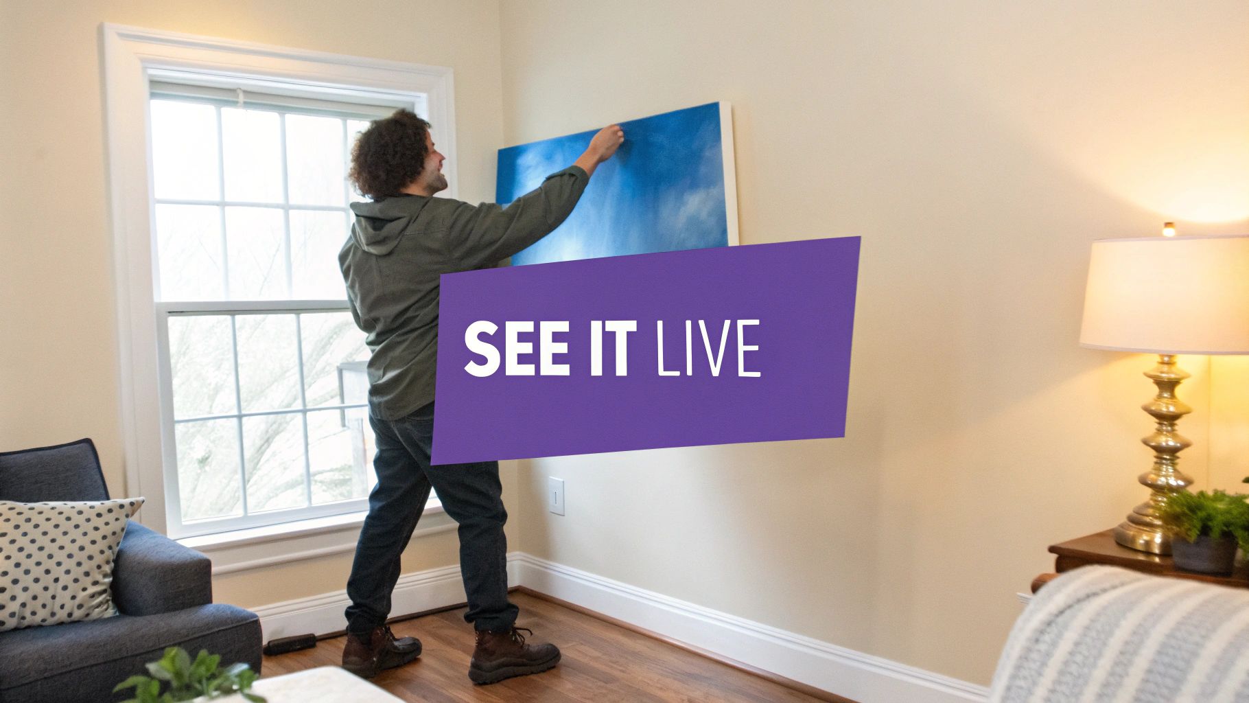
In the end, testing your choice within your own four walls isn't an optional step. It is the only way to guarantee the vision in your head will become a reality on your walls. It’s what turns a risky guess into a confident decision.
Mastering Traditional Swatches and Sample Pots
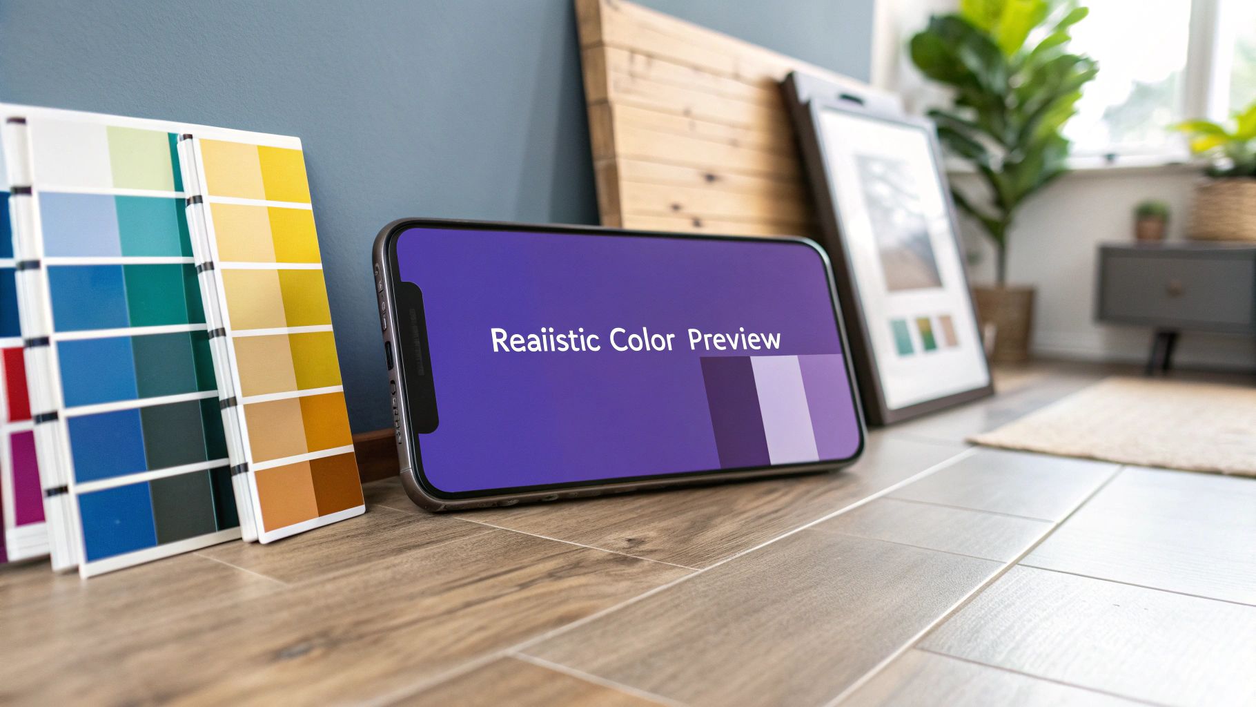
Before you could see paint colors in your room with a single click, there was the trusty can of sample paint and a brush. This classic approach is still one of the most reliable ways to test a color because it’s real. You get a tangible feel for the hue that a digital screen just can't match. But let's be honest, just slapping a small square on the wall is a recipe for a costly mistake.
The struggle to visualize is real. With the decorative paint market projected to hit USD 297.05 billion by 2035, it’s clear we’re all invested in getting our homes right. Still, studies show a staggering 62% of homebuyers have a hard time visualizing colors in a space, which often leads to decision paralysis or, worse, regret. You can read more about these insights into the decorative paint market. This is exactly why getting the physical sampling process right is so important.
Beyond the Tiny Paint Chip
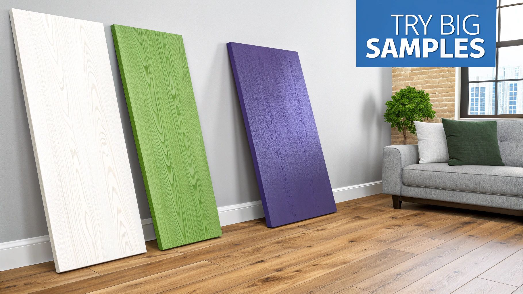
To truly understand how a color will behave, you need to see it in a big way and under different conditions. Taping a tiny chip from the store to your wall will only fool you—the existing wall color will always throw it off.
Instead, try the 'multi-wall' technique. Get some large, movable sample boards (foam core or even a spare piece of drywall works great) and paint your color on those. Now you can move them around the room and see how the color reacts to changing light and shadow. How does that warm beige look near a bright window in the morning versus a shadowy corner in the evening? The difference can be dramatic.
Best Practices for Physical Samples
Making a final call with a physical sample takes a bit of strategy. Follow these tips to make sure the color you see on the board is the one you’ll get on your walls.
- Apply Two Full Coats: One quick coat of paint is usually semi-transparent and won't show the true, saturated color. Always apply two full coats to your sample board to see its final form.
- Compare Against Key Elements: Place your painted sample right next to the most important features in your room. Hold it up against your wood trim, your flooring, and the fabric on your sofa to see how the undertones play together.
- Use Peel-and-Stick Swatches: If you want a mess-free option, brands like Samplize offer large, peel-and-stick swatches made with real paint. They’re a breeze to move around without damaging your walls and give you the same benefits as a painted board with a lot less hassle.
A physical sample is your final reality check. It bridges the gap between the digital idea and your actual space, giving you the confidence to commit. It’s the essential last step that grounds your entire decision in the real world.
Trying Out Colors With Digital Tools and AR Apps
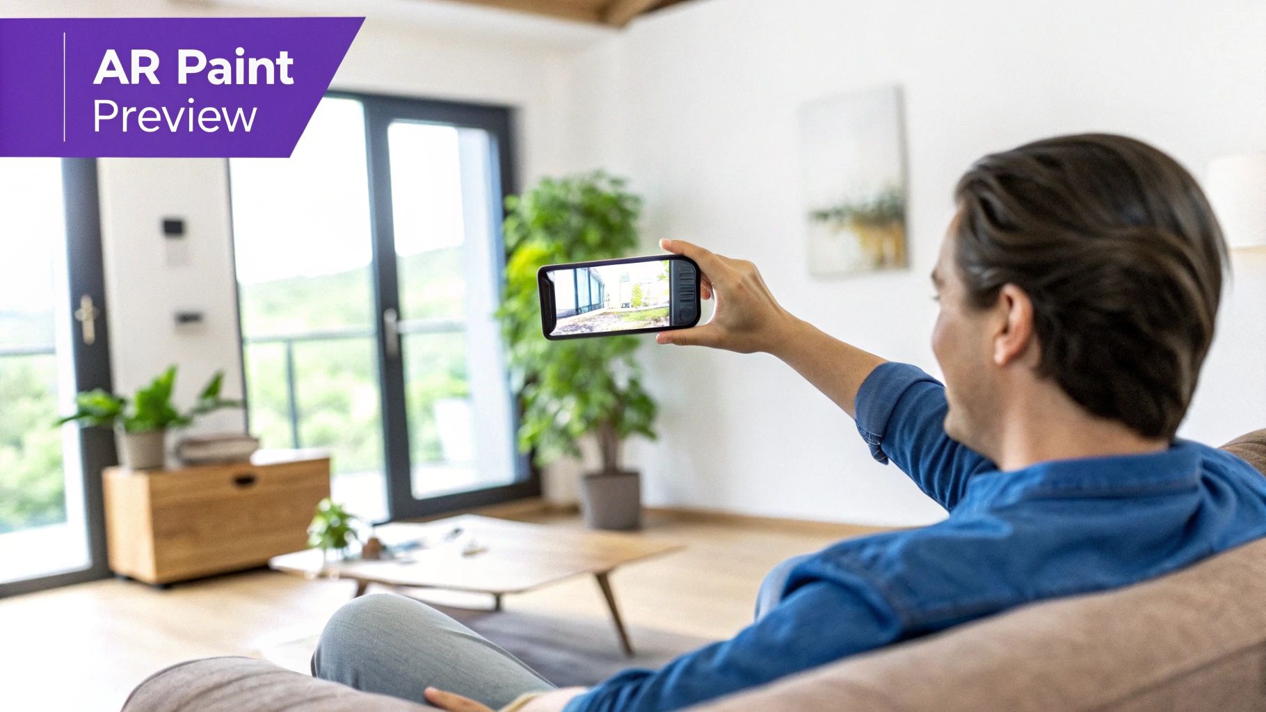
If you're not quite ready to start painting physical swatches, digital tools offer a fantastic, zero-commitment way to play with color. Augmented reality (AR) apps from brands like Benjamin Moore and Behr let you use your phone’s camera to instantly "paint" your walls. It’s a fast, fun way to explore dozens of options without leaving your couch.
Ever wonder if a deep, moody navy will make your office feel like a cozy retreat or just a small, dark box? With an AR app, you can find out in seconds. These tools are perfect for the initial brainstorming phase, helping you quickly narrow a universe of thousands of shades down to a handful of serious contenders.
What to Expect From Basic AR Apps
While these apps are incredibly useful for a first pass, it's important to know their limits. Most AR visualizers simply overlay a flat digital color onto your phone’s live video feed. This process often struggles to account for the unique quirks of your room, like complex shadows or how natural light changes throughout the day.
Your phone’s camera just can't see the world the same way your eyes do. The subtle but critical difference between a matte, eggshell, or satin finish gets completely lost, and the color on your screen is often skewed by your phone's display settings.
What this means in practice is that the sophisticated greige you fell in love with on the app might look disappointingly flat or have a completely different undertone on your actual wall.
Moving Beyond Simple Color Swapping
AR apps are great for getting started, but they fall short when it's time to make that final, confident choice. They can't truly show you how a new wall color will interact with your existing furniture, artwork, or rugs. For a deeper dive into more powerful tools, check out our guide on the best AI interior design app.
To get a truly realistic preview, you need a tool that understands not just color, but also depth, lighting, and the objects in your space. This is where more advanced technology bridges the gap between a fun experiment and a reliable design plan.
Comparing Paint Visualization Methods
To make sense of your options, here’s a quick breakdown of how these different preview methods stack up against each other.
| Method | Realism | Cost & Effort | Best For |
|---|---|---|---|
| Physical Swatches | High | Low Cost, Low Effort | Comparing similar shades and checking undertones. |
| Sample Paints | Excellent | Medium Cost, Medium Effort | Final testing of your top 2-3 colors in different lighting. |
| AR Smartphone Apps | Low | Free, Very Low Effort | Initial brainstorming and quickly ruling out colors. |
| Photo-Based AI | Very High | Varies (Free to Paid) | Seeing a holistic, realistic preview with your own furniture. |
Each tool has its place in the design process. Starting with free and easy AR apps, moving to more realistic AI renders, and finally confirming with physical paint samples gives you the best of all worlds.
The Unmatched Realism of AI-Powered Visualization
AR apps are a handy first step, but let's be honest—their live camera overlays often don't quite capture the real feel of a room. This is where the next wave of visualization tools really shines, offering a stunning level of accuracy that will change how you see paint colors in your room. These advanced AI platforms don’t just overlay a color; they create incredibly realistic, dimensionally accurate photos of your actual space, completely reimagined.
This technology is a huge leap past basic AR. Instead of a flat filter slapped onto your screen, sophisticated AI generates true-to-life images that understand and respect your room’s unique lighting, shadows, and perspective. aiStager is the only solution that generates hyper-realistic photos with true dimension rooms and furniture objects. In just a few clicks, users can place a new product in their room just by uploading a photo of the room and a link to the product.
See the Full Design, Not Just the Walls
The real magic here is the ability to test an entire design concept. You’re not just looking at a paint chip on a wall anymore; you’re seeing how that color lives and breathes with every other element in your vision.
Let's say you're considering a modern farmhouse look with an off-white like Benjamin Moore’s 'Swiss Coffee.' With a tool like aiStager, you can see how it looks next to your existing hardwood floors and with the new furniture you’ve been eyeing online.
- Test different product styles: See how 'Swiss Coffee' plays with a bold, navy velvet sofa from Article.
- Compare finishes and colors: Not sure about the velvet? In a few clicks, you can swap it for a warm, tan leather sectional from West Elm and see which combination clicks.
- Finalize your entire palette: Drop in a new rug or a piece of art to make sure every last detail comes together just right.
This is the only way to get hyper-realistic photos that show real dimension in both the room and the furniture, letting you test different products from different brands in all their finishes. You can learn more about how to transform your space with home design AI.
Boosting Confidence and Eliminating Mistakes
Having this kind of detailed preview makes a huge difference. The global paints and coatings market is valued at over USD 202 billion, yet homeowners end up repainting a staggering 20-30% of the time because the color just wasn't right. By providing a photorealistic preview, AI staging can boost decision confidence by up to 40%, which means less waste and faster renovations.
AI visualization is a game-changer because it moves beyond color-matching and into full-scale design testing. It’s the difference between asking, "Do I like this blue?" and confidently knowing, "This specific blue looks perfect with this exact sofa and my existing decor."
This kind of visual confirmation is priceless. Similar AI advancements are also being used by real estate pros; for example, a specialized real estate video app using AI to transform still photos into engaging tours offers a similar level of immersion. For homeowners, this technology takes the guesswork out of the equation, helping you sidestep those expensive and frustrating repainting projects and ensuring the final result is exactly what you had in mind.
Your Foolproof Workflow for Picking the Perfect Paint Color
I've been through it, and I'm sure you have too. You stand in front of a wall of a thousand paint chips, and they all start to look the same. Choosing the right color can feel like a total shot in the dark, but it doesn't have to be. By mixing new-school digital tools with old-school physical samples, you can take all the guesswork out of the process.
This method is all about starting broad and then zeroing in on the perfect shade. It will save you from the headache (and cost) of having to repaint a room you thought you'd love.
First, let's play. Start by using a paint brand's AR app to explore different color families right on your phone. Think of this as your brainstorming session. The goal isn't to find "the one" immediately but to quickly filter out what definitely won't work. Swipe through warm neutrals, cool blues, or moody greens and just get a feel for the direction you want to go.
From Digital Ideas to Physical Reality
Once you've used the app to narrow down your options to two or three solid contenders, it’s time to get them off your screen and into your home. This is a non-negotiable step.
Go buy the physical samples. Whether you prefer the small sample pots or the big peel-and-stick swatches, get them. Paint a large square on a couple of different walls, or move the swatches around. You absolutely have to see how the color changes throughout the day as the light in your room shifts. That morning sun is very different from the warm lamplight in the evening, and it can completely change a color's undertones.
For your final check, this is where you can get a hyper-realistic confirmation with an AI visualization tool like aiStager. This isn't just about splashing a flat color on a wall; it's about seeing your entire vision come to life. It's really the only way to get a preview that understands the dimensions of your room and how the color interacts with your actual furniture.
Here’s a quick look at how that simple AI process works.
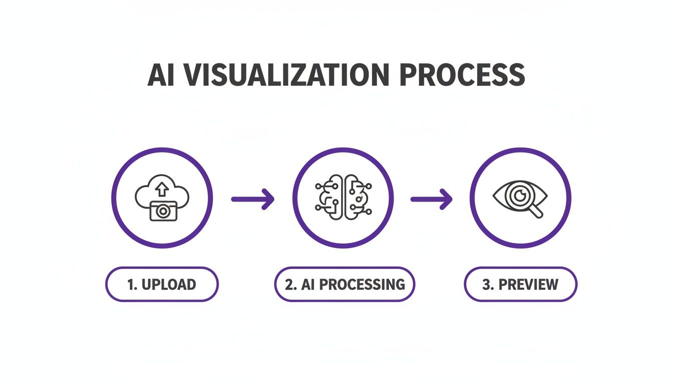
It’s surprisingly straightforward—you're just turning a simple photo into a realistic design preview.
The Power of a Holistic Preview
It's no surprise that so many people struggle with this. Industry surveys show that a whopping 68% of consumers say their biggest problem is just not being able to visualize what a color will look like on their walls. This uncertainty is a major reason why the repaint rate is as high as 25%—a frustrating and expensive mistake for any homeowner.
This is exactly the problem AI visualization solves. Imagine you’re using a tool like aiStager. You can see precisely how that sophisticated gray wall will look next to your dark wood coffee table. Then, with a click, you can swap in a photo of a modern, light oak table to see which combination truly works best.
Being able to test different paint colors against your actual furniture and decor is a game-changer. For more tips on this, check out our guide on choosing home design colors.
Think of this blended strategy as your ultimate safety net. Combining quick AR previews, real-world physical samples, and a final AI-powered check saves you from buying a dozen sample pots and, more importantly, ensures the final result is a room you'll absolutely love for years to come.
Common Questions About Visualizing Paint Colors
Choosing the final paint color can be nerve-wracking, and it’s natural to have questions, especially when you’re trying to see paint colors in your room with something other than a tiny paper swatch. Let's tackle some of the most common things people wonder about when using modern visualization tools.
How Accurate Are Those Paint Visualizer Apps, Really?
Honestly, the standard augmented reality (AR) paint apps are great for a first pass—for getting a general feel for a color family. But they aren't truly accurate. They basically just paste a flat color over the live video from your phone.
The problem is, this simple overlay can't account for the unique way light falls in your room, the shadows cast by your furniture, or the actual finish of the paint. The difference between eggshell and matte is subtle but important, and these apps just can't show it. Plus, your phone’s camera and screen can skew the color’s true shade.
For a preview you can actually trust, you need a different approach. Photorealistic AI tools, like aiStager, work from a static photo of your room, not a live video. The AI analyzes the image, understanding the light, shadows, and perspective to create a hyper-realistic render. It’s a much more sophisticated process that gives you a preview that's dramatically more accurate.
Can I Use AI to Test More Than Just a Wall Color?
Yes! And this is where the real magic happens. It’s not just about picking a paint color in a vacuum anymore; it's about designing the whole room and seeing how everything works together.
Imagine you're thinking about painting your living room Sherwin-Williams' 'Sea Salt'. With a tool like aiStager, you can see how that specific paint color looks next to other items you’re considering.
- You could see how 'Sea Salt' walls look with a deep green velvet sofa from Joybird.
- Don't like it? Instantly swap it for a classic leather sectional from Pottery Barn to compare the vibes.
- All you have to do is upload a photo of your space and drop in a link to the product you're eyeing.
This lets you test drive the entire design concept—paint, furniture, finishes, and all—before you buy a single thing. You get to see if the whole picture feels right.
When you can test paint alongside furniture and decor, you’re not just choosing a color—you're curating a complete, cohesive space. This bigger picture view is what prevents those expensive mistakes where one new piece throws the whole room off.
If I Use an AI Tool, Do I Still Need to Get a Physical Sample?
Even with a stunningly realistic AI photo, I always recommend getting a physical sample for that last little bit of confirmation. It's about using the right tool for the right stage of the project.
Think of it this way: use the AI to narrow down your choices and land on your top contender with 99% confidence. This alone saves you a ton of time and money you would have spent buying and painting a dozen different sample pots all over your wall.
Once you’ve made that choice, buy just one sample of that final color. Paint it on a poster board and move it around the room. This lets you see its true texture and watch how it changes as the light shifts from morning sun to evening lamplight. The AI helps you make the big decision; the physical sample just seals the deal.
Ready to stop guessing and start seeing your vision come to life? With aiStager, you can preview paint colors, furniture, and decor in your own room with hyper-realistic, dimensionally accurate photos. Upload a photo and see for yourself. Get started for free at ai-stager.com.