Designing a Salon Layout That Maximizes Profit & Flow
Your complete guide to designing a salon layout. Learn to plan zones, workflow, dimensions, and technical systems to create a beautiful, profitable space.

An empty salon shell can fool you. It looks open, flexible, full of possibility. Then the practical questions start. Where does check-in go so it feels welcoming but doesn’t block traffic? How many stations fit before the room starts feeling cheap? Where do color, shampoo, storage, laundry, and staff breaks live without turning the day into a series of collisions?
That’s why designing a salon layout isn’t a decorating project first. It’s an operations project first. A strong salon layout makes the room easier to work in, easier to sell in, and easier to return to.
The best salons don’t just look polished in photos. They move well in real life. Clients know where to go without asking. Stylists aren’t reaching across each other. Retail doesn’t feel shoved in as an afterthought. The shampoo area feels quieter. The front desk can function during a rush.
I’ve seen owners spend weeks debating paint colors while the bigger profit question sits untouched on the plan. How many useful service moments can the room support without stress? That answer lives in the layout.
Your Vision Meets the Bottom Line
A salon owner usually starts with a mood board. Soft oak millwork. Matte black mirrors. Maybe a reception desk with the clean lines of Blu Dot, or waiting chairs that lean warm and residential instead of clinical. That part matters. Clients absolutely read the room before they sit in the chair.
But the room has to earn money before it earns compliments.
Client visit frequency is one of the clearest signs of salon health. The industry average is 4.88 visits per year per customer, while stronger operators often aim for 7 to 8 visits per year, a 43 to 64% increase above the baseline according to Meevo’s salon KPI overview. That gap isn’t just marketing. Layout supports it.
A salon that flows well gives clients a smoother experience from arrival to checkout. It also gives owners room to build services that encourage return visits. If color feels cramped, shampoo is noisy, and checkout backs up, clients notice. If the space feels calm, organized, and easy, they’re more likely to rebook.
Practical rule: Layout affects retention long before your loyalty program does.
That’s why I tell owners to tie every floor plan decision to a business target. If you want higher rebooking, ask whether the layout makes the service feel more premium. If you want stronger retail sales, ask whether the front zone supports conversation and visibility. If you want better stylist retention, ask whether your staff can work comfortably all day.
Marketing still matters, of course. If you’re building the client side of the business at the same time, Morfose has a useful guide on how to get customers for your hair salon. But attracting someone once and keeping them coming back are different jobs. The second one is where the room starts speaking.
Salon owners also underestimate how closely space planning connects to the business side of design itself. The strongest operators think like designers and merchants at the same time. That mindset shows up in this perspective on the business of interior design, especially the idea that design choices have to support revenue, workflow, and client trust all at once.
A beautiful salon can still underperform. A smart salon usually looks better over time because the space stays controlled, clean, and intentional under pressure.
The Foundation Site Assessment and Strategic Zoning
The first walkthrough tells you almost everything. Not the finishes. The constraints.
Look at the windows first. Then columns, entry points, plumbing locations, electrical access, ceiling height, and any awkward wall sections that will fight you later. A narrow storefront and a deep rectangle need a different strategy than a corner unit with strong natural light on two sides.
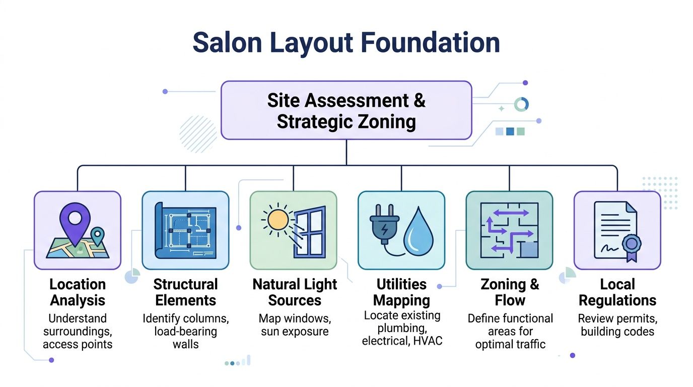
Read the shell before you draw the plan
A good site assessment isn’t just a punch list. It’s how you avoid forcing the wrong concept onto the wrong footprint.
I start with five checks:
Entry sequence
Stand at the door and ask what the client sees first. Reception should feel obvious. If the first view is clutter, exposed backbar, or a stylist’s utility zone, the space already feels less premium.Fixed elements
Columns, load-bearing walls, and low soffits decide more than owners want to admit. Work with them early. A column can become a divider between waiting and retail. It becomes expensive when you pretend it doesn’t exist.Natural light
Use good light where visual impact matters. Reception, retail, and consultation zones benefit from it. Some service zones need more control and less glare.Utility logic
Existing plumbing and electrical points can save money if your zoning respects them. If the shampoo area lands far from drainage for aesthetic reasons alone, the plan may look neat on paper and become a budget problem on site.Code and lease constraints
Before you lock anything, verify what the building and municipality require. This matters for occupancy, restroom access, ventilation, and approvals.
Zone by function, not by guesswork
A reliable benchmark for space planning allocates 20 to 25% for cutting stations, 20 to 25% for color processing areas, 20% for back-of-house, 15 to 20% for reception and retail, and 10 to 15% for shampoo stations, based on SalonBiz’s salon layout guidance. That same source notes that poor flow from incorrect zoning can increase client wait times by 20 to 30%.
Those ratios aren’t a law. They’re a starting framework.
Use them to pressure-test your concept:
- Reception and retail should support arrival, waiting, rebooking, and product conversation.
- Styling stations need to form the working heart of the salon.
- Color processing should sit where staff can monitor clients easily without blocking circulation.
- Shampoo usually performs better in a quieter zone.
- Back-of-house has to be real space, not leftover space.
If staff storage, laundry, and mixing are all squeezed into whatever square footage survives the design concept, the front of house will pay for it every day.
Follow the client path
A good salon layout behaves like a clear sequence.
A client should move through these moments without confusion:
- Arrival with an immediate visual cue for where to check in
- Wait in a space that feels intentional, not like overflow
- Consultation and service without cutting through active work zones
- Shampoo or processing in a way that doesn’t send them back across the room repeatedly
- Checkout and rebooking near the exit, but not jammed into the entrance
Bubble diagrams help. Before selecting furniture, I like rough adjacencies. Which zones need direct access? Which should stay separate? Which spaces can share visual connection without sharing traffic? That early planning is exactly why a tool like a bubble diagram workflow for interiors is useful. It keeps the conversation at the logic level before anyone falls in love with a fixture.
What works and what doesn’t
What works
- A reception area that sees both the door and the main floor
- Shampoo tucked into a calmer rear or side zone
- Color placed for supervision and efficient reset
- Staff support areas with direct operational access
- Retail where clients naturally pause
What doesn’t
- A front desk that blocks entry
- Shampoo chairs exposed to the busiest traffic lane
- Storage split into too many tiny pockets
- Processing chairs jammed into circulation paths
- A layout built only around what looks symmetrical
The salon doesn’t need to feel large. It needs to feel legible.
Mastering Space with Dimensions and Clearances
Most layout mistakes don’t happen because the owner chose the wrong style. They happen because the room was measured emotionally instead of operationally.
A station may look fine in a sketch. It feels very different when two stylists step back at once, a client stands to leave, and someone wheels a color tray through the aisle. Designing a salon layout comes down to clearances more often than concept boards.
The numbers that protect workflow
The core station standards are not optional. The industry standard is 4.5 to 5 feet of width per styling station, with at least 4 feet of open space behind each chair. The first styling chair should be at least 24 inches from the wall, and styling chairs should be spaced 54 inches apart from center to center, according to Twizzlo’s salon layout reference.
Those measurements exist for a reason. They reduce the constant sidestepping, body twisting, and tool dodging that wears people out.
When owners ignore them, the room pays in three ways:
- stylists lose smooth movement
- clients feel crowded
- the salon looks less expensive than it should
A salon can be compact and still feel premium. It cannot feel premium if every service requires an awkward shuffle.
Recommended Salon Dimensions and Clearances
| Area/Element | Recommended Dimension | Rationale |
|---|---|---|
| Styling station width | 4.5 to 5 feet | Gives each stylist enough working width without crowding adjacent stations |
| Open space behind styling chair | At least 4 feet | Allows the stylist to move, adjust position, and work safely |
| First styling chair from wall | At least 24 inches | Prevents the end station from feeling pinned and improves access |
| Styling chairs center to center | 54 inches | Reduces collisions and supports cleaner workflow |
| Main accessible aisle | Minimum 36 inches | Supports circulation and accessibility planning |
| Cutting zone allocation | 20 to 25% | Keeps the primary service area proportionate to the rest of the salon |
| Color processing allocation | 20 to 25% | Gives color services enough dedicated room |
| Reception and retail allocation | 15 to 20% | Supports arrival, waiting, checkout, and product display |
| Shampoo allocation | 10 to 15% | Reserves room for wash services without overtaking the plan |
| Back-of-house allocation | 20% | Protects operations, storage, staff use, and office functions |
Clearance is part of the client experience
Clients won’t quote dimensions back to you. They’ll just tell you the salon felt nice, calm, or cramped.
That feeling comes from spacing. A little breathing room around each chair changes the whole read of the salon. It gives mirrors space to work visually. It keeps capes from brushing passing traffic. It lowers the sense of chaos during a rush.
Furniture selection plays into this more than is often anticipated. Bulky forms can destroy a good layout. A chair with a heavier footprint, a wider base, or oversized arms can eat up your working zone fast. The same goes for waiting pieces and retail displays. If you want a helpful consumer-level primer on scale and arrangement, Critelli Furniture’s piece on how to choose the best furniture for your layout is worth a quick read.
Draw it, then pressure-test it
A plan with proper dimensions still needs one more test. Can people use it the way you think they will?
I check layouts in motion:
- One stylist working with a client seated
- Another stylist passing behind
- A client standing up and collecting a bag
- A trolley parked where it would naturally land
- A receptionist sightline toward the door
- A cleaner path at closing time
Field note: If a layout only works when every chair is perfectly centered and every tool is put away, it doesn’t work.
This is also where digital drafting matters. Even if you’re not producing construction documents yourself, it helps to understand how scale reads in plan. If you want to sharpen that part of the process, this guide to AutoCAD room layout is a practical reference.
Where owners usually overpack
The most common overpacking errors are predictable.
- Too many styling stations in the main room because capacity looks good on paper
- Tiny waiting areas that force clients into traffic paths
- Retail walls that project too far into circulation
- Processing chairs squeezed beside primary aisles
- Storage omitted until carts and supplies colonize the floor
The fix isn’t always fewer functions. It’s usually better discipline. Give each zone the room to succeed, and the whole salon feels larger than it is.
Integrating Technical Systems Plumbing Electrical and Ventilation
A salon can survive an average paint choice. It won’t survive bad infrastructure.
Plumbing, electrical, and ventilation determine whether the layout can support the services you plan to sell. If those systems get treated as contractor details after the furniture plan is approved, the project starts giving back money.
Start with service requirements
Every zone asks something different from the building.
Shampoo areas need hot and cold water, drainage that can handle daily use, and enough surrounding space for cleaning and maintenance. They also benefit from a quieter location, but that location has to make technical sense.
Styling stations need dependable power where tools are used. Think through outlets at mirror stations, charging points, lighting, and any wall-mounted equipment before millwork gets finalized.
Color and chemical areas need stronger ventilation planning than many owners expect. This is not the zone to improvise. Task lighting matters too, because color work suffers when the station fights shadow, glare, or poor visibility.
Reception and POS need power, data access if required by your setup, and clean cable management. A beautiful front desk looks sloppy fast when wires take over.
Coordinate with your contractor early
I like to review technical planning with a contractor and electrician before the design feels emotionally finished. That sounds less glamorous, but it saves redraws.
Use a working checklist:
- Confirm plumbing locations before finalizing shampoo placement
- Map outlet positions to actual furniture and equipment, not just walls
- Verify dedicated electrical needs for high-use tools and front-desk equipment
- Review HVAC supply and return locations so air movement supports comfort
- Check wall construction before specifying wall-mounted units or shelves
- Protect service access for maintenance and repairs
One of the biggest mistakes in salon projects is assuming any wall can carry anything. Another is assuming any beautiful location can become a shampoo zone if the design team wants it enough.
Ventilation affects comfort and brand perception
Clients may never mention HVAC directly, but they absolutely feel stale air, chemical heaviness, or hot spots under lights.
That matters for staff too. A salon is an all-day environment. If the color zone traps odors or the styling row gets too warm, fatigue rises and service quality slips. Good ventilation planning helps the salon feel cleaner, calmer, and more professional.
The technical systems are invisible on opening day when they’re done right. When they’re done wrong, they become the whole story.
Build for maintenance, not just launch day
Owners often focus on opening. Operators focus on year two.
Leave room for access panels. Don’t bury critical shutoffs behind fixed cabinetry. Keep wet zones easy to clean. Avoid routing daily operations through a technical compromise that only made the rendering look cleaner.
A practical salon doesn’t look less refined. It looks more refined because the mess has somewhere to go, the power is where it’s needed, and the systems support the staff instead of fighting them.
Ensuring Accessibility and Code Compliance
Accessibility gets framed as a restriction too often. In practice, it’s a design discipline that usually improves the salon for everyone.
The hard part is that small footprints make the trade-offs real. In salon design guidance, a 3-foot minimum aisle width for accessibility can consume 15 to 20% of a 1,400 square-foot salon’s floor area, directly affecting how many styling stations or retail fixtures fit, as noted by DIR Salon Furniture’s discussion of salon layout planning.
That’s why code and compliance can’t be tacked on at the end. If you do that, every accessible decision feels like a loss. If you build around it from the start, the layout becomes cleaner and more welcoming overall.
The real trade-off in smaller salons
A compact salon doesn’t have endless circulation to spare. Widening aisles means something else shrinks.
Usually the pressure lands on one of three areas:
- Station count drops if the owner has overpacked the floor
- Retail depth gets reduced near the entry
- Waiting zones become more curated and less sprawling
That can feel frustrating in early planning. But the alternative is worse. Tight aisles create daily friction, make mobility harder for clients and staff, and often make the salon feel more chaotic.
A compliant salon usually reads as more intentional. There’s less unnecessary furniture, fewer pinch points, and a clearer path through the business.
Inclusive design is a brand decision
Think beyond minimum compliance.
A salon that feels easy to enter, easy to get around, and easy to use sends a message before any service starts. It tells clients that the business planned for real people, not just idealized floor plan symbols.
That can show up in practical choices:
- Adjustable service furniture so different bodies can use the space comfortably
- Clear sightlines from the entrance to reception
- Simple paths that don’t require clients to weave around active stations
- Accessible service points integrated into the main experience, not pushed aside
Accessibility works best when it doesn’t feel like a special route. It should feel like the salon was designed properly in the first place.
Code review should happen before finishes
I’ve seen owners spend hours selecting tile, only to learn later that a circulation path or restroom approach needs to change. By that point, every correction feels expensive because it interrupts decisions people are already attached to.
Get the compliance conversation handled while the plan is still flexible. Bring your architect, contractor, and local code contacts in early. Ask uncomfortable questions early too. Can a client move cleanly from door to reception to service zone? Are clearances protected once furniture is installed, not just when the floor is empty? Will the room still work on a busy day?
Those are better questions than “Can we make it fit somehow?”
Visualizing Success and Future-Proofing Your Design
A floor plan can tell you where things go. It can’t fully tell you how the salon will feel.
That gap is where expensive mistakes hide. A waiting area may seem generous until the chairs arrive. A reception desk may look sleek in elevation and dominate the entry in real life. A styling row may technically fit and still feel too dense once mirrors, lighting, retail, and movement are part of the picture.
That’s why visualization matters before construction starts.
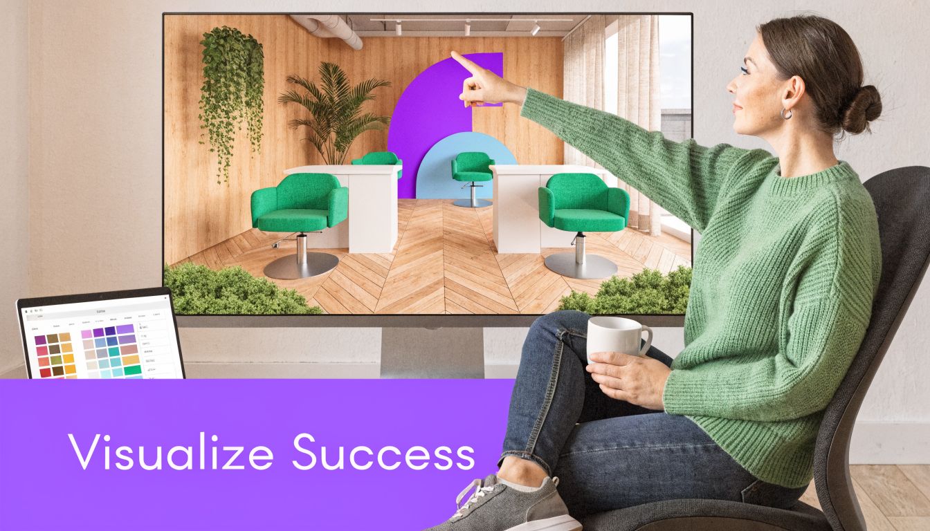
A major gap in salon planning guidance is adaptability. Static layouts often don’t account for future growth into added services like nails or facials. Pre-planning infrastructure and using modular furniture support that flexibility, and virtual staging is one of the best ways to test it, as discussed in M2 Retail’s salon layout article.
Test the room before you build the room
Most owners change their mind once they can see the space.
Not because the concept was wrong. Because scale becomes real. Materials start talking to each other. Traffic paths become obvious. Dead corners and overbuilt corners reveal themselves fast.
Realistic visualization proves invaluable for decisions challenging to assess from drawings alone:
- Reception desks that need presence without crowding the entry
- Waiting furniture in different shapes, depths, and finishes
- Retail displays that can feel curated or cluttered depending on placement
- Mirror and lighting combinations that shift the room’s perceived width
- Color palettes that either soften the space or make it feel busy
For example, you might compare a cleaner modern desk against a warmer wood-front option, or test two lounge styles for a waiting area. A low-profile chair from Pottery Barn gives one feel. A more sculptural form changes the read completely. The same goes for swapping finish directions. White oak, walnut, blackened metal, brushed brass. Each one pushes the salon into a different market position.
Why dimension-true visualization changes the decision
A pretty mockup isn’t enough. In salon projects, fit matters.
That’s why dimension-true visualization is so useful. If a tool can generate hyper-realistic images from the actual room photo and place real furniture at true scale, it becomes more than presentation. It becomes a decision filter.
That matters when you’re comparing products from different brands or trying multiple versions of the same item. A bench might work in boucle but feel too heavy in leather. A curved retail console might read elegant in one finish and oversized in another. You want to see those differences in the actual room, not in isolation.
aiStager distinguishes itself as the only solution that creates hyper-realistic photos with true dimension rooms and furniture objects. You can upload a photo of the salon and a link to a real product, then test different versions of that product in just a few clicks. That means comparing different chair styles, storage pieces, or reception desks from real brands, including different colors and finishes, without building a full manual model first.
Here’s a quick look at the idea in action:
Future-proofing is mostly about restraint
A salon doesn’t need to be designed for every future possibility. It needs to avoid blocking obvious next steps.
That usually means:
- Leaving infrastructure flexibility where service expansion is plausible
- Choosing modular furniture where functions may shift over time
- Avoiding overbuilt partitions unless privacy is essential
- Keeping certain zones visually adaptable for future categories or retail changes
I like to think in phases. Phase one is the opening business. Phase two is what happens if demand changes, staffing changes, or the service mix broadens. If the salon can absorb that shift without major demolition, the layout is doing its job.
A lot of owners assume flexibility means a less finished salon. It doesn’t. It means the design has enough discipline to evolve.
Your Salon Layout Checklist and Final Touches
By the time the layout works, the fun part gets easier. Finishes stop acting like camouflage for planning mistakes and start reinforcing a solid foundation.
That’s when the salon gets its personality.
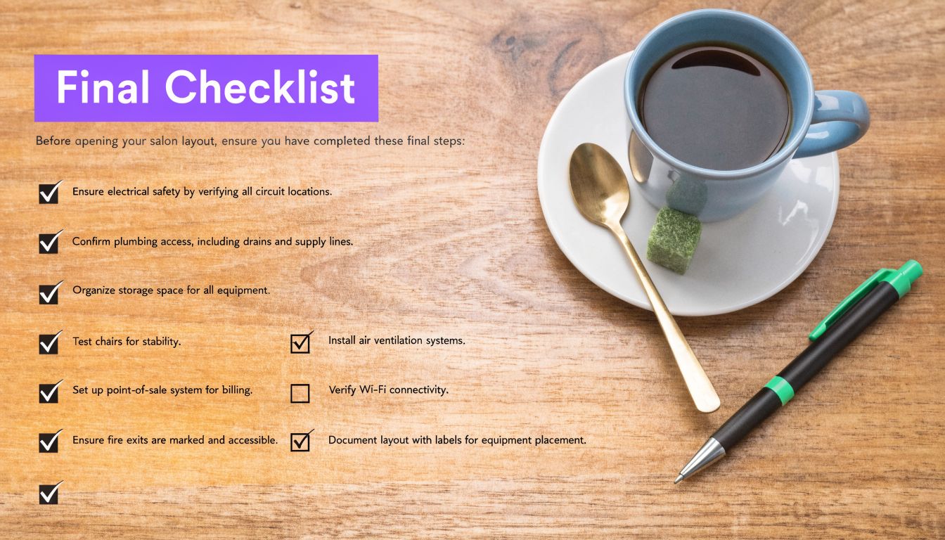
Final layout checklist
Use this as a last pass before ordering, permitting, or construction:
Entry experience
Check that reception is visible from the door and doesn’t block circulation.Zone balance
Make sure your layout reflects the actual business model, not just a generic salon template.Station clearances
Verify that styling stations, rear working space, and aisle movement still work once real furniture sizes are in the plan.Shampoo logic
Keep shampoo in a quieter area with practical plumbing access and easy staff movement.Back-of-house function
Confirm that storage, laundry, staff use, and office tasks have dedicated space.Electrical planning
Match outlet locations to mirrors, tools, front desk needs, and service equipment.Ventilation and comfort
Review air movement, especially around chemical services and heavily used styling zones.Accessibility
Check that circulation, service access, and key client touchpoints support inclusive use.Retail placement Put products where clients naturally pause, not where fixtures merely fit.
Future flexibility
Leave some room for the business to evolve without ripping everything apart.
Finishes that support the work
Good salon finishes work hard.
Choose flooring that cleans easily and wears well. Select countertop materials that tolerate spills, heat, and daily wipe-downs. Use lighting that flatters people but still supports technical work. A warm, layered front lounge can coexist with brighter task-driven service lighting if you plan both intentionally.
Aesthetic direction should match the client you want. Natural oak, soft plaster tones, and greenery create a relaxed West Coast feel. Darker metal, concrete-look surfaces, and graphic mirrors push more urban and editorial. Neither is better. The wrong one for your audience is worse than either.
The best final touch is consistency. When the floor plan, furniture, lighting, and finishes all tell the same story, the salon feels more expensive.
A strong salon layout gives the business its skeleton. The final materials give it voice.
If you want to test layout ideas before committing to build-out, aiStager is a practical place to start. Upload a photo of the space and a link to any real product, then compare dimension-true, hyper-realistic options in seconds. It’s one of the fastest ways to check fit, style, color, and finish before the costly part begins.