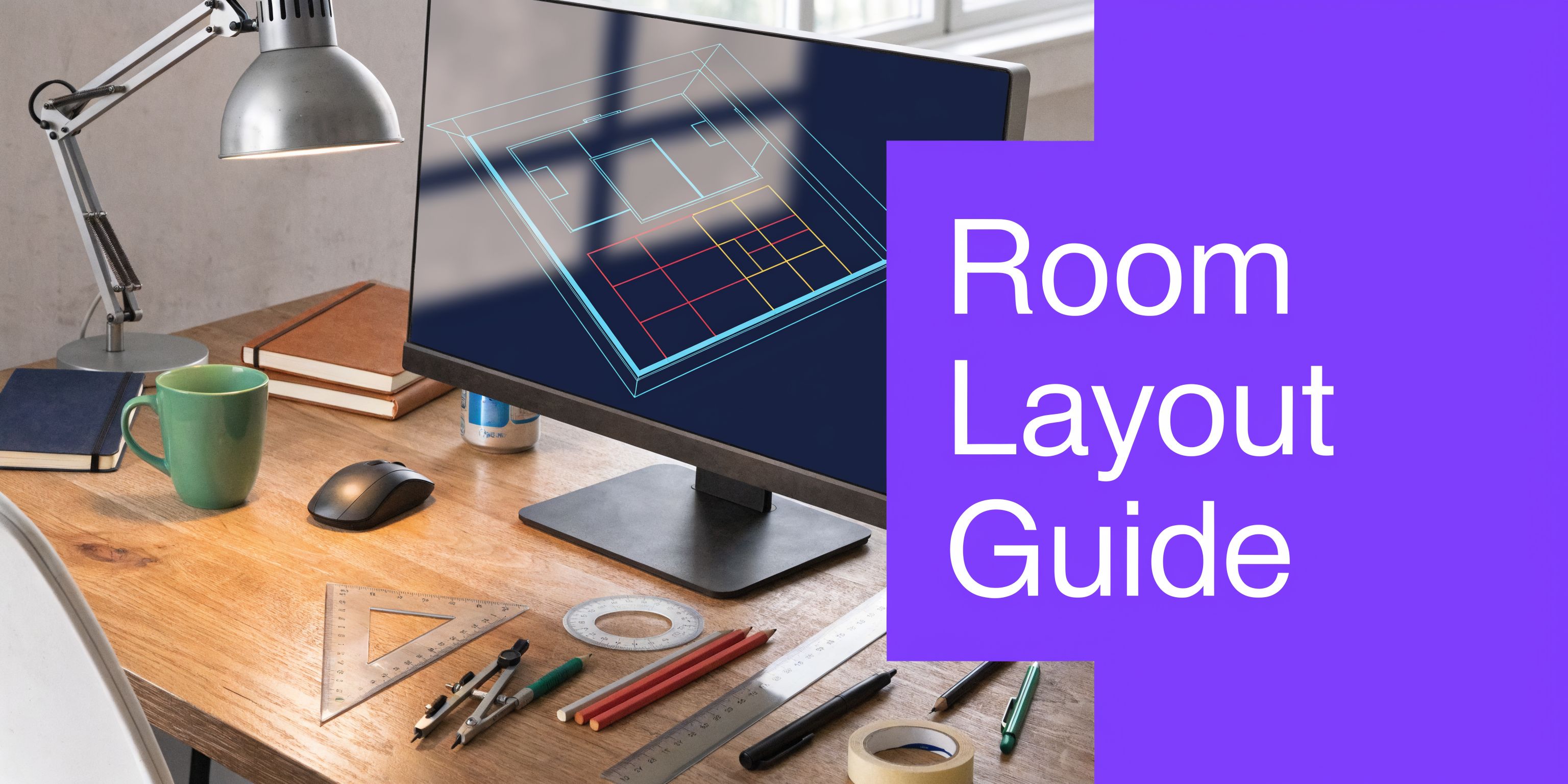
AutoCAD Room Layout A Step-by-Step Guide for 2026
Create a dimension-accurate AutoCAD room layout from start to finish. Our guide covers setup, drawing, and exporting for photoreal AI visualization.
You’ve probably seen this happen. The plan looks clean on screen, the furniture arrangement feels balanced, and the client approves it. Then the room gets measured again, the sectional clips a doorway swing, the dining chairs choke the circulation path, or the “perfect” bedroom layout leaves no usable clearance at the dresser.
That gap between a nice drawing and a room that works is where most autocad room layout problems show up.
A lot of tutorials still stop at lines, offsets, and blocks. They show how to draft a room, but not how to carry accurate dimensions through to real furniture choices and realistic presentation. That’s a real pain point. In 2025 Autodesk user surveys, 68% of interior designers reported scaling inaccuracies as a top pain point, slowing projects by 30-40% (YouTube reference).
The fix isn’t to abandon CAD. It’s to use CAD for what it does best, then hand off to visualization tools in a smarter way. AutoCAD gives you precision. A photo-based visualization workflow gives you speed, finish options, and client-friendly realism. When those two parts work together, the plan stops being a technical document only. It becomes a decision-making tool.
From Blueprint to Reality Why Precision Matters
Interior layouts fail in predictable ways. The room may be measured correctly, but the furniture assumptions are soft. A sofa block stands in for a real product. A dining table fits on paper, but no one tested chair pullback. A bed clears the side walls, but the nightstand depth steals the walkway.
That’s why a good autocad room layout starts with one rule. Draw the room as it will be used, not as it looks in an abstract plan.
The expensive gap between 2D and real life
Clients don’t buy linework. They buy confidence.
A contractor wants dimensions that hold up in the field. A designer wants to test spacing fast. A real estate team wants visuals that help a buyer understand scale. If the room layout is only technically correct, but not tied to real products and circulation, the drawing is incomplete.
Practical rule: If you haven’t checked wall thickness, opening size, furniture depth, and walking space together, you don’t have a finished layout yet.
Many beginner workflows break down at this stage. They draft walls first, then decorate the plan later with generic symbols. That looks fine in a tutorial. It’s weak in practice.
What a modern workflow looks like
The strongest workflow is hybrid.
Use AutoCAD to establish the hard geometry. That includes walls, openings, dimensions, layers, and circulation checks. Then use that accurate framework to test real products, finishes, and room feel in a faster visual environment.
That matters when you’re comparing actual pieces instead of placeholders. A living room might need a low-profile modern sofa, or it might need something softer and deeper. On paper, both can fit. In a room photo, the difference becomes obvious.
For US interiors, that often means testing styles that clients already recognize. A California casual scheme might call for a linen sectional and light oak pieces. A refined urban apartment might lean into darker finishes and cleaner silhouettes. The CAD file gives you the scale truth. The visual stage helps you judge whether the room feels cramped, balanced, or under-furnished.
What works and what doesn’t
Here’s the trade-off in plain terms:
| Workflow | What it does well | Where it breaks |
|---|---|---|
| Manual drafting only | Accurate geometry and documentation | Slow furniture testing and weak client visualization |
| Photo mockup without measured setup | Fast visuals | Easy to misjudge scale |
| CAD plus dimension-aware visualization | Accurate layout plus quick client-facing review | Requires cleaner setup upfront |
A room plan should answer two questions at once. Does it fit, and does it feel right. The rest of this guide is built around that standard.
Setting Up Your AutoCAD Project for Success
A room layout usually goes off track before the walls are even drawn. The file opens in the wrong units, a consultant plan comes in at the wrong scale, blocks land on Layer 0, and by the time the client wants a revised furniture test, nobody trusts the dimensions.
That is why setup work pays for itself.
AutoCAD has been standard drafting software for decades, and its staying power comes from one thing: controlled geometry. For interior designers, that control matters twice. It keeps the plan buildable, and it gives AI visualization tools a cleaner base to read when you want staged outputs that still respect real dimensions.
Start with units, scale, and snap behavior
Set units first, then verify them against one known dimension from the source material. I do not trust imported files until a wall, door, or grid line has been checked manually. One bad insertion scale can throw off every clearance, furniture fit study, and export that follows.
For most US interior projects, architectural units are the safest choice if contractors, millworkers, or permit reviewers will touch the file. Decimal units can work for interiors too, especially with product-based planning, but only if every block, xref, and consultant drawing follows the same logic.
Turn on the snaps you will use. Endpoint, midpoint, intersection, perpendicular, and extension cover most room-layout work without cluttering the cursor with too many options. Good snap discipline keeps corners closed, openings clean, and dimensions believable when the file leaves your desk.
If you want a broader view of how drafting standards connect to presentation output, this guide to interior design AutoCAD software gives useful context.
Build layers for revision, not just for plotting
Layer structure decides whether a file stays editable under pressure.
A simple interior layer stack is enough for most room plans:
- Walls for fixed construction
- Doors-Windows for openings and swings
- Furniture for movable planning objects
- Dimensions for plotted measurement data
- Electrical for outlets, switches, and fixture symbols
- Notes for callouts and text
- Hatch-Finishes for floor patterns and material reads
The trade-off is straightforward. More layers give better control, but too many layers slow down smaller jobs and confuse junior staff. I usually keep the base set tight, then add project-specific layers only when they solve a real coordination problem.
Separate layers also help when the CAD plan moves into rendering or AI staging. If furniture, walls, and annotations are isolated properly, it is much easier to export a clean underlay or stripped plan for dimension-aware image generation in tools such as aiStager. That preparation reduces the usual mismatch between a beautiful visual and a room that cannot fit the pieces shown.
Use blocks like a library, not a junk drawer
Blocks should save time. Random downloaded content does the opposite.
Keep a vetted set of 2D blocks for doors, plumbing fixtures, casework, and standard furniture footprints. Check insertion units, simplify overbuilt symbols, and name them consistently. A chair block with clean extents is more useful in planning than a decorative block packed with linework nobody needs.
This becomes even more important if the same plan will feed both documentation and fast visualization. AI tools respond better when the source geometry is legible, consistent, and free of duplicate or exploded junk.
Reference outside files cleanly
Use XREFs for architectural backgrounds, consultant plans, and repeated unit types. Do not explode everything into one file unless you enjoy sorting through layer chaos later.
That approach keeps updates manageable. It also makes handoff cleaner for architects, visualization teams, and designers who need to test alternate room concepts without breaking the base drawing. For renovation work, especially lower-level conversions and additions, this article on planning a room layout is a practical companion because the early setup decisions affect every revision after that.
Drawing Dimension-Accurate Walls and Openings
Walls should go down fast. If you’re drawing each segment as isolated lines and cleaning the mess later, you’re wasting time.
The fastest way to build a reliable autocad room layout is to draft the structural envelope with a command sequence that stays editable. Draw the main control lines first. Then offset for thickness, clean intersections, and convert where needed into continuous geometry.
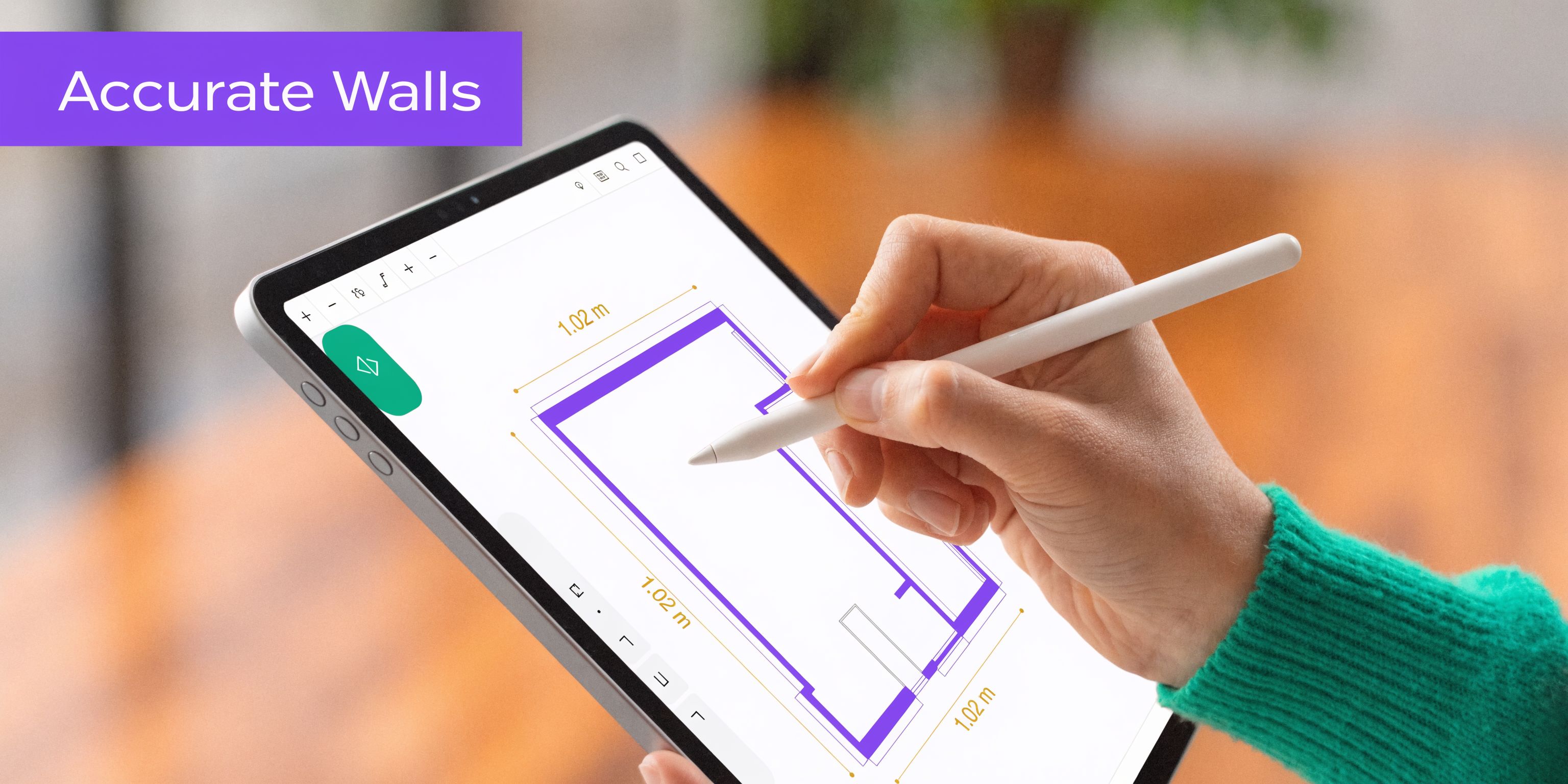
Use a wall-building sequence that stays clean
A dependable wall workflow usually looks like this:
- Lay out primary axes using LINE or POLYLINE from fixed dimensions.
- Offset wall thicknesses from those control lines instead of redrawing parallel walls by eye.
- Trim intersections immediately so corners read cleanly.
- Extend where needed to avoid tiny gaps that later break hatches and joins.
- Join geometry once the room shell is stable.
That sequence keeps the plan editable. It also makes later changes much easier when a client wants to widen a bedroom, shift a closet wall, or reduce an opening.
For people working through basement renovations or room additions, this guide on planning a room layout is useful because it frames layout decisions around use, circulation, and constraints before you get too far into drafting.
Openings should be placed from intent, not habit
Doors and windows aren’t symbols you scatter after the walls are done. They define how the room behaves.
A door needs more than width. It needs swing logic, furniture clearance, and a sensible approach path. A window needs more than rough location. It affects bed placement, millwork, daylight, and sightlines.
When I place openings, I check three things first:
- Approach space so a person can use the door comfortably
- Conflict zones where swings collide with furniture or cabinetry
- Visual balance because a room can be technically workable and still feel off-center
If you need a focused walkthrough on opening conventions, this article on how to draw windows on a floor plan helps tighten up that part of the drawing.
Parametric edits save time when layouts move
This is one of the few AutoCAD features that changes workflow, not just convenience.
Parametric constraints can automatically adjust walls and openings when dimensions change, and that can improve accuracy and speed by over 100% in complex interior designs compared with static line drawings (YouTube reference). That matters when the client asks for “just a few small tweaks,” which usually means the whole room shifts.
Use parametric behavior where repetition or revision risk is high. It’s especially useful for:
- Bedroom suites where wall moves affect closets and bath openings
- Kitchen-adjacent rooms where appliance or cabinet changes alter circulation
- Open living spaces where one width change ripples into several furniture zones
Here’s a quick visual walkthrough before the next part of the process.
What usually goes wrong
Most bad wall plans share the same problems.
| Issue | What it causes |
|---|---|
| Independent line segments | Broken corners, messy edits, hatch failures |
| Openings inserted late | Conflicts with furniture and circulation |
| No snap discipline | Tiny inaccuracies that grow during revision |
| No editable relationships | Slow redraws every time dimensions change |
Draw walls as a system. Don’t draw them as artwork.
That mindset keeps the structure solid when the design starts moving.
Adding Dimensions Annotations and Essential Details
A room layout usually falls apart during review for a simple reason. The geometry may be correct, but the drawing still leaves too much open to interpretation. The contractor needs buildable information. The client needs clarity. The visualization team needs a clean plan they can trust. If any of those readers have to guess, the revision cycle gets longer.
Dimensions should answer decisions.
Overall dimensions define the room envelope. Interior strings locate wall breaks, openings, and built-ins. Clearance dimensions belong only where they settle a fit issue, such as a tight bed wall, a vanity approach, or a dining path. Covering every object with numbers makes the plan harder to read, not more professional.
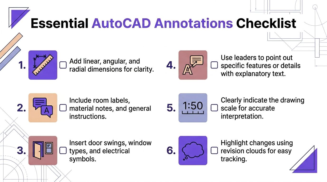
A solid annotation stack for interiors usually includes:
- Overall room dimensions at the outermost level
- Openings and offsets for door and window placement
- Key furniture callouts where exact fit matters
- Room names and use labels so the intent is obvious
- Material notes for flooring, trim, or built-in areas
Keep annotation separate from geometry. This discipline provides critical control during revisions.
I keep dimensions, notes, tags, and symbols on their own layers because every output has a different purpose. A permit or construction sheet may need the full note set. A client PDF usually reads better with fewer callouts. A visualization handoff should be lighter still, with the room shell, openings, and a few labeled reference points doing most of the work. That separation also makes it easier to prepare a plan for CAD rendering workflows that support accurate visualization, especially when the next step is sending the layout into AI staging tools that depend on clean, dimension-true inputs.
A readable plan makes the right information easy to find.
Hatches and symbols need the same restraint. Use hatches to mark material changes, wet areas, built-ins, or floor transitions that matter to the design. If the pattern starts fighting the dimensions, reduce the scale, fade it back, or remove it. Decorative drafting choices often look fine on screen and print badly on paper or in a review PDF.
A few small details improve handoff quality fast:
- Door swings should be clear and consistent
- Window tags or notes should match your opening logic
- Leader notes work best for exceptions, not every object
- Revision clouds help clients spot changes between rounds
The annotation hierarchy is simple.
| Priority | Include it when | Typical examples |
|---|---|---|
| Must show | It affects construction or fit | Wall sizes, opening sizes, room dimensions |
| Helpful to show | It improves review clarity | Furniture tags, floor finish notes |
| Show only if needed | It answers a known question | Specialty notes, revision callouts, visual guidance |
For AI visualization, this cleanup step matters more than many designers expect. If the plan includes conflicting dimensions, overloaded notes, or hatches that obscure the room edge, the staged result can drift away from the physical space. A clean AutoCAD room layout gives renderers and AI tools the same clear instruction set you would give a contractor. That is how you get images that still respect the plan.
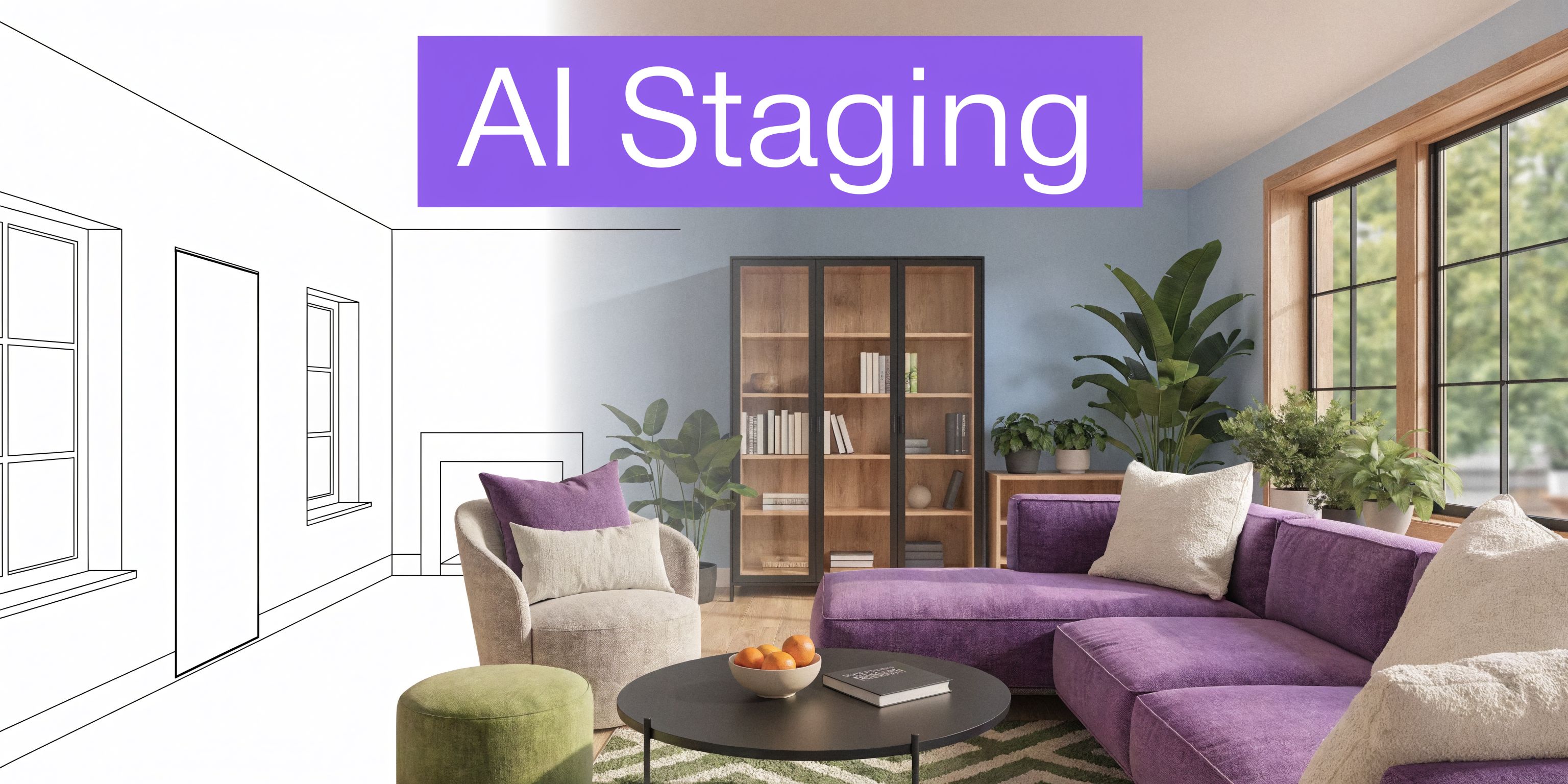
From CAD to Photoreal Staging with AI
Traditional room layout workflows slow down at this point.
The CAD file may be accurate, but the client still has to imagine the room. That’s hard enough for designers. It’s much harder for homeowners, leasing teams, or buyers looking at an empty space.
Manual furniture planning in AutoCAD has a place. You import scaled blocks, use offsets to test circulation, and verify clearances. That’s still solid drafting. But it’s also labor-intensive. For AutoCAD furniture placement, 70% of interior designers report the process takes 2-3x longer than visual tools (YouTube reference).
Where CAD still wins
AutoCAD is still the right place to settle the hard facts:
- Room dimensions
- Opening locations
- Furniture clearances
- Circulation paths
- True placement logic
I wouldn’t skip that stage. If the room shell and furniture footprints aren’t correct, every rendering or staged view built on top of them gets less trustworthy.
Where manual CAD visualization starts to drag
Once you move from fit to feel, the process changes.
A client rarely wants to review a generic sofa block. They want to know whether the room works better with a slipcovered sectional, a tighter bench-seat sofa, or a pair of apartment-scale pieces. They also want to compare colors and finishes in context.
That’s where CAD alone becomes inefficient. You can model and render all of it. You just won’t do it quickly.
For example, say a living room has enough room for a deep sofa and a pair of lounge chairs. The question isn’t only whether they fit. The question is whether a deeper piece makes the room feel inviting or overcrowded. Comparing a Restoration Hardware style sofa against a Crate & Barrel style sectional in multiple finishes through pure CAD rendering is possible, but slow.
The useful hybrid workflow
The cleaner approach is to use measured planning first, then move into a visual tool for fast option testing.
One factual option in that category is rendering in CAD, which outlines how teams bridge technical drawings and presentation outputs. In practice, some teams now pair room photos with product links so they can test actual furniture within the existing space without rebuilding the whole room in a full 3D environment.
One platform that fits that workflow is aiStager. It uses a room photo and a product URL to place actual items into the space with dimension-aware visualization. That’s useful when you want to compare different versions of the same product family, such as changing a sofa from a warm oatmeal fabric to a darker performance weave, or testing whether a walnut finish reads too heavy in a bright coastal room.
What this changes in practice
The difference is speed of decision-making, not just speed of image production.
A good visual review can answer questions like:
- Does this bed feel too wide once nightstands are included?
- Does the boucle chair look too bulky next to the media wall?
- Would a lighter finish make the room feel larger?
- Does this sectional overwhelm the entry sightline?
That’s hard to judge from blocks alone.
Clients react faster to a room image that respects real dimensions than to a beautiful rendering built on assumptions.
This matters for product testing too. If you’re comparing two sofa brands, or the same sofa in two upholstery colors, you can evaluate the visual weight of each option in the actual room instead of in a generic staged set. For US-facing residential work, that’s often the difference between a quick approval and another round of uncertainty.
What I’d keep in CAD and what I’d move out
| Keep in AutoCAD | Move to visual staging workflow |
|---|---|
| Walls and openings | Finish and color comparison |
| Measured furniture footprints | Real-product look testing |
| Circulation checks | Client-facing photoreal previews |
| Sheet-ready documentation | Fast side-by-side concept options |
The strongest autocad room layout process doesn’t ask one tool to do everything. It lets CAD handle precision and lets visual staging handle persuasion.
Finalizing and Exporting Your Professional Room Layout
A professional layout isn’t finished when model space looks good. It’s finished when another person can open the file or PDF and understand exactly what to do with it.
Build the sheet, not just the drawing
Move into layout space and set the drawing on a sheet that matches the audience.
For client review, that might be a cleaner presentation sheet with fewer technical notes. For contractor use, the same room may need fuller dimensions and clearer references. Use viewports to lock the right scale and keep the composition stable.
A few habits make a big difference here:
- Lock viewport scales once they’re set
- Use a consistent title block with room name, project, and revision date
- Check line weight translation before exporting
- Plot to PDF and review it at full size, not only on screen
Plot styles are part of communication
A wall should read heavier than a rug outline. A dimension line should never compete with structure. That only happens if your CTB or plot style setup is doing real work.
Use plotting to reinforce hierarchy:
| Element | Plot intent |
|---|---|
| Walls | Heaviest line weight |
| Doors and windows | Medium weight |
| Furniture | Lighter than structure |
| Dimensions and notes | Clear but restrained |
| Hatches | Light enough to stay in the background |
If the PDF looks muddy, your hierarchy is off. If everything is thin, the plan loses authority. If everything is heavy, it becomes tiring to read.
Export for the next user
I usually prepare two outputs.
One is the polished PDF for review, approval, and markups. The other is a cleaned DWG for coordination, visualization, or consultant handoff. That DWG should be stripped of junk layers, duplicate blocks, and anything decorative that doesn’t help the next person.
Before sending, check:
- Units are correct
- Unused layers are purged
- External references are intentional
- Dimensions still associate correctly
- File names are clear and revision-safe
If someone else has to guess what version they’re looking at, the export wasn’t finished.
A strong autocad room layout ends with clean communication. That’s what turns accurate drafting into usable work.
If you want to move from precise plans to client-ready visuals faster, aiStager can help you test real products in actual rooms from a photo and product URL, while keeping room and furniture dimensions aligned for more reliable layout decisions.