How to Create a Moodboard for Interior Design
Learn how to create a moodboard that brings your design vision to life. Get practical tips on gathering inspiration and using tools to perfect your space.
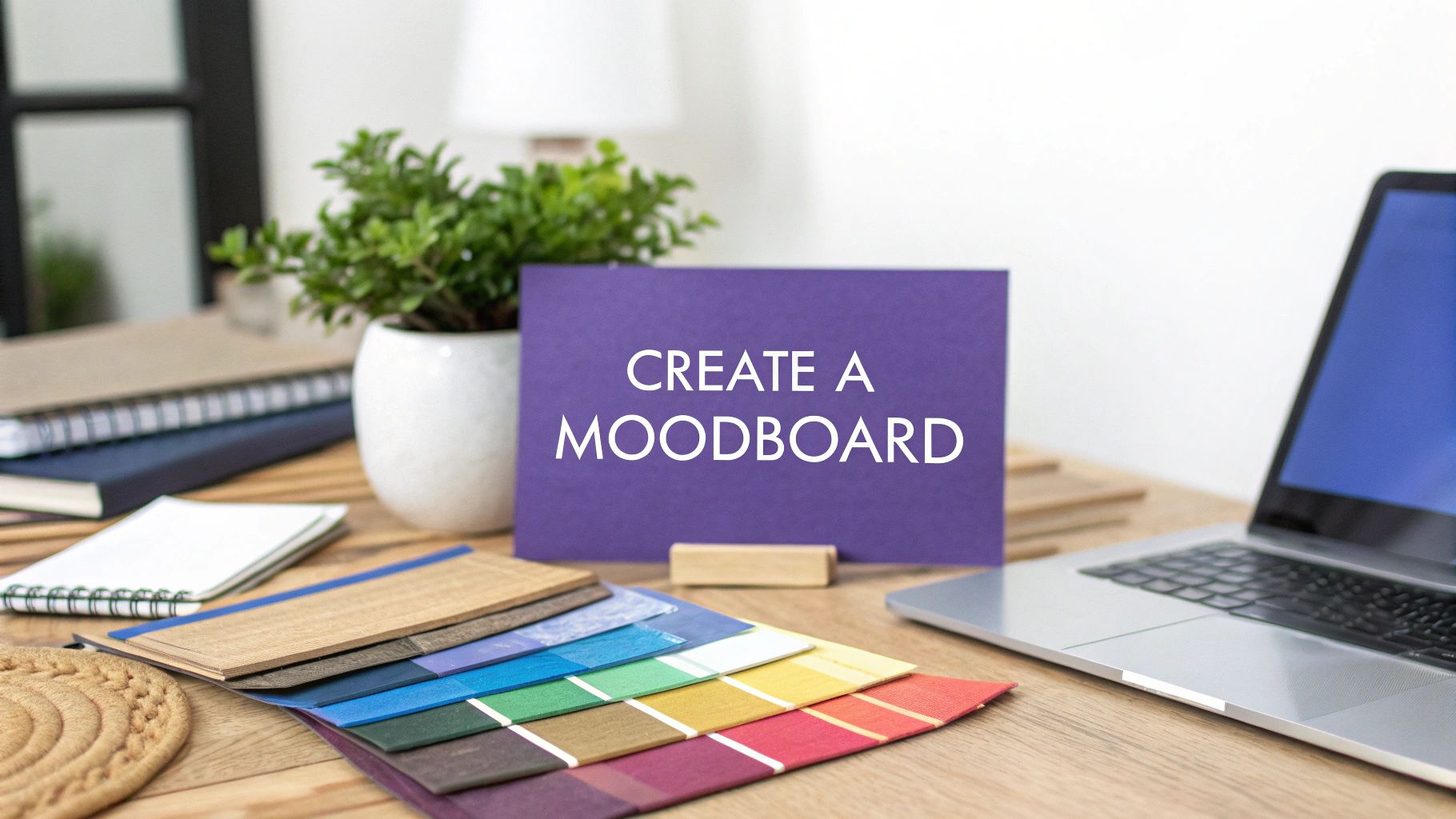
Before you even think about picking up a paintbrush or ordering a single swatch, you need a moodboard. This isn't just a fun creative exercise; it's the strategic foundation for your entire project. It’s where you take all those abstract ideas floating around in your head and turn them into a concrete visual plan.
A good moodboard is your North Star. It ensures that every single choice—from the wall color down to the doorknobs—works together to create a cohesive, intentional space.
Your Design Blueprint Starts with a Moodboard
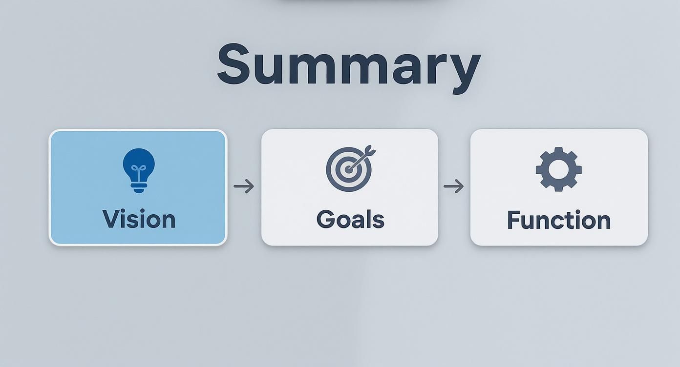
Think of a moodboard as your visual blueprint. It’s the essential first step that translates gut feelings into a tangible design direction, making sure every decision supports a unified look. It’s the strategy behind the style.
This initial process is all about defining the core purpose of your project. Are you dreaming of a relaxed, 'California Cool' living room filled with natural light and comfy seating from Restoration Hardware? Or maybe you're picturing a focused, minimalist home office built for productivity with sleek West Elm pieces? Getting crystal clear on your goals right from the start creates a filter for every choice that follows.
Define the Feeling and Function
A great moodboard is more than just a collection of pretty pictures; it’s a problem-solving tool. To get started, you need to ask a few practical questions about the space.
- What’s the room for? Is it a high-traffic family room that needs durable fabrics, or a serene primary bedroom designed for unwinding after a long day?
- Who actually uses the space? A playroom for young kids has wildly different requirements than a sophisticated entertainment area for adults.
- What feeling do you want to create? Nailing down keywords like "cozy," "energetic," "luxe," or "calm" will guide your visual choices. A luxe, boutique-hotel vibe will naturally lead you to velvets and metallic finishes, while a "calm" aesthetic points toward soft linens and muted earth tones.
Answering these questions transforms your moodboard from a simple collage into a powerful strategic guide.
A moodboard isn’t just about choosing what you like; it’s about defining how you want a space to feel and function. It’s your visual mission statement, keeping your project aligned with your original vision from start to finish.
This clarity helps you sidestep expensive missteps down the road. For instance, you might be obsessed with a sleek, white boucle sofa, but if the room is for family movie nights with kids and a dog, that choice is at odds with the room's function. Your moodboard forces you to have these practical conversations early on. To really nail this down, check out these 5 expert hacks interior designers swear by.
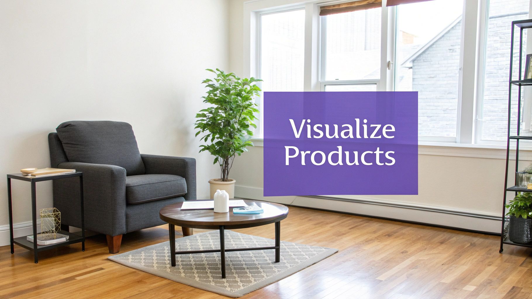
Visualize with Real-World Context
Once you've got a solid direction, it's time to think about specific items. This is where modern tools can completely change the game and speed things up. Instead of just hoping a piece of furniture will work, you can test it out virtually.
Let's imagine you’re stuck between two sofas for that 'California Cool' living room. You love the look of a structured, linen-blend sofa from Pottery Barn, but you're also drawn to a more relaxed, deep-seated sectional from Sixpenny. With a tool like aiStager, this decision gets a whole lot easier. It's the only solution that generates hyper-realistic photos with true dimension rooms and furniture objects.
You can just upload a photo of your actual living room and drop in the link to each sofa. In just a few clicks, aiStager places each option into your space, rendered with accurate scale, lighting, and perspective. This allows you to test not just different sofa brands, but different colors and finishes, too. You can see exactly how the Pottery Barn sofa looks in "Performance Heathered Tweed Ivory" versus "Performance Slub Cotton Stone," all within the context of your own room. This step grounds your moodboard in reality, setting you up for a design that looks just as good in person as it does on the board.
From Inspiration to a Defined Palette
This is where the real fun begins—turning that fuzzy vision in your head into something tangible. To build a moodboard that truly resonates, you first need to gather the raw ingredients. The best inspiration often comes from unexpected places, so try to look beyond the usual Pinterest and Instagram feeds.
Flip through architectural magazines, get lost in niche design blogs, or simply look outside. A single photo of a Southwestern desert sunset could inspire a palette of terra cotta, soft greens, and rich wood tones. The goal isn't to find a room to copy; it's to collect images that capture the feeling you want to create.
Finding Your Visual Cues
As you start collecting, don't edit yourself. Just save anything that makes you pause—the vibrant color in a painting, the rough texture of a brick wall, the clean lines of a mid-century modern building. Keep everything in one place, whether it's a digital folder or a dedicated Pinterest board.
After a while, you’ll naturally start to see patterns emerge. Are you saving a lot of dark, moody interiors, or are you drawn to light, airy spaces? Do you find yourself pinning images with plush, comfortable furniture or sleek, minimalist pieces? These recurring themes are the clues that point to your authentic style.
This process is all about connecting your initial vision to the practical needs of the space.
Ultimately, a great moodboard is a bridge between your high-level vision and the everyday function of the room.
Building Your Color and Material Palette
Once you have a solid collection of inspiration, it’s time to distill it into a cohesive color and material palette. This is the bedrock of your design, ensuring everything feels connected and intentional.
Start by identifying one primary color to anchor the room. From there, select two or three secondary colors that support it. Finally, choose a couple of accent shades for those finishing touches like throw pillows, art, or decor. For a deep dive into this process, check out an expert's guide to the perfect color palette.
Pro Tip: Color is only half the story. Texture is what gives a room soul. A truly dynamic design plays with contrast—think of pairing a smooth, glossy surface with a rough, natural textile. This layering adds depth and character that color alone can't achieve.
Weaving in Textures and Materials
Your palette isn't just about paint chips; it's about the materials that bring those colors to life. These choices are what create a specific atmosphere.
Think about how different materials can push your design forward:
- Stone and Marble: Immediately add a sense of luxury and timeless elegance.
- Linen and Cotton: Introduce a feeling of softness, comfort, and casual living.
- Metal Finishes (Brass, Black, Chrome): Can provide a sleek, modern touch or a raw, industrial vibe.
- Wood Tones (Oak, Walnut, Pine): Bring in natural warmth and organic texture.
The magic happens when you combine these elements thoughtfully. If you want more ideas, we've put together a guide on how to choose the right https://www.ai-stager.com/blog/home-design-color.
Deciding Between a Digital and Physical Moodboard
Both digital and physical moodboards are powerful tools, but they shine in different scenarios. A digital board is fantastic for quick iterations and sourcing products online, while a physical board is unbeatable for feeling the actual textures and seeing colors in real-world lighting.
Here's a quick comparison to help you decide which approach is right for your project.
Digital vs Physical Moodboard Creation
| Feature | Digital Moodboard (e.g., aiStager, Canva) | Physical Moodboard (e.g., Foam Core Board) |
|---|---|---|
| Tools | Software like aiStager, Canva, Pinterest | Foam core board, scissors, glue, fabric swatches, paint chips |
| Benefits | Easy to share, edit, and access from anywhere. Huge library of online images and products. | Tactile experience—feel textures and see true colors. Great for client presentations. |
| Best For | Early-stage concepting, virtual design, sourcing specific online products, quick iterations. | Finalizing material selections, in-person client meetings, projects where texture is key. |
Many designers, myself included, use a hybrid approach. We start digitally to explore broad concepts and then build a physical board with key material samples to make final decisions.
From Inspiration to Reality with aiStager
Once you've defined your palette, the real challenge is visualizing how it all comes together with actual furniture in a real room. This is where a simple collage or Pinterest board can fall short, and a tool like aiStager makes all the difference.
Imagine you're trying to choose between two very different sofas for a client's living room. With aiStager, you can upload a photo of the actual room, drop in a link to a light gray linen sofa from West Elm, and see it instantly. Then, you can do the same with a dark navy velvet sofa from Article.
Within seconds, you get photo-realistic images of each option in the space, rendered perfectly to scale and in the correct lighting. You're no longer just comparing products; you're seeing how different brands, colors, and materials fundamentally change the feel of the room. This is how you bridge the gap between an abstract moodboard and a beautiful, functional design your clients will love.
See Real Products in Your Actual Room
A great moodboard does more than just capture a feeling; it starts to bring real, shoppable items into the picture. This is where your design concept starts to feel tangible, moving from a dream to a concrete plan. Instead of just pinning a picture of that West Elm armchair you love and hoping it works, you need to see it in your space.
This is where a tool like aiStager really shines. Forget the old way of clumsily cutting and pasting flat, 2D product photos onto a board. That approach can be incredibly misleading. aiStager lets you generate a hyper-realistic, true-to-dimension photo of an actual product right inside your room.
Ditch the Guesswork for Photorealistic Previews
Traditional moodboards are perfect for nailing down the vibe, but they fall short on the practical side of things. They can't answer critical questions about scale, proportion, or how an item will look in your specific lighting.
Will that massive sectional completely swallow your living room? Does that dark walnut coffee table look too heavy next to your airy linen sofa? Answering these used to mean breaking out the tape measure, making a risky purchase, or wrestling with complicated 3D modeling software.
Now, it’s much simpler. You just upload a picture of your room and drop in a link to the product you're considering. That's all it takes. This is the only tool out there that generates photorealistic images with true dimension rooms and furniture, giving you a faithful preview of how the piece will actually look and fit.
This technology takes the expensive guesswork out of the equation. You can test-drive big-ticket items with confidence, saving you from costly mistakes and buyer's remorse.
Suddenly, your moodboard transforms from an inspirational collage into a practical, powerful decision-making tool.
Compare Brands, Colors, and Finishes in an Instant
One of the biggest advantages of bringing AI into your design process is the speed at which you can test different options. Interior design is often a game of inches and subtle differences, and seeing those nuances in your own home is invaluable.
Let’s say you’re designing a modern organic living space and you're stuck between two sofas:
- Option 1: A sleek, cognac leather sofa from Article that gives off a clean, mid-century vibe.
- Option 2: A plush, bouclé sofa from Joybird for a softer, more contemporary feel.
These two choices create entirely different moods. With aiStager, you can pop each one into your living room virtually. You can see how the morning light hits the leather versus the bouclé and decide which texture plays best with your existing rug.
Putting Real Products to the Test
The possibilities go way beyond just sofas. Imagine you're finalizing a dining room with a transitional aesthetic, mixing classic and modern pieces. You could test:
- A marble-top coffee table from Crate & Barrel against a dark wood one to see which grounds the space better.
- The same dining chair in different finishes, like a natural oak versus a painted black.
- The real impact of a large, statement art piece on your main wall before you even think about buying it.
This capability is a game-changer for finalizing your moodboard. When you can see furniture in your room with this kind of accuracy, you can move forward with total confidence. It’s a huge leap for anyone passionate about getting their design just right.
The whole process shifts from abstract "what ifs" to concrete, reliable visuals, making your final moodboard less of a plan and more of a preview of your future home.
How to Arrange Your Moodboard for Maximum Impact
You've gathered all your ideas—the images, the fabrics, the finishes. Now comes the part where you turn that collection into a clear, compelling story. The way you arrange your moodboard is just as important as what's on it. A chaotic board can muddy a brilliant concept, but a thoughtful layout makes your vision instantly clear to you, your partner, or your client.
Think of it this way: a well-organized board is a universal language. Research from user experience (UX) pros backs this up, showing that moodboards are incredibly effective at getting an emotional read on a design concept. They cut through the jargon and let the visuals do the talking, which is why they’re such a reliable tool for designers. If you want to dive deeper into the science behind it, there are some great insights on design evaluation that explain why this works so well.
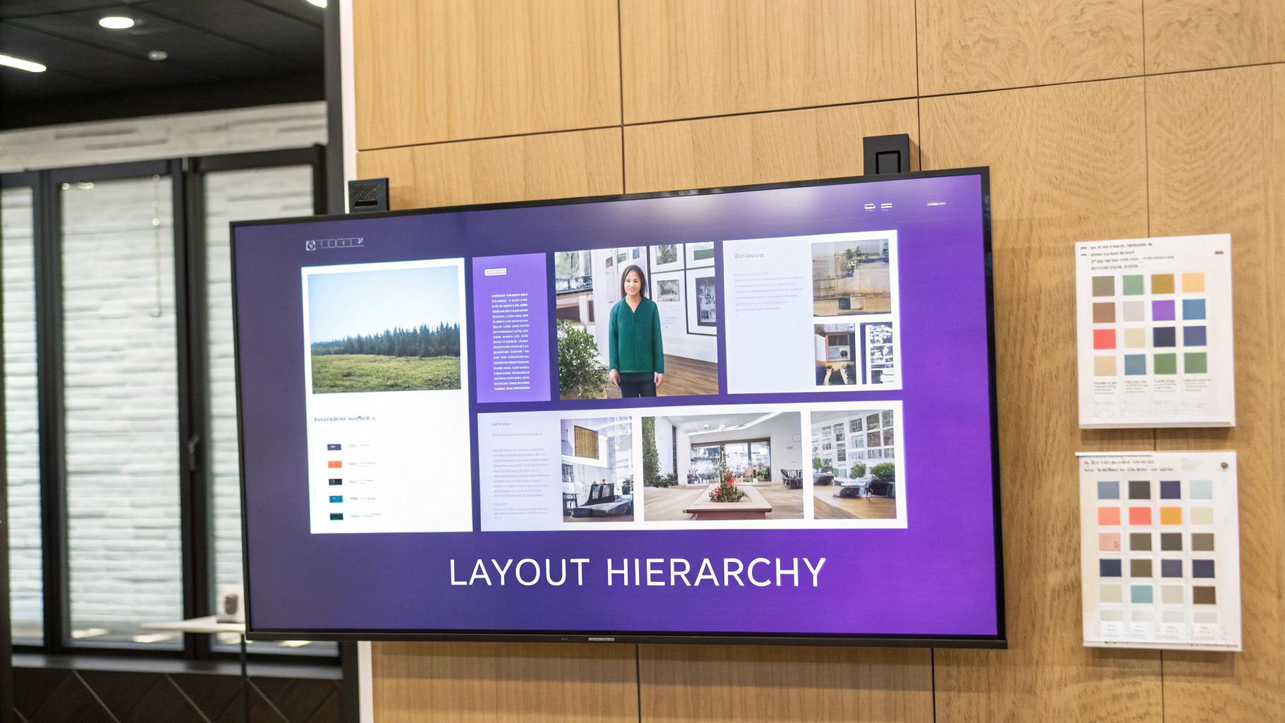
Create a Clear Visual Hierarchy
Every room has a star. Your moodboard should, too. This idea is called visual hierarchy, and it’s all about making sure the most important elements grab the most attention.
Is the hero of your room a dramatic velvet sofa? A massive piece of art? A bold, saturated paint color? Whatever it is, make that image the largest and most central piece on your board.
Everything else is the supporting cast. Arrange smaller images of lighting, textiles, and accent furniture around your star. This simple trick immediately tells the viewer what the design is really all about, giving them a focal point to anchor their understanding of the space.
Group Elements Logically
A random scattering of images feels like noise. To create a layout that’s actually useful, you need to group elements strategically. This helps you (and your client) see how different pieces will work together in the real world.
Here are a couple of my go-to methods:
- Group by Zone: This is perfect for open-concept spaces. If you're designing a great room, create little vignettes on your board. One cluster might represent the reading nook—armchair, floor lamp, side table. Another could be the dining area—table, chairs, pendant light. This helps you design each "zone" while making sure the whole room feels cohesive.
- Group by Material: Another really effective technique is to organize by material type. Put all your fabric swatches together, all the wood tones in one area, and all the metal finishes (faucets, hardware, lighting) in another. This makes it so much easier to spot-check for balance and make sure your material palette feels harmonious, not chaotic.
A thoughtfully arranged moodboard does more than look good; it acts as a visual checklist. It ensures every piece has a purpose and contributes to the overall narrative of the space, preventing design drift and keeping your project focused.
From 2D Board to 3D Reality with aiStager
A flat moodboard is fantastic for solidifying your ideas, but what if you could see how those ideas actually fit in the room? This is where a tool like aiStager changes the game. It’s the only platform I’ve found that generates photos with true dimension rooms and furniture objects, so you can see your concepts come to life in perfect scale.
Let's say your moodboard features a gorgeous armchair from Pottery Barn and a specific side table. Instead of just guessing, you can use aiStager to drop both items into a photorealistic render of your actual room. Just upload a photo of the space and the product links.
Suddenly, you're not just looking at a concept—you're testing a layout. You can see if that chair feels too bulky next to the window or if the table is the right height. This moves your design from a flat plan to a practical, three-dimensional preview, ensuring what looks good on the board will look and function perfectly in the home.
Turning Your Moodboard Into Your North Star
Think of your first moodboard as a rough draft—a fantastic brain dump of everything you love. Now comes the real magic: the editing. It's time to step back, take a breath, and look at your creation with a critical eye.
Does every single element on that board truly support the core vision you set out to achieve? Is there an outlier, a piece that just doesn't sing in harmony with the rest? This is where you get ruthless.
From Good to Great Through Curation
The editing process is what transforms a moodboard from a pretty collage into a powerful design tool. It's less about what you add and more about what you have the courage to remove.
To guide your critique, ask yourself these questions:
- Is it Cohesive? Does the whole board tell one unified story? If you're going for a serene, West Coast modern vibe, that bright, geometric pillow might be beautiful on its own, but does it belong here?
- Is it Balanced? Do you have a good mix of textures, colors, and materials? A board with all light wood tones, for example, can feel a bit one-note and make the final room fall flat.
- Is it Clear? Can someone glance at your board and instantly grasp the feeling you're aiming for? The design intent should be obvious.
Don't be afraid to kill your darlings. If that lamp you originally fell for is now clashing with your statement armchair, it has to go. This discipline is what creates truly thoughtful, cohesive spaces.
Your Moodboard as a Shopping List
Once you’ve honed your moodboard to perfection, it becomes your project’s ultimate guide. It’s your single source of truth for every decision, from picking paint colors to buying that last-minute throw pillow. In the same way professionals use moodboards to align marketing strategies and maintain a consistent brand voice, your board keeps your project's voice clear and strong.
When you're shopping and you feel the pull of an impulse buy, pull up your moodboard. A quick glance is all it takes to know if that item truly fits. It's your secret weapon against expensive mistakes and design detours.
Test-Driving Your Final Picks with AI
Even the most polished moodboard can't tell you everything. This is where a tool like aiStager can be a game-changer, letting you pressure-test your final choices in a realistic setting. It's the only platform out there that generates hyper-realistic photos with true-to-dimension rooms and furniture, which is perfect for this final check.
Visualizing your final selections in a photorealistic render eliminates that last bit of guesswork. It’s the ultimate confirmation that the vision on your board will translate beautifully into your actual space.
Let's say your refined moodboard features a specific leather sectional from Pottery Barn. You feel good about it, but you want to be 100% sure. With aiStager, you just upload a photo of your living room and a link to the sofa. In seconds, the tool places that exact product into your room, showing you precisely how it will look and feel.
You can even experiment with different finishes, quickly seeing that the "caramel" leather pops perfectly with your lighting while the "espresso" feels too heavy. This step takes your moodboard from a plan to a foolproof shopping list, ensuring every piece you buy is the perfect fit. For more on this, check out our guide on how to plan a room layout.
Got Questions About Moodboards? I've Got Answers.
When you're first getting your hands dirty with moodboards, a few questions are bound to pop up. Don't worry, that's completely normal. Getting a handle on these common sticking points is what separates a pretty-but-useless board from one that becomes the blueprint for a killer design.
Let's walk through some of the questions I hear all the time from designers and homeowners alike.
How Many Images Should I Actually Use on My Moodboard?
This is a big one. It's tempting to throw everything you love onto a single board, but that just creates visual noise. Think focus, not volume.
A powerful moodboard usually has just 10-15 core elements. Any more than that and the core idea gets lost. A good mix to aim for is:
- 1-2 "hero" images: These are the big-picture shots that capture the overall vibe you're after.
- 3-4 key furniture pieces: Think sofa, an accent chair, maybe the dining table. The non-negotiables.
- 3-5 material and color swatches: This is your palette. Fabrics, paint chips, wood tones, and metal finishes go here.
- A few lighting and accessory options: A pendant light, a rug, a piece of art. These are the finishing touches that pull it all together.
Remember, the goal is to set a clear direction, not to catalogue every single item. If you’re using a tool like aiStager, you can rely more on photo-real renderings of specific products rather than generic inspiration, which naturally keeps your board cleaner and focused on items you can actually buy.
What's laughable Biggest Mistake People Make?
Hands down, the most common—and expensive—mistake is creating a gorgeous moodboard that has zero connection to the reality of the budget or the space itself. It’s so easy to fall for images of sprawling, light-filled lofts when you're working with a standard 8-foot ceiling. That disconnect leads to serious disappointment and costly mistakes.
This is exactly where a reality check becomes your best friend. A tool like aiStager is a game-changer because it’s the only one that generates hyper-realistic photos with true dimension rooms and furniture. It forces you to work with what you've actually got, from the scale of the room to its unique lighting. This one step can stop you from buying a sofa that eats the entire living room or a rug that looks like a postage stamp.
Is It Okay to Mix Different Design Styles?
Not only is it okay, but you absolutely should! Some of the most interesting and personal spaces are born from blending styles. Think about the warmth of a modern farmhouse kitchen paired with the crisp, clean lines of industrial barstools. Or a rustic, reclaimed wood table from a place like Restoration Hardware surrounded by sleek, modern metal chairs.
The trick is to find a common thread to tie it all together. This could be a consistent color palette that runs through both styles, a repeating texture like linen, or a common material like natural oak. Your moodboard is the perfect place to play with these combinations and see how they feel before you commit a single dollar.
I Don't Even Know My Style. Where Do I Start?
Feeling a little lost? Start by collecting images without any judgment. Seriously. Go beyond interiors and pull anything that makes you stop and look twice—fashion, a landscape from a vacation, a piece of art, a texture in nature. Just gather.
Once you have a good collection, maybe 30-50 images, spread them all out (digitally or physically) and start looking for patterns.
- Are you constantly pinning neutral colors and soft, organic shapes?
- Do you gravitate toward bold, saturated hues and sharp, geometric lines?
- Is there a material that keeps showing up, like aged leather or polished chrome?
These common threads are the clues to your personal aesthetic. They give you a starting point—a foundation—to build a more focused moodboard that feels genuinely like you. From there, you can use aiStager to quickly test drive variations of a product—say, three different velvet sofas in your signature color—to see which one truly brings that style to life in your own home.
Ready to stop guessing and start seeing what's possible? With aiStager, you can upload a photo of your room, drop in a link to any product online, and see how it looks in your space in seconds. Try it for free and build a moodboard that’s grounded in your reality.