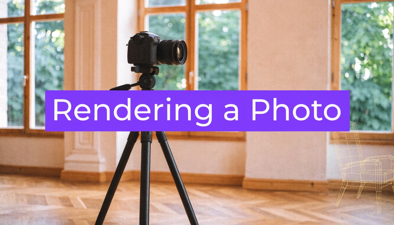
Rendering a Photo: AI Visuals for Design & Real Estate
Transform your interior design or real estate project by rendering a photo with aiStager. Create stunning, photoreal AI visuals in just a few clicks.
You already have the photo. The hard part is trusting what comes next.
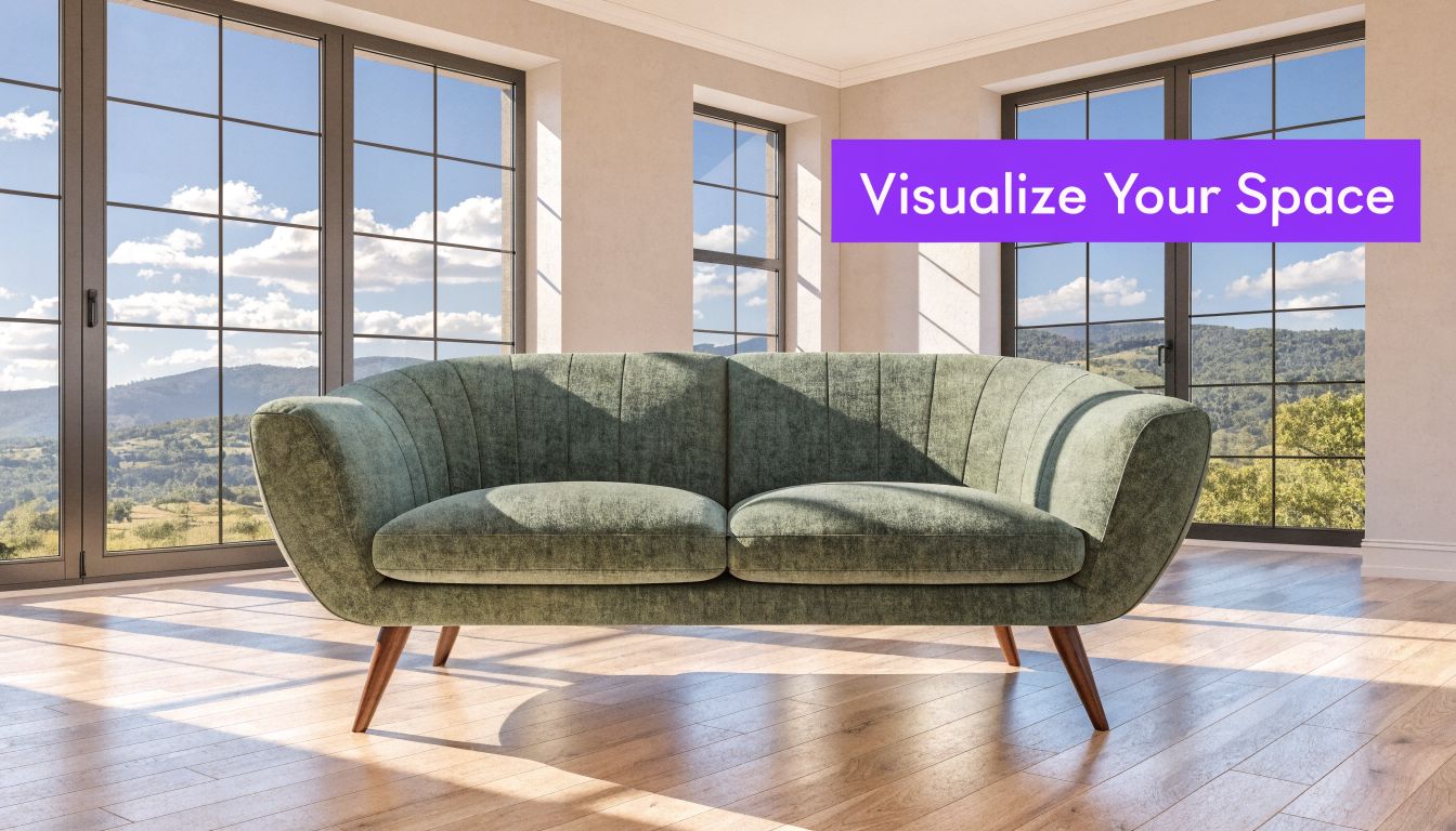
An empty listing, a spare bedroom, a corner of a living room, a showroom shot that almost works. You find a sofa online, maybe a sectional from Article or a lounge chair from West Elm, and you want to know how it will look in the actual room. Not a rough mockup. Not a floating cutout. A render that keeps the room’s proportions, respects the original camera view, and places the product where it would really fit.
That’s the challenge in rendering a photo for interiors. The image has to look like it was shot that way in the first place. Scale, angle, lighting, finish, and floor contact all have to agree. If one of them breaks, the whole illusion breaks with it.
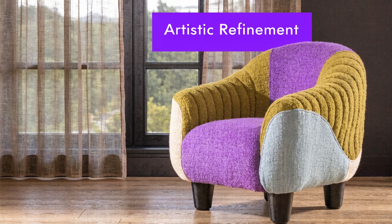
The New Era of Rendering a Photo for Interiors
Photography has always moved toward faster, more believable image making. One of the clearest historical jumps came in 1839, when Louis Daguerre introduced the daguerreotype, the first commercially successful photographic process. That shift turned image rendering into something practical and widely usable, and it laid groundwork for the modern photo manipulation and AI rendering methods used now. The same historical thread matters here because modern tools can generate interior visuals up to 100x faster than manual 3D/CAD mockups, as noted in HARMAN’s history of photography.
That speed matters, but accuracy matters more. The goal isn’t another mood image. Instead, the focus is on answering practical questions. Will the sofa crowd the walkway? Does the walnut finish look too heavy against pale oak floors? Will a cream bouclé silhouette soften the room, or will it disappear into the walls?
What changed for interior visualization
Old workflows usually forced a trade-off. You either used a limited object library, or you spent time building and scaling assets manually. Both approaches slowed decisions down, especially when a client wanted to compare several real products from different retailers.
Now the process can start with two things you already have:
- A room photo that captures the actual space
- A product URL from a real brand or marketplace
- A need for realistic fit rather than generic inspiration
That combination changes who can use rendering a photo well. It’s no longer just for CG artists or large studios.
Practical rule: If the output doesn’t preserve the room’s original perspective, it won’t feel credible no matter how attractive the furniture looks.
Why this matters in real rooms
A vacant condo listing needs warmth. A homeowner wants to compare a camel leather sofa against a moss velvet version. A designer needs to test whether a low-profile media console feels grounded in a narrow wall elevation. These are small decisions on screen, but expensive ones in practice.
The breakthrough is being able to work from the room you have, with the product you want to buy. That means you can test a Rejuvenation fixture over a dining table, swap a sectional for a tighter apartment-scale sofa, or compare finishes without rebuilding the whole scene from scratch.
Preparing Your Scene for a Flawless Render
A convincing render starts with disciplined inputs. If the room photo is poorly shot or the product page is missing usable details, even a strong renderer has to guess, and guesses show up fast in the final image.
The goal is simple. Give aiStager a room image that reads clearly and a product URL that reflects the actual item you want to place at true scale. That combination is what separates a useful design test from a pretty but unreliable mockup.
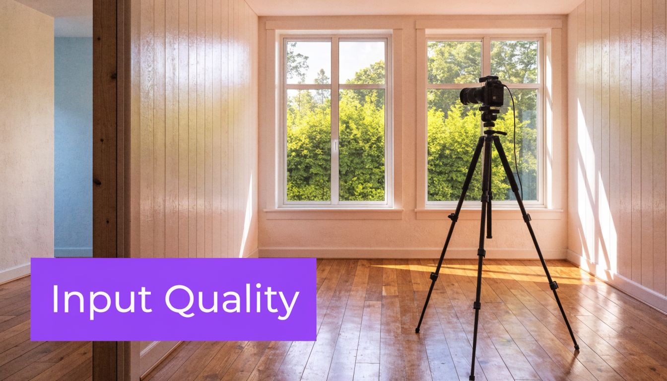
A clean room photo improves edge detection, floor recognition, and material consistency. Before you shoot, clear stray objects, straighten textiles, and simplify surfaces that create visual noise. If the space is being photographed for sale or rent, these tips for real estate photography prep are a solid checklist.
Start with a photo the renderer can read
Choose a room photo with visible floor area, uninterrupted wall lines, and enough depth cues for object placement. The renderer needs to understand where a product can sit, how far it is from the camera, and what parts of the room should stay untouched.
These inputs usually produce stronger results:
- Level framing: Keep verticals close to straight and avoid heavy camera tilt.
- Usable light: Even daylight is easier to preserve than mixed lighting from lamps, LEDs, and blown-out windows.
- Clear placement zones: Leave the floor visible where a sofa, table, or bed will go.
- Sharp resolution: Compression artifacts and motion blur make every added object look softer than the room around it.
Vacant rooms are often the easiest starting point because the boundaries are easy to read and there is less visual conflict around the new furniture. If you want a practical reference, this guide on using an empty room photo as a staging starting point shows what makes a blank space easier to work with.
Pick product URLs with real buying information
The product URL matters as much as the room photo. aiStager stands out here because you are not limited to a closed furniture library or forced to scale objects by eye. You can work from the actual retailer page for the piece you want, whether that is a sofa from Article, a pendant from Rejuvenation, or a side chair from a marketplace seller.
Use the listing with the clearest product photography and complete dimensions. A polished lifestyle page can look appealing, but it is less useful than a straightforward product page that shows width, depth, height, and finish names clearly.
Choose the most informative listing, not the most stylish one. Clear dimensions and a clean product image usually produce a render that needs fewer corrections.
Inputs that help, and inputs that create problems
Usually works well
- A straight-on or lightly angled room shot
- Visible floor where new objects will be placed
- Product pages with dimensions, finish details, and clean imagery
- Listings that isolate the item instead of burying it in décor
Usually causes trouble
- Dark phone photos with clipped highlights
- Extreme ultrawide distortion
- Screenshots of thumbnails instead of the full product page
- Listings with vague sizing or missing measurements
This preparation step saves time later. When the photo is readable and the URL points to a real product with clear dimensions, aiStager can place almost any item into your own room with scale that holds up under scrutiny.
Mastering Scale and Perspective Automatically
A room photo falls apart fast when scale is wrong. A 96-inch sofa reads like a loveseat. A dining chair sits too high against the table. A pendant drops into the frame at a height no electrician would ever install. People notice it immediately, even if they cannot name the perspective error.
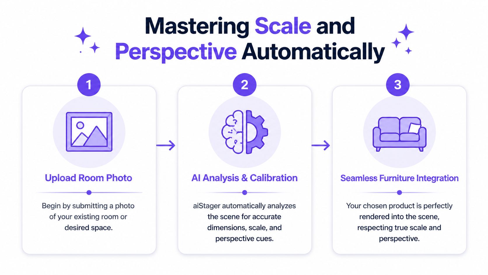
This is the primary advantage of aiStager. It does not ask you to pull a generic chair from a fixed catalog and resize it until it looks close enough. It uses the room photo and the dimensions tied to an actual product URL, so the object can be placed at true scale in your own space. That changes the quality of the result and the speed of the workflow.
Why angle preservation matters
Interior photos already contain the camera position, lens perspective, horizon, and floor direction. If the added object ignores those cues, the image stops reading as photography. It starts reading as a collage.
I see this often with manual mockups. The product itself may be attractive, but the base does not sit flat on the floor plane, the side faces the wrong vanishing point, or the piece is scaled from instinct instead of measurements. That is usually enough to break trust.
Automatic calibration helps because the system is solving several placement problems together, not one at a time. It has to interpret the floor plane, estimate room depth, respect the original camera angle, and fit the product's real width, depth, and height into that geometry. The principles are the same ones covered in aiStager’s guide to scale and proportion in interior design, but here they are applied directly to your photo and your selected product.
What the system needs to get right
A believable render depends on a few relationships being correct at the same time:
| Scene element | What the system must infer | Why it matters |
|---|---|---|
| Floor plane | Where objects physically sit | Keeps furniture from floating, tilting, or sinking |
| Vanishing points | Direction of depth and alignment | Keeps edges consistent with the room |
| Camera height | Viewer eye level in the photo | Makes tops, seats, and surfaces read naturally |
| Product dimensions | Actual width, depth, and height | Preserves fit and true scale |
Get those relationships right, and a bench near the back wall still feels grounded. Get them wrong, and even a simple side table looks fake.
Why URL-based placement changes the job
Traditional 2D staging often looks acceptable at thumbnail size, but it can collapse under a closer look because it is not built from room geometry. Full 3D workflows can solve that problem, though they usually require more setup, more software skill, and more manual adjustment.
aiStager sits in a more practical middle ground. You can pull from almost any product URL, place the actual item into a personal room photo, and keep its proportions tied to the actual product dimensions instead of guessing by eye. That matters when you are comparing pieces from different retailers, checking whether a sectional will crowd a walkway, or testing a larger dining table against the room's existing circulation.
It also makes finish comparisons more useful. A bulky oak dresser and a slim lacquered one do not just change the style of the room. They change the visual weight and the amount of space the room appears to hold. If the scale is off, those decisions become unreliable. For adjacent material decisions beyond furniture, references such as durable design finishes for Northern Colorado can help frame how surface choices affect the final look.
How to review a render like a professional
Do not judge the image only by whether it looks attractive. Check whether the object obeys the room.
Floor contact
Legs, plinths, and bases should sit cleanly on the floor with no hovering and no buried edges.Eye-level logic
Console tops, arm heights, and table surfaces should make sense from the original camera height.Line alignment
Furniture edges should follow the same perspective logic as floorboards, baseboards, windows, or tile joints.Distance behavior
Objects farther from the camera should reduce in apparent size naturally, based on depth, not arbitrary scaling.Fit in context
Walkways, clearances, and spacing around doors or adjacent furniture should still feel usable.
That last check matters more than many users expect. A render can look polished and still be wrong for the room. The goal is not a pretty insert. The goal is a product shown at believable size, believable angle, and believable placement inside your actual space.
Refining Your Vision with Lighting and Finishes
Once the object sits correctly in the room, the render still isn’t done. Good placement gets you credibility. Light and material finish get you conviction.
A sofa in navy velvet and the same sofa in distressed leather don’t just change color. They change how the room handles light. Velvet absorbs and softens. Leather catches sharper highlights. Bouclé diffuses. Polished wood bounces. If the render treats all of those materials the same way, it will look fake immediately.
Light has to agree with the room
Photoreal interior rendering depends on consistent control of brightness, color temperature, shadow depth, and highlights. If those pieces conflict with the material properties, the scene breaks. That’s the key point in this guide to photorealistic rendering and lighting consistency.
In practice, this means a walnut coffee table near a window shouldn’t react like a chalky matte cube. A brushed metal lamp should pick up directional highlights. A cream performance fabric chair in warm lamp light should not read with cold daylight shadows.
Test finishes the way people actually shop
This is the part users tend to enjoy most, because it’s where the room starts answering design questions instead of creating new ones.
Try a few realistic comparison rounds:
Same silhouette, different upholstery
Put a Pottery Barn armchair in navy velvet, then switch it to distressed leather. The shape stays constant, so you can judge finish without being distracted by form.Same category, different brands
Compare one sofa with a tighter bench seat against another with loose cushions. This is useful when you’re balancing a cleaner modern look against a softer family-room look.Same product, different wood tones
Test light oak, medium walnut, and painted finishes against the same flooring and wall color.
For homeowners in high-use spaces, finish durability matters too. If you’re deciding between painted, lacquered, or more opaque surface treatments for cabinetry or built-ins, this piece on durable design finishes for Northern Colorado gives practical context about finish behavior in lived-in interiors.
Materials tell on bad renders faster than shape does. If the finish reacts to light the wrong way, viewers notice even if they can’t name the error.
A practical room example
Take a bright living room with pale floors and warm afternoon light. A boucle loveseat may feel airy but slightly flat against a cream wall. Switch to a moss green velvet version and the room gains contrast, but now reflections from the window need to stay soft. Try a camel leather option and the scene becomes warmer, though the highlight pattern should be tighter and more directional.
That kind of comparison is exactly where one-click product swaps help. You don’t need a new photo shoot each time. You need the same room, the same angle, and a faithful response to each material change.
A short walkthrough helps when you’re evaluating these details in motion:
Finishes should support the style, not just the product
US buyers often respond strongly to style cues like warm modern, organic contemporary, California casual, and Japandi-inspired interiors. Rendering a photo lets you test those directions without committing too early.
A few style pairings that work well in review cycles:
| Style direction | Product variation to test | What to watch |
|---|---|---|
| Warm modern | Camel leather vs off-white fabric | Contrast with walls and wood floor warmth |
| Japandi | Light oak frame vs upholstered base | Visual weight and calmness |
| Mid-century influenced | Walnut case goods vs black-accent legs | Rhythm with existing trim and hardware |
| Family-friendly transitional | Performance fabric vs textured weave | Softness versus visual clutter |
The useful question isn’t “Which one is prettier?” It’s “Which one looks like it belongs in this specific room?”
Generating and Applying Your Photoreal Renders
A client sends a room photo at 10:12. By 10:30, they want to know whether the 96-inch sofa fits, whether the oak finish fights the floor, and whether the larger rug makes the room feel tighter or better grounded. That decision window is short. If rendering takes too long, the review loses momentum and the team starts guessing.
Fast output matters because it keeps the conversation tied to the actual room. You can test a product from its live URL, place it at true scale, and compare options while the buyer, designer, or agent is still engaged. That speed changes the job from static presentation to active decision support.
Where these renders produce real business value
The best uses are practical ones. They solve hesitation, shorten review cycles, and make room photos more useful than standalone product shots.
| Use Case | Primary User | Key Benefit |
|---|---|---|
| Vacant listing staging | Real estate agents and brokers | Helps buyers read purpose and layout in empty rooms |
| Product-in-room previews | Furniture retailers and shoppers | Makes fit and style easier to judge before purchase |
| Client concept boards | Interior designers | Speeds approvals with realistic room-specific views |
| Unit marketing updates | Property managers and leasing teams | Refreshes visuals without physical staging logistics |
| Showroom merchandising tests | Retail teams | Compares products and finishes in real room contexts |
A practical buying workflow often starts with product photography, but a catalog image rarely answers the final question: will it look right in my room? Gates Home Furnishings makes a related point in its article on making informed furniture purchases. The missing step is placement inside the buyer's own space, at believable scale.
Real estate use
Vacant rooms are clean, but they leave too much work to the viewer. Buyers have to estimate furniture size, traffic flow, and possible function on their own. A render removes that friction.
A living room can show a real seating plan. A breakfast area can prove that four chairs fit comfortably. A spare room can read as an office, nursery, or guest space without changing the photo itself. Teams exploring virtual home staging services for listing marketing usually want one thing above all: images that belong with the rest of the listing set and still feel believable.
E-commerce and retail use
Retail has a different pressure point. Shoppers often like the product, then pause on proportion. The room photo answers that faster than another studio angle ever will.
This approach is especially useful when comparing versions of the same item:
- The same sofa in ivory, rust, or olive
- The same dining table in natural oak and dark stain
- The same bed in queen versus king
- The same lamp in aged brass and matte black
aiStager is useful here for a specific reason. It can take a personal room photo and a product URL, read the product information, and render that item into the space at true scale. That matters in day-to-day work because you are not limited to a closed asset library, and you do not have to estimate size by eye or manually fake proportions.
Design and client presentation use
Design reviews improve when every option stays in the same room, from the same camera position. Feedback gets sharper because the only variable is the product change itself.
I see this most often with clients deciding between close alternatives. Once they can compare the exact chair, table, or bed in their own photo, comments become specific and useful. They stop reacting to a mood board in the abstract and start judging what fits the room.
The strongest render is the one that helps someone choose with confidence. Photorealism matters. True scale matters more.
Troubleshooting Common Rendering Challenges
A render usually fails for a small number of predictable reasons. In practice, I check three things first. Source photo quality, product page clarity, and whether the room geometry gives the system enough usable information to place the item cleanly at true scale.
If the render looks soft
Start with the room photo. A blurry, dark, or compressed image limits the result before rendering even begins. Screenshots, cropped listing photos, and images passed around in chat apps often lose the edge detail the renderer needs to read corners, floor lines, and wall transitions.
Look closely at the room itself. If baseboards disappear into shadow or the floor meets the wall in a muddy blur, the object can still render, but it will be harder to ground it convincingly.
If the object scale feels off
This problem often starts with the product listing. Retail pages vary a lot. Some hide dimensions in collapsed tabs, some combine multiple sizes on one URL, and some show a hero image that does not clearly match the selected variant. Choose the cleanest listing you can find, with readable dimensions and a straightforward product view.
Camera choice matters too. A room shot on an extreme wide lens can make near objects feel oversized and back walls feel farther away than they are. aiStager does a strong job interpreting perspective from a real room photo and product URL, but a more neutral photo still gives you a better starting point, especially for large pieces like sectionals, beds, and dining tables.
If glass, metal, or glossy finishes look fake
Rendering physics are critical here. Photoreal results depend on physically based rendering, which means materials respond to light according to their real surface behavior rather than a generic shine setting. Reflective finishes expose mistakes fast. If reflections are too flat, highlights are too broad, or shadows do not match the room lighting, the object starts to look pasted in.
This is also where experience helps. Glass should show depth. Metal should catch tighter, cleaner highlights. A satin finish should read differently from polished lacquer, and velvet should absorb light differently from leather. When those reactions are believable, the render settles into the photo instead of fighting it.
A quick fix checklist
- Use the best room photo you have: Higher resolution and clearer edges give the renderer more to work with.
- Choose a cleaner product URL: Good dimensions and a clear product image improve scale matching.
- Avoid extreme lens distortion: Straightforward camera views make placement more convincing.
- Check finish expectations: Wood, boucle, leather, glass, and metal should not reflect light the same way.
- Inspect floor contact: If the product does not feel planted on the surface, the image will feel wrong.
Judge the relationships first. Product to floor, scale to room, finish to light, and angle to camera.
Good renders are usually built, not guessed. A clean photo, a reliable product page, and a system that can place products from any URL at real scale solve most problems before you ever reach the final image.
If you want to test your own room with real products, aiStager lets you upload a room photo and add furniture from a product URL so you can review fit, finish, and placement before you commit.