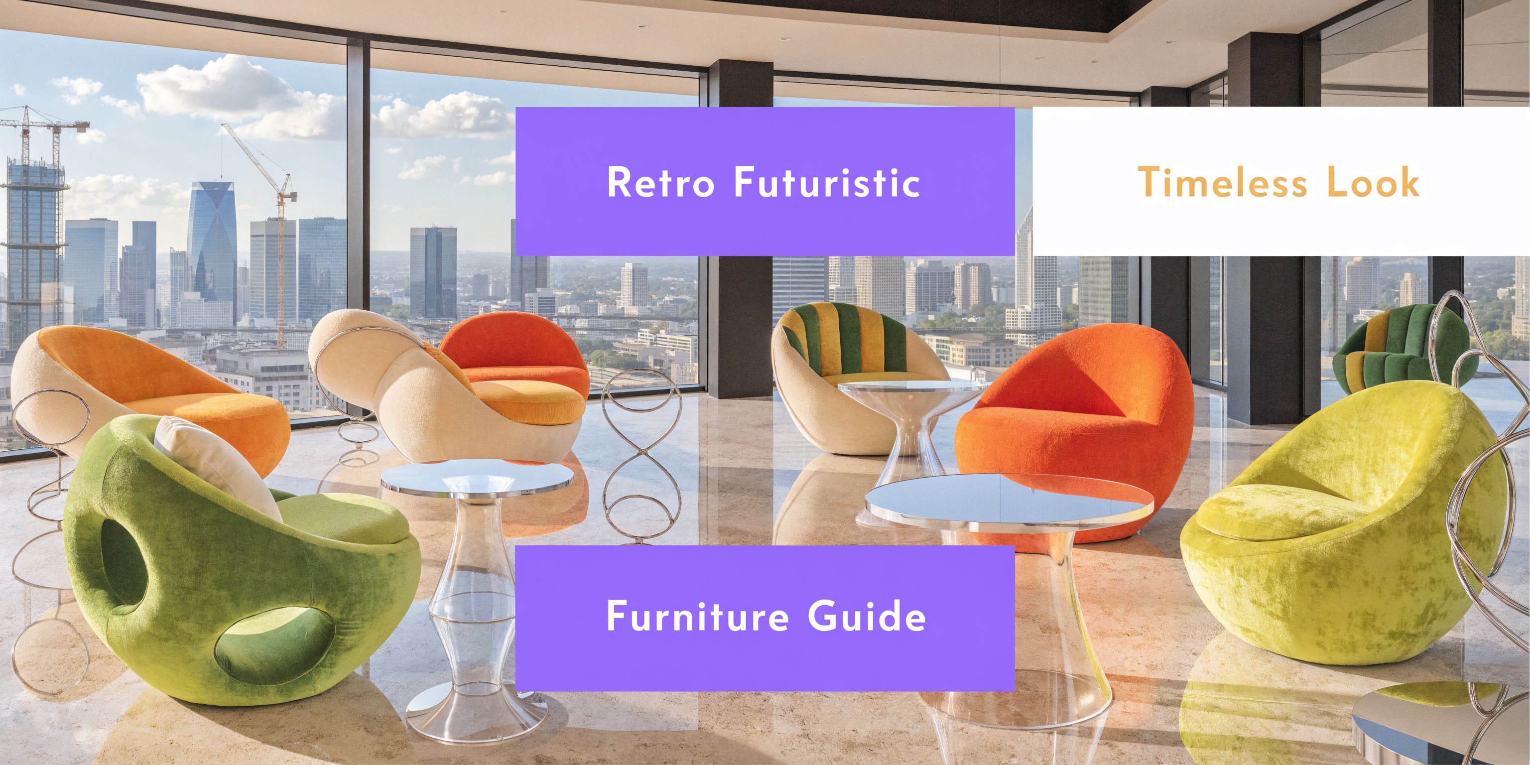
Retro Futuristic Furniture: Your Guide to a Timeless Look
Explore retro futuristic furniture from the Space Age to the 80s. Learn to style it and visualize any piece in your room with our hyper-realistic guide.
You open Instagram, Pinterest, or a furniture site, and every room starts to blur together. Beige boucle. Soft oak. Safe shapes. Clean, yes. Memorable, not always.
Then one chair stops you. It looks like a pod from an old sci-fi film. Or maybe it is a glossy table with one sculptural base, or a wild cabinet in colors that should not work together but somehow do. You like it, but you also wonder whether it will look brilliant in your room or completely out of place.
That tension is exactly why retro futuristic furniture feels so exciting. It gives you the optimism of past visions of tomorrow, while still feeling expressive in a modern home. The trick is learning how to read the style, how to edit it, and how to test it before you spend money on a bold piece you may regret.
Your Guide to Retro Futuristic Furniture
A lot of people come to this style after getting bored with rooms that feel too cautious. They do not want chaos. They want personality.
Retro futurism works for that moment. It blends nostalgia with invention. You get the smooth, space-age confidence of the 1960s, the playful rebellion of the 1980s, and the clean practicality many US homeowners still want today.
I often think of the client who loves a Herman Miller classic but also saves photos of glossy chrome lighting, rounded chairs, and dramatic color. They are not confused. They are responding to a style that was always about contrast. Warm and cool. Soft and slick. Familiar and experimental.
That is why this look can feel intimidating at first. The forms are stronger. The finishes are shinier. The colors can be bolder than what many buyers are used to.
But the style gets much easier once you know what to look for. A few clear design signals make retro futuristic furniture feel less random and much more intentional. And when you can preview real products in your own room before ordering, the whole process becomes far less risky.
What Exactly Is Retro Futurism
You spot a rounded white chair online, then a loud geometric cabinet in bright primary colors, and both are labeled retro futurist. That can feel contradictory until you understand the idea behind the style.
Retro futurism is furniture and decor shaped by older visions of tomorrow. It takes the future people once dreamed about and brings that vision into a real room. The result is a style with memory, optimism, and a little theatrical flair.
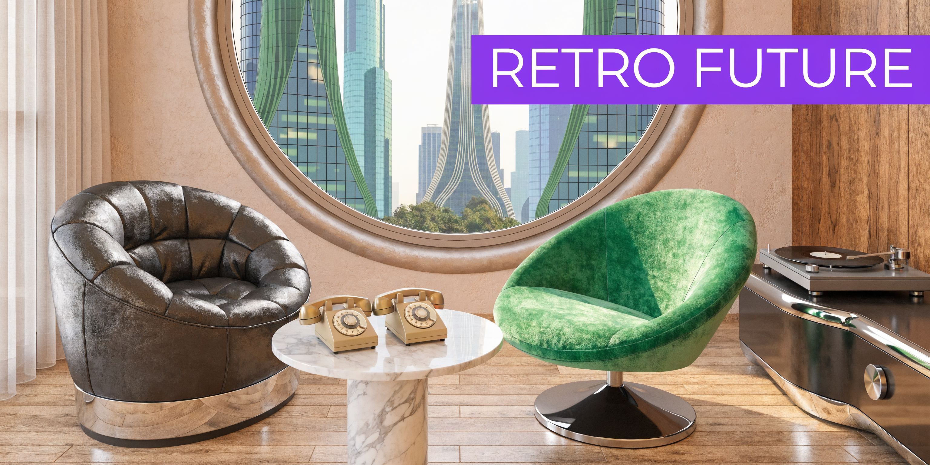
A helpful way to understand it is to see retro futurism as two family branches. One branch comes from the Space Age years, when designers responded to rockets, satellites, and the promise of life beyond Earth. The other comes from the postmodern 1980s, when the future looked less like a quiet moon base and more like a bold experiment in color, pattern, and technology.
The Space Age side
The Space Age branch grew out of the 1950s and 1960s. Designers were captivated by speed, new materials, and the idea that homes could look as advanced as the machines of the era.
A defining example is the Ball Chair. The Ball Chair was designed in 1963 by Eero Aarnio, and it became a cornerstone of retro-futurism because its fiberglass shell looked like a sci-fi pod, reflecting the optimism of the era (sohnne.com/blog/retro-futurism-interior-design). Pieces from this branch often feel molded, smooth, and aerodynamic. They use curves the way a classic car uses chrome. Not as decoration alone, but as a signal of progress.
If you have ever seen a product like the Jetson Bar Console, you have already met a commercial echo of that mood. Even the naming points to the era’s fascination with space travel, motion, and tomorrow’s home.
The Postmodern side
The second branch arrived later and changed the mood completely. By the 1980s, many designers had grown tired of strict minimalism and polished perfection. They started asking a different question. What if the future could be witty, colorful, and a little strange?
The Memphis Group was founded in 1981 by Ettore Sottsass in Milan (britannica.com/topic/Memphis-Group). Its furniture helped define a postmodern version of retro futurism through clashing colors, exaggerated geometry, and patterns that felt almost electronic. The Memphis Group was founded in 1981 by Ettore Sottsass in Milan, and it helped define 1980s retro-futurism through radical postmodern furniture that rejected minimalism for clashing colors and explosive patterns (sohnne.com/blog/retro-futurism-interior-design).
This is the point where readers often hesitate. They expect “futuristic” to mean sleek and restrained. Retro futurism uses a broader definition. Sometimes the future is a pod chair in glossy white fiberglass. Sometimes it is a zigzag shelf that looks like it came from a music video set.
Why the style still works now
Retro futurism still feels fresh because it bridges two needs at once. It gives a room personality and visual history, but it can still support clean layouts and edited, functional spaces.
That balance matters if you are furnishing a real home rather than a photo shoot. A sculptural chair may look exciting on its own and completely overwhelm your living room once it arrives. A bold lacquered cabinet may be perfect in theory and wrong for your light, flooring, or wall color in practice. That is why a visual test matters so much.
You can get more historical context in this retro-futurism interior design overview, but the practical takeaway is simple. Retro futurism is not one strict formula. It is a design language built from older ideas about tomorrow, and aiStager helps you test that language in your own space before you commit to the furniture.
The Hallmarks of Retro Futuristic Design
A lot of readers hit this section and wonder what they are looking for. The easiest answer is this. Retro futurism has a few repeatable signals, and once you know them, the style becomes much easier to spot, edit, and test in your own home with aiStager before you spend money on a single statement piece.
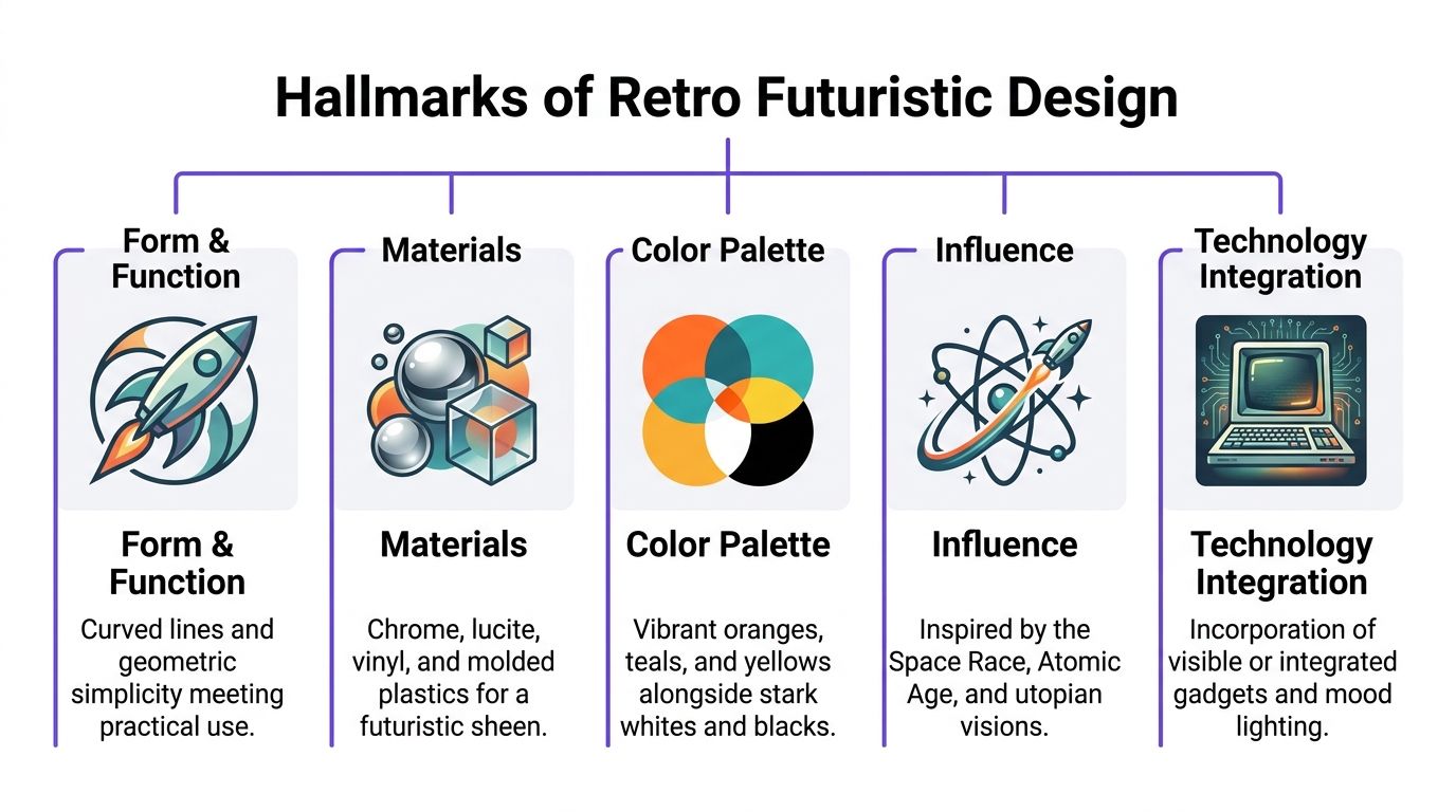
Start with shape
Shape usually gives the first clue.
One branch of retro futurism uses rounded shells, cocoon-like seating, pedestal bases, and smooth curves that feel aerodynamic. The outline looks simplified, almost as if the piece was molded in one sweep instead of assembled from many parts. That is why these rooms often feel sleek even when the furniture is bold.
Another branch takes a sharper route. You will see zigzags, stacked geometry, asymmetry, and exaggerated proportions. A cabinet can read like functional art. A side table can look intentionally unstable while still being perfectly usable.
A retail example helps make this concrete. The Jetson Bar Console shows how naming, silhouette, and attitude can suggest a future-facing look without pushing the room into movie-set territory.
Materials create the futuristic effect
If shape is the outline, materials are the voice.
The adoption of fiberglass and plastics in the 1960s opened the door to forms that traditional wood construction could not easily produce, and fiberglass offered tensile strength of approximately 300 to 500 MPa (ai-stager.com/blog/retro-futurism-interior-design). That helps explain why so many classic retro-futurist pieces feel light, molded, and fluid rather than carved or heavily joined.
Chrome often appeared beside those molded materials, and chrome has reflectivity of over 90% (ai-stager.com/blog/retro-futurism-interior-design). In plain terms, it throws light around the room. That reflective quality is a big reason retro-futurist interiors can feel bright, sharp, and a little cinematic.
The strongest rooms usually balance those cool, glossy surfaces with something that has texture and warmth. A molded chair looks better near walnut or teak. Chrome feels more inviting next to leather, velvet, or a thick rug. Acrylic also helps because it keeps visually heavy rooms from feeling crowded.
If you are unsure whether a room needs more shine or more softness, aiStager is useful here. You can test a chrome-heavy version against a warmer mixed-material version and compare them side by side instead of guessing from product photos.
Color is a clue, not a rule
Color trips people up because they assume the style requires loud contrast in every corner. It does not.
The palette shifts with the reference point. Earlier retro-futurist looks often use white, black, red, yellow, and orange. Later interpretations move toward punchier combinations such as teal, lavender, turquoise, and other high-contrast pairings. If you want a clearer read on those brighter combinations, this guide to a vaporwave color palette gives useful context.
The safer approach for a real home is to treat color like seasoning, not the whole meal. Start with one dominant tone, one support tone, and one high-energy accent. Then mock it up in aiStager to see whether the palette feels expressive or chaotic in your actual light.
A quick cheat sheet
| Element | Space Age (1950s-1970s) | Cyber/Postmodern (1980s-1990s) |
|---|---|---|
| Form | Rounded, pod-like, aerodynamic | Angular, asymmetrical, geometric |
| Materials | Fiberglass, molded plastic, chrome, acrylic | Laminate, glossy finishes, metallic accents, graphic surfaces |
| Mood | Optimistic, clean, orbital | Energetic, ironic, digital |
| Best supporting pieces | Pedestal tables, globe lamps, low sculptural seating | Statement storage, colorful side pieces, graphic lighting |
| Common mistake | Making it too sterile | Making it too chaotic |
If the furniture has a strong point of view but the room still feels comfortable to use every day, you are usually very close to the right balance.
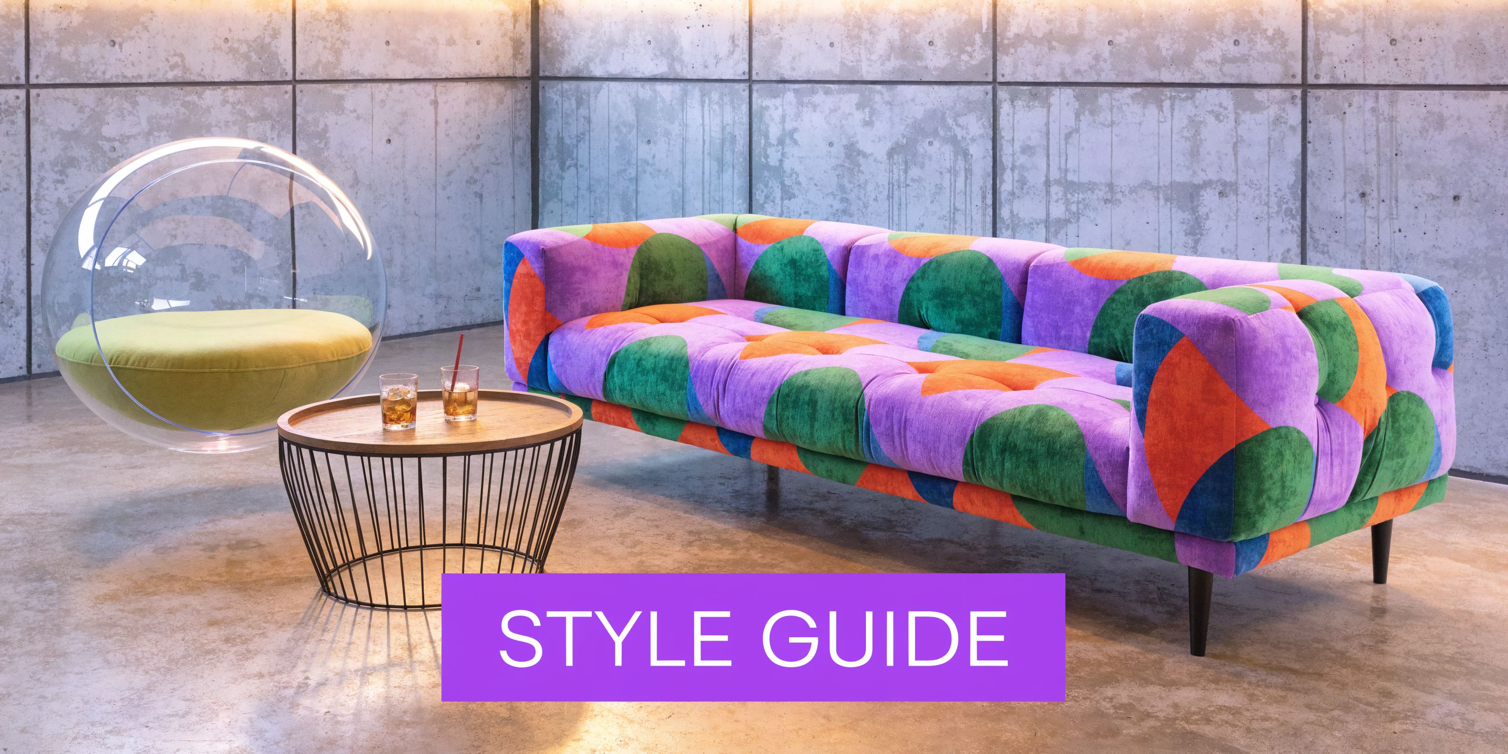
Styling Retro Futurism Room by Room
You spot a glossy pod chair online, add a chrome lamp to the cart, then wonder whether your room will feel visionary or like a movie set. That hesitation is healthy. Retro futurism asks for editing, not accumulation, and the safest rooms usually start with one memorable piece that sets the tone for everything around it.
Start with an anchor, then test the supporting cast around it. aiStager makes that process far less intimidating because you can preview bold shapes, finishes, and layouts in your own space before any purchase turns into an expensive mistake.
Living room
The living room handles drama well, but it still needs a clear hierarchy. A serpentine sofa, pod chair, or low sculptural coffee table usually works best as the star. Once that piece is in place, the rest of the room should help it read clearly instead of competing for attention.
Material contrast does a lot of the heavy lifting here. Warm wood keeps a retro-futurist room grounded, while chrome and acrylic add the crisp, optimistic shine that gives the style its forward-looking edge. Retro-futuristic furniture often pairs warm wood with cool chrome, and chrome plating offers reflectivity above 90% while wood’s low thermal conductivity helps maintain comfort (idwitalia.com/en/retro-futuristic-design-a-journey-between-past-and-future-in-interior-design). In practice, that could mean a glossy lamp beside a walnut console, or a metallic side table balanced by a leather lounge chair.
Soft textures keep the room from feeling hard or echo-prone. The same source notes that high-pile shag rugs can absorb 20 to 30% more sound (idwitalia.com/en/retro-futuristic-design-a-journey-between-past-and-future-in-interior-design)). That is one reason a textured rug, velvet cushion, or upholstered ottoman often makes a bold living room feel calmer and easier to live in.
A useful formula for many homes looks like this:
- Anchor: One curvy sofa or pod chair
- Support: A simple wood coffee table or pedestal table
- Shine: One chrome or acrylic accent
- Softening layer: Textured rug, velvet pillow, or leather ottoman
If you are unsure whether the room needs one more sculptural piece or one less, mock up both versions in aiStager. Side-by-side comparisons usually make the answer obvious.
Dining room
Retro futurism feels especially natural in the dining room because many classic tables and chairs already have strong silhouettes. A Saarinen-style Tulip Table is a good example. Its pedestal base keeps the floor line open, so the room feels lighter even when the furniture has a dramatic shape.
Chair choice shifts the mood. Molded chairs push the room toward a Space Age read. Graphic or angular dining chairs pull it closer to postmodern territory. Either way, leave generous clearance around the table so the form stays readable from across the room and guests can move comfortably.
Lighting matters more here than many homeowners expect. A dining room with one harsh overhead fixture can flatten even beautiful furniture. Layered light solves that problem. Use ambient light for overall glow, then add a pendant, arc lamp, or wall light to shape the table zone. Reflective surfaces nearby, such as chrome or glass, help bounce light around the room so the setup feels intentional instead of theatrical.
For visual inspiration, this short video shows how strong curves, lighting, and color can change the character of a room.
Bedroom and home office
Bedrooms usually need a lighter hand. The goal is a hint of retro futurism, not a full set piece. One rounded headboard, a globe lamp, or a lacquered nightstand can create the mood without making the room feel restless at night.
Home offices benefit from the same restraint. A sleek chair, a compact chrome desk lamp, or a curved guest chair can bring in personality while keeping the space usable for focused work. Good retro-futurist styling works like seasoning. A little changes the whole experience. Too much makes the room harder to use.
Bold style works best when the room still supports daily life. If you need to work, relax, or host in the space, keep at least some pieces visually quiet.
Sourcing Retro Futuristic Furniture
Once you know what you like, the next question is practical. Do you hunt for originals, or do you buy newer pieces inspired by the look?
Both paths make sense. The right choice depends on budget, patience, and how much authenticity matters to you.
Vintage originals
Authentic vintage pieces bring history into the room. They often have richer materials, more character, and stronger collector appeal.
The trade-off is uncertainty. Condition can vary a lot. Upholstery may need work. Finishes can show wear. Measurements are sometimes less forgiving than buyers expect, especially with rounded forms.
For serious searching, marketplaces like 1stDibs and Chairish are common starting points for verified vintage and collectible design. If you go this route, ask for detailed photos, dimensions, and restoration notes before you commit.
Reproductions and inspired pieces
For many homes, reproductions are the smarter move. They are typically easier to source, easier to coordinate, and less stressful to maintain.
Brands such as Knoll and Herman Miller remain useful references for modern classics, while Design Within Reach, CB2, and similar retailers often carry pieces that capture the right silhouette without requiring a collector’s budget. You may also find strong options from Article if you want a cleaner, more accessible interpretation.
A newer piece also makes color and finish testing easier. If you are debating white versus black, boucle versus vinyl, or polished chrome versus brushed metal, reproductions often offer more options.
A simple decision test
Use this if you feel stuck:
| Question | Vintage may fit better | Reproduction may fit better |
|---|---|---|
| Do you want collector value? | Yes | Not a priority |
| Are you comfortable with wear and restoration? | Yes | Prefer new condition |
| Do you need flexible finish options? | Less likely | More likely |
| Is your budget tighter? | Sometimes difficult | Usually easier to manage |
The goal is not purity. It is a room that feels intentional. A vintage chair can sit comfortably next to a newer table if the forms and materials speak the same language.
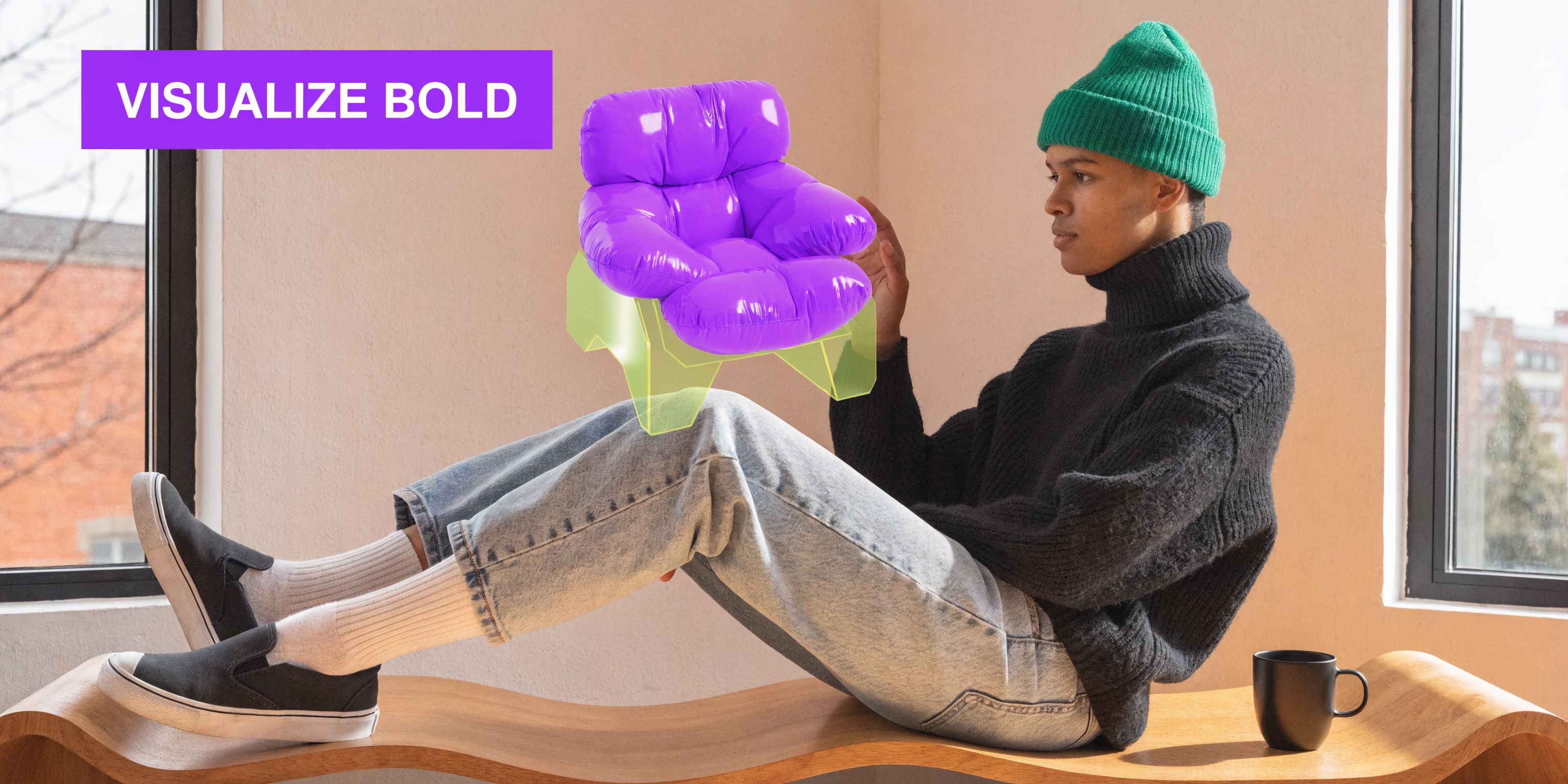
Visualize Before You Buy with aiStager
Retro futuristic furniture is fun to admire online and much harder to judge in your room. A chair that looks compact on a product page may read much larger once its curve projects into the walkway. A chrome lamp can feel elegant in one space and harsh in another. A bold orange finish may look perfect against walnut and completely wrong against gray flooring.
That is why previewing matters.
Why this style needs a visual test
This look depends on proportion more than many people realize. Rounded chairs, pedestal tables, and low sweeping sofas do not behave visually like boxier furniture. The footprint can be surprising, and the finish has a huge effect on light.
That is one reason general shopping photos are not enough. This article on how to use online furniture photos to make smarter buying decisions is a helpful reminder that product images need context before they become purchase decisions.
A practical workflow for trying ideas
aiStager lets you upload a room photo and paste a link to a real product so you can preview that item in the space as a hyper-realistic image using true room and furniture dimensions. That matters with retro futuristic furniture because shape, overhang, and scale are a big part of whether a piece feels iconic or awkward.
The workflow is straightforward.
- Photograph the room clearly. Use a photo that shows the main wall, floor, and nearby furniture.
- Pick a real product. This can come from a marketplace, a retailer, or a vintage listing.
- Paste the product link. The platform pulls the product imagery and dimensions.
- Compare versions. Try different colors, finishes, or even different brands of the same furniture type.
- Review the result in context. Check walking space, visual balance, and how light plays off the finish.
If you want to see the process in more detail, this guide shows how to see furniture in your room.
Easy tests that save expensive mistakes
Here are a few examples that work especially well for this style:
- Pod chair comparison: Test one rounded chair in white, then swap to black. The room may suddenly feel lighter or far more dramatic.
- Sofa brand match-up: Place a curved sofa from one retailer, then compare it with a sleeker option from another brand. You may find that one reads elegant while the other feels too heavy.
- Finish study: Try chrome, smoked acrylic, and warm wood side tables next to the same sofa. The overall mood changes fast.
- Dining table choice: If you like a Tulip-style table, compare a white top with a darker version in the same room photo rather than guessing from separate product pages.
The biggest benefit is not novelty. It is decision clarity. You stop wondering whether a bold piece might work and start seeing what it does to your room.
This is especially useful for homeowners mixing eras. You may love a sculptural chair from a vintage dealer and a cleaner sofa from CB2. Testing both together helps you spot whether the room feels curated or disconnected before anything gets delivered.
The Future of the Past Is in Your Hands
Retro futuristic furniture is not just a style trend. It is a way of decorating with optimism, personality, and a little courage.
Some people are drawn to the smooth Space Age mood. Others love the louder postmodern side. Both can work beautifully in today’s homes when you control three things well: shape, material contrast, and scale.
That last point matters most. Bold furniture asks for better decisions. When you can preview a rounded chair, a chrome lamp, or two different sofa finishes in your own room first, the style stops feeling risky and starts feeling usable.
You do not need to redesign your whole house at once. Start with one piece. Test it. See how it changes the room. Then build from there.
If you want to try retro futuristic furniture without guessing, aiStager makes the first step simple. Upload a photo of your room, add a product link, and compare real furniture in realistic context before you buy.