Stonewood Terrace Apartments: A Leasing & Staging Guide
Explore Stonewood Terrace Apartments in Dallas. Our guide covers floor plans, amenities, and virtual staging tips to help agents lease older properties faster.
A leasing team usually knows the feeling. The location is solid. The rent story is workable. The unit has practical features residents still care about. But the listing photos make the apartment look flat, older than it feels in person, and harder to choose next to newer properties with cleaner visual branding.
That’s the exact kind of challenge stonewood terrace apartments represents.
It’s not a mystery property. It’s a real apartment community at 3872 Dixon Cir, Dallas, TX 75210 in the South Dallas Fair Park area, a neighborhood with strong local identity and everyday convenience. For leasing teams, that combination matters. A property can be older and still lease well if the marketing presents the right value clearly, truthfully, and visually.
Your Guide to Stonewood Terrace Apartments
Stonewood Terrace Apartments sits in a part of Dallas that gives leasing agents a real story to work with. The community is in South Dallas Fair Park, an area known for cultural attractions including the State Fair of Texas, which draws over 2.3 million visitors annually according to Apartments.com’s Stonewood Terrace listing. The same listing notes the property’s access to major employers in healthcare and logistics, which gives the location practical relevance beyond neighborhood identity.
That’s the first trade-off to understand. Stonewood Terrace doesn’t sell itself as luxury product. It sells location, utility, and accessibility. In my experience, older communities lease better when the team stops trying to imitate new construction and starts presenting the property as the best version of what it already is.
Why the location still does heavy lifting
For many renters, especially in an urban market, the first decision isn’t about quartz counters or trendy pendants. It’s about commute time, neighborhood familiarity, budget control, and whether daily life feels manageable.
Stonewood Terrace gives a leasing team several honest talking points:
- South Dallas Fair Park setting with a recognizable neighborhood identity
- Proximity to employers in practical sectors, not just lifestyle destinations
- Urban convenience that can matter more than polished finishes for price-sensitive renters
That changes how the property should be marketed. The listing strategy should connect the apartment to the renter’s routine. Commute. Parking. Essentials. Comfort. Simplicity.
Practical rule: When a property isn’t winning on “brand new,” it has to win on “easy to live in.”
The familiar leasing problem
A team can know all of that and still struggle to convert views into tours.
Why? Because most prospects don’t read a listing like an asset manager. They scan photos first. If the images feel dated, sparse, or visually confusing, the prospect often decides the property is less appealing before they ever absorb its strengths.
That’s why Stonewood Terrace is such a useful case study. It reflects a common situation in multifamily leasing. Good location. Functional offering. Older presentation. Competitive pressure from newer stock. The issue isn’t only the property. The issue is how the property gets seen.
A Realistic Look Inside the Units and Amenities
The basics matter here, and Stonewood Terrace has more substance than many older listings communicate well. According to UMoveFree’s Stonewood Terrace page, the property was constructed in 1963, renovated in 1999, and includes 160 units. The same source highlights features that still matter to renters: central air conditioning, walk-in closets, wall-to-wall carpeting, and an all bills paid utility structure.
That last point is more important than many marketers treat it. “All bills paid” isn’t glamorous, but it’s concrete. It simplifies the resident’s monthly decision. In an older property, operational clarity often beats aspirational branding.
What works in the property’s favor
A good leasing strategy starts with what is already real and useful.
| Feature | Why it matters in leasing |
|---|---|
| All bills paid | Easier budgeting for residents and a clearer value conversation |
| Central air conditioning | Basic comfort that prospects expect in Dallas |
| Walk-in closets | Storage is one of the easiest practical wins to market visually |
| Wall-to-wall carpeting | Not trendy, but can still read as comfortable if styled correctly |
Those features won’t create excitement on their own. But they can support a stronger message if the presentation is disciplined.
Where the friction shows up
The challenge is equally straightforward. A property built in the early 1960s and last renovated in the late 1990s sits in an awkward middle zone. It’s not historic in the way a curated vintage property gets marketed. It’s not modern enough to let clean architecture carry the visuals. That leaves leasing teams with a common problem: the apartment may function better than it photographs.
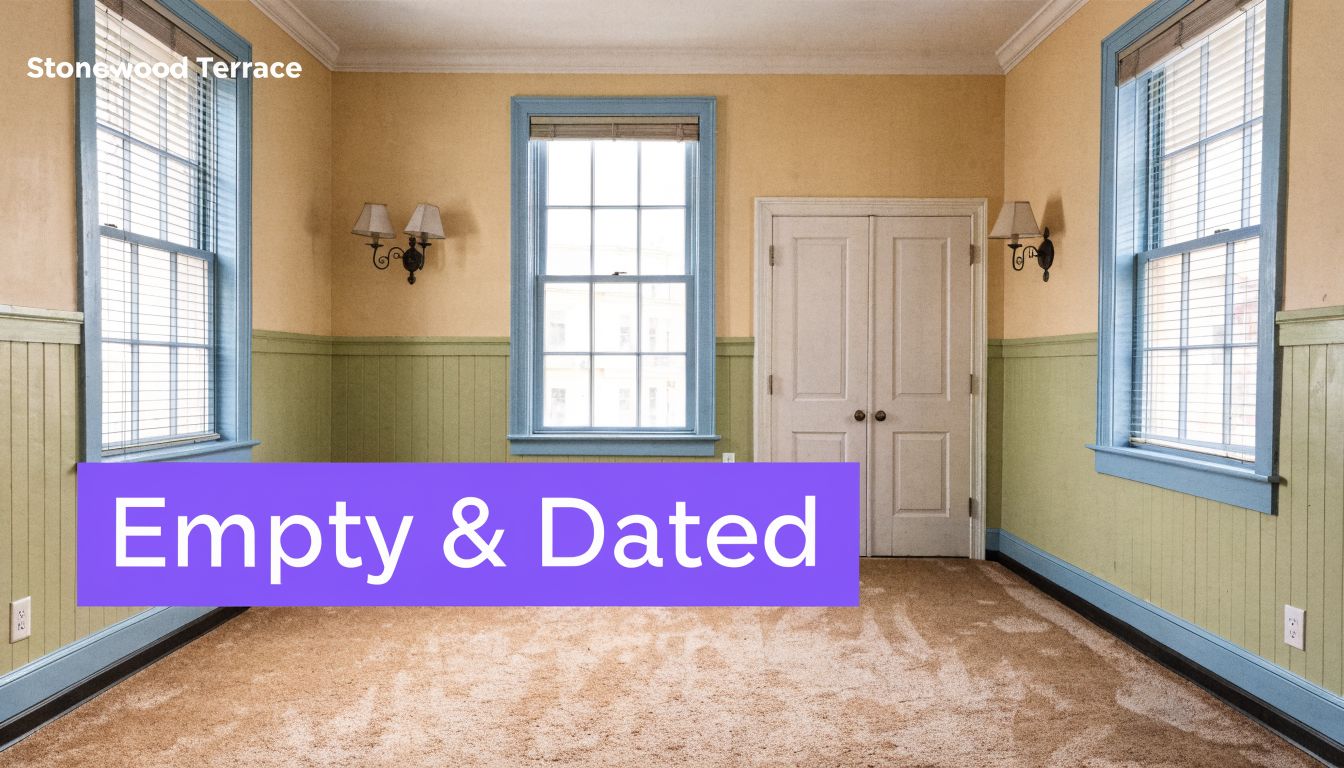
Prospects notice details fast. Older carpet, simpler trim, basic blinds, and a conventional layout can read as “dated” even when the apartment is clean and serviceable. That reaction isn’t always fair, but it is real.
Empty rooms don’t just look vacant. They often look smaller, older, and harder to furnish than they actually are.
What standard listing photos miss
A standard photo set usually captures walls, windows, flooring, and corners. It documents the room, but it doesn’t interpret it. For older communities, that’s a problem.
Leasing teams need visuals that answer practical questions such as:
- How does a sofa fit in the living room?
- Can the carpet work with lighter or darker furniture?
- Does the layout feel comfortable for daily living?
- Can an older unit still feel current without pretending to be brand new?
Those are visual questions. Text can support them, but text can’t solve them.
The Marketing Challenge of Empty Dated Spaces
The hardest units to market are often not the worst ones. They’re the ones that ask too much imagination from the prospect.
At Stonewood Terrace, that issue is tied to age and presentation. Apartment Finder’s property page notes that the property was built in 1963 and renovated in 1999, and describes a modernization gap created by its 63-year-old infrastructure and limited recent updates. That gap is difficult to overcome with standard photos of empty units, especially when the property is competing with newer developments in South Dallas.
Why vacant rooms work against older properties
An empty room in a newer building can still look crisp because the finishes do the selling. An empty room in an older building usually needs help. Beige carpet, plain walls, older trim conditions, and modest natural light can make a room feel unresolved.
That creates what I’d call an imagination gap. The leasing agent can describe comfort, value, and layout all day. The prospect still sees a blank room and starts mentally adding cost, effort, and uncertainty.
If the target renter is furnishing a place for the first time, that uncertainty gets even bigger. A practical resource like this guide to furniture for their first apartment can help explain what pieces matter most, but the listing itself still has to show how those pieces would live in the room.
What standard photos fail to do
Standard vacancy photos are useful for documentation. They’re weak at persuasion.
They usually fail in three ways:
- They flatten scale. Prospects can’t tell whether a loveseat, dining set, or bed will fit comfortably.
- They magnify age. Every older finish becomes the main subject when no furnishing balances the frame.
- They ask the renter to do design work. Most renters won’t do that. They’ll move on to a listing that feels easier to understand.
A good example of how emptiness affects perception is covered in this analysis of empty room photos, which gets into why vacant spaces often underperform visually even when the underlying layout is strong.
The prospect isn’t rejecting the floor plan. They’re rejecting the effort required to imagine living there.
That distinction matters. It means the marketing problem is solvable.
How Virtual Staging Bridges the Imagination Gap
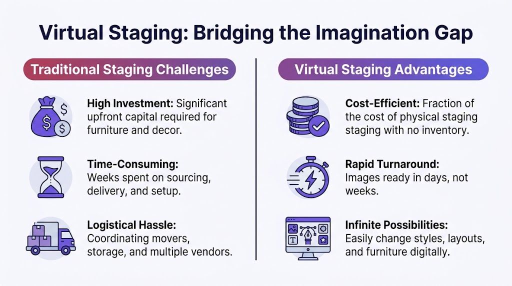
Physical staging can work, but it’s rarely the best fit for an older apartment community with multiple unit turns, layout variations, and pricing pressure. It takes coordination, furniture, setup time, and a level of consistency many leasing teams can’t maintain unit after unit.
Virtual staging solves a different problem than is commonly believed. It isn’t just decoration. It’s a communication tool. It helps a renter read the room correctly.
What virtual staging does better
For properties like stonewood terrace apartments, virtual staging gives the leasing team something standard photos can’t: context.
A prospect can see:
| Question | What a staged image answers |
|---|---|
| Will my furniture fit? | Approximate room function and placement become easier to read |
| Can this older space feel current? | Style direction gives the room a more updated impression |
| Is the layout awkward? | Furnished images show traffic flow and use zones |
| Could I feel comfortable here? | The room starts to read as a home, not an empty shell |
That’s the advantage. Good staged visuals lower uncertainty.
Where most staging tools fall short
A lot of visual tools create attractive images that don’t hold up on closer inspection. The furniture scale feels off. The room proportions drift. Perspective gets muddy. For leasing, that’s risky. If a staged image looks fake, it doesn’t build trust. It does the opposite.
That’s why teams should care about realism and dimension accuracy, not just style presets. If you’re evaluating the category, EMFURN’s definitive guide to home staging is a useful primer on what staging is meant to accomplish. But for rental marketing, the standard should be higher. The image has to feel believable enough that the prospect can make a real decision from it.
For teams that want the broader category explained before choosing a workflow, this overview of what virtual staging is is a good reference point.
The practical decision
Use physical staging when the property is high-value, low-turn, and the exact unit justifies the setup effort.
Use virtual staging when you need speed, consistency, style variation, and a way to show multiple unit types without turning every vacancy into a production project.
That’s usually the better fit for an aging multifamily asset.
Visually Transforming a Stonewood Terrace Apartment
The strongest use case at Stonewood Terrace isn’t fantasy staging. It’s clarity staging. The goal is to help a prospect understand what the apartment can be with realistic furniture, believable spacing, and a design direction that suits the likely resident.
ForRent’s listing for Stonewood Terrace points out a core issue: there’s conflicting unit data and no available floor plans across the property’s 160 units. That makes consistent visual inventory more valuable. If property managers upload photos from different empty layouts and stage them in a standardized way, prospects can compare spaces more confidently.
Scenario one with a mid-century modern direction
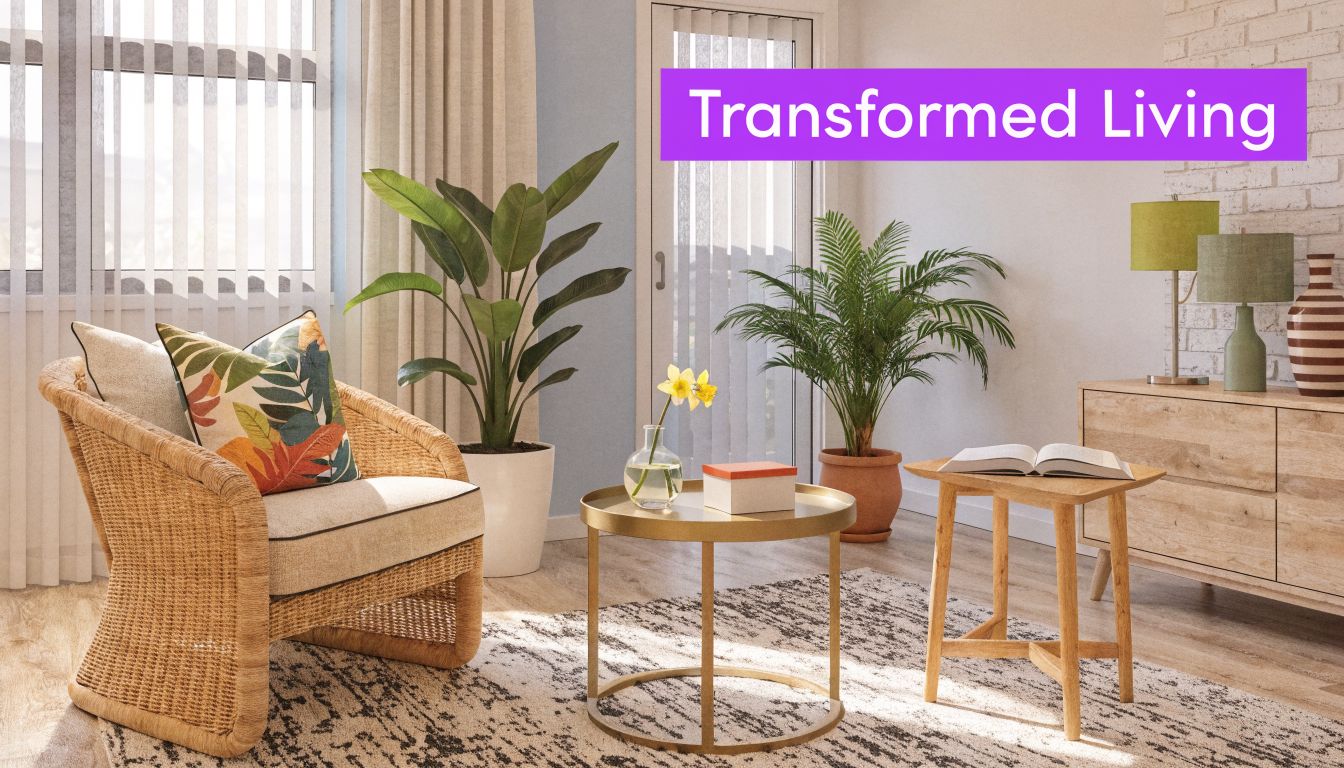
This is the easiest style bridge for an older apartment. It respects the age of the property instead of fighting it.
Take a vacant living room photo. Use a warm neutral sofa such as an Article Sven as the anchor piece. Add a simple West Elm media console with low horizontal lines. Bring in a wood coffee table, a restrained floor lamp, and art that doesn’t crowd the walls. Suddenly, older trim and carpet can read as part of a calmer, more intentional room.
Why this works:
- The furniture profile stays clean
- Wood tones soften dated finishes
- The room feels adult and settled without looking expensive
This approach is especially useful when the unit has straightforward geometry. You don’t need dramatic styling. You need believable living.
Field note: The best staged image for an older rental usually isn’t the flashiest one. It’s the one a renter believes they could recreate.
Scenario two with an urban bohemian direction
Some units respond better to softness and layering than to strict lines. In that case, test a more relaxed setup.
Use a velvet sofa option from Joybird in one version, then try a different colorway of a similar silhouette in another. Add a patterned rug from Ruggable, plants, woven accents, and mixed pillows. The point isn’t to overstyle the room. The point is to show that a basic apartment can still feel personal and current.
This type of variation matters because renter taste isn’t uniform. A leasing team should be able to test:
- Different sofa brands
- Different colors of the same sofa
- Different wood finishes on case goods
- Alternative rugs for the same footprint
That’s where dimension-true rendering becomes valuable. The room still has to make spatial sense after each swap.
How the workflow should look
For a leasing or marketing team, the process should stay simple:
- Photograph the empty room cleanly. Straight lines, good daylight, no clutter.
- Choose the target renter profile. Budget-conscious first apartment, small household, or style-focused urban renter.
- Pull real product links. Use actual retail items you want to test in the room.
- Generate several options. Keep the layout consistent and vary only what helps decision-making.
Here’s a short visual walkthrough of the idea in action:
What good transformation looks like
A useful staged set doesn’t hide the apartment. It interprets it honestly.
The final images should show:
| Good staging choice | Why it helps |
|---|---|
| True room proportions | Builds trust and reduces “this looked bigger online” disappointment |
| Real retail products | Makes the room feel actionable, not imaginary |
| Style variation | Lets the same unit appeal to more than one renter taste |
| Consistent framing across units | Helps teams build a usable leasing library |
The result is better than a prettier photo. It’s a better explanation of the product.
A Practical Playbook for Leasing Agents
Most leasing teams don’t need a complicated content strategy. They need a repeatable one. For older communities, the visual workflow has to be fast enough for regular turns and consistent enough that every listing doesn’t look like it came from a different property.

The working system
I’d keep it to five moves.
Start with one clean photo set
Shoot the living room, primary bedroom, and kitchen or dining area. Keep angles repeatable so future units can be staged and compared in the same format.Match the style to the renter, not your personal taste
If the likely prospect wants practical comfort, don’t style the room like a luxury condo showroom. Simpler, grounded design usually performs better for broad rental appeal.Use real products people recognize
Test items from brands such as Article, West Elm, Joybird, or Ruggable. Familiar retail references make the room feel attainable.Create more than one version of the hero room
A single staged image is helpful. Two or three options are better if they answer different objections. One version can show a lighter palette. Another can test darker finishes or a different sofa shape.Distribute the images everywhere the prospect sees the property
Listing pages, social posts, email follow-up, leasing packets, and investor updates should all use the same visual story.
Where teams usually waste effort
They spend too much time editing copy and too little time fixing the images.
For an older rental, the headline rarely changes the outcome on its own. The prospect needs to understand the room before they’ll care about the details. If the images are weak, the rest of the marketing has to work too hard.
A good companion resource for teams building a broader campaign is this guide on how to market rental properties. It aligns well with the practical reality of multifamily leasing, where speed and clarity matter more than elaborate branding.
Use your staged images as sales tools, not just listing decorations. Each one should answer a question a prospect is already asking.
The simplest standard to hold
Ask one question before publishing any image: Does this help a renter picture daily life in the unit?
If the answer is no, replace it.
That standard will improve older property marketing faster than almost any copy rewrite.
Inquire About Leasing or Start Your Virtual Staging
If you’re interested in stonewood terrace apartments as a renter, the most practical next step is to contact the property through its current listing channels and confirm availability, floor plan details, and current rates. Because listing details can vary across platforms, it’s smart to verify the exact unit configuration, included features, and move-in terms before making a decision.
If you market apartments, this property is a strong reminder of what visual presentation can fix. Older communities often don’t need a different product. They need a better explanation of the product they already have. Better room photos, consistent staging, and realistic furniture placement can make a dated unit easier to understand and easier to choose.
If you want that kind of visual clarity in your own listings, try aiStager. It’s the only solution that generates hyper-realistic photos with true-dimension rooms and furniture objects, using a room photo plus a real product link. You can test different versions of the same sofa, compare colors and finishes, declutter images, and create believable staged scenes in just a few clicks. For leasing teams, that means faster creative turnaround, a cleaner visual inventory, and listing images that help renters make decisions.