Mastering Modern Interior Apartment Design
Unlock modern interior apartment design secrets. Learn principles, space planning, lighting, & visualize furniture with AI.
You’ve saved a dozen room screenshots. You’ve compared sofas, paint swatches, rugs, and lighting ideas. You know what you like when you see it, but your own apartment still feels unresolved. That’s the hard part of modern interior apartment design. The issue usually isn’t taste. It’s translation.
The struggle isn't with inspiration itself. It lies in seeing how inspiration will behave inside a real room with imperfect walls, low light, awkward corners, and furniture that has to fit actual daily life. A beautiful reference image is easy to admire. A livable apartment is harder to build.
Modern apartment design works best when it’s treated as a practical design method, not a trend label. It should help a space feel clearer, calmer, more functional, and more personal. Sometimes that means clean lines and fewer pieces. Sometimes it means richer color, layered texture, and a stronger point of view. The common thread is intention.
Your Guide to Modern Apartment Design
A modern apartment rarely starts modern. It starts with a problem. The living room is too narrow. The bedroom has no storage. The dining area feels like a hallway. Or the whole place is serviceable but flat, with nothing pulling it together.
That’s why good design begins before you buy anything. The first decisions aren’t about a chair or a lamp. They’re about how the room should work, where the eye should land, and what needs to disappear so the apartment feels composed.
A strong room doesn’t come from more choices. It comes from better constraints.
The apartments that look effortless usually have a disciplined backbone. Furniture fits the architecture. Lighting has layers. Storage is built into the visual language instead of fighting it. Materials repeat just enough to create rhythm. Accent pieces do a job instead of filling space.
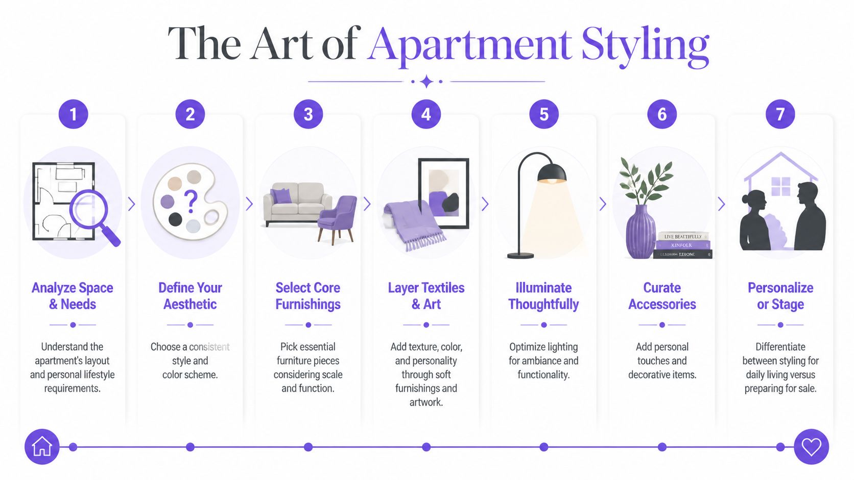
A practical process usually looks like this:
- Start with layout: Solve movement and function before color.
- Build the envelope: Decide on wall tone, flooring direction, cabinetry, and major materials.
- Choose anchor pieces: Sofa, bed, dining table, storage units.
- Layer light and texture: With these elements, the apartment stops feeling flat.
- Style last: Art, objects, books, textiles, and small decor should support the room, not rescue it.
The biggest obstacle is the visualization gap. A paint chip doesn’t show how a room darkens at dusk. A product page doesn’t show whether a sofa overpowers your window wall. A floor plan alone doesn’t tell you if a narrow room will still feel generous once everything is installed.
That gap is where many projects go off course. It’s also where modern visualization tools have become useful. They make it easier to test how ideas would look in your room before spending money on the wrong move.
Understanding Modern Design Principles
Modern design is often confused with minimalism. They overlap, but they aren’t the same thing. Minimalism reduces. Modern design organizes. It asks every element to justify its place, then shapes the room around clarity, comfort, and function.
What modern design actually looks like
At its core, modern design depends on a few durable principles:
- Clean geometry: Straight lines, simple silhouettes, and furniture that reads clearly from across the room.
- Functional planning: Rooms should support daily routines without awkward circulation.
- Material honesty: Wood should feel like wood, stone like stone, linen like linen. Overworked finishes often age badly.
- Controlled contrast: A modern room can be warm or crisp, but it usually avoids visual noise.
That doesn’t mean every room has to be sparse. In fact, current apartment interiors are mixing traditional character with modern ease. According to Apartment Therapy’s 2025 designer survey, 91% of respondents identified Parisian Pied-à-Terre style as continuing to dominate, while Mid-Century Modern and Scandinavian styles rose to 66% and 64%. The same survey found color preferences shifting toward heathered plum at 45% and olive green at 20%.
That combination tells you something important. Modern apartment design isn’t moving in a single direction. Designers are blending architectural memory with practical living.
Three interpretations that work well in apartments
| Style direction | What it adds | Where it works best |
|---|---|---|
| Scandinavian | Soft light woods, pale textiles, visual calm | Smaller apartments that need brightness |
| Mid-Century Modern | Sculptural furniture, walnut tones, strong silhouettes | Living rooms that need character without clutter |
| Parisian-inspired modern | Molding, mirrors, classic detailing with updated lighting | Older apartments with architectural bones |
A Parisian-inspired apartment doesn’t need a marble mantel to feel right. It may just need one gilded mirror, one curved sconce, and cleaner upholstery. A Scandinavian apartment doesn’t need to be all white. It may need oak, wool, and restraint. Mid-century modern doesn’t mean turning the room into a set piece. One well-scaled teak sideboard can do more than six smaller decorative items.
What to keep and what to avoid
Keep the principles. Don’t copy the stereotype.
Practical rule: If a room looks modern in photos but feels inconvenient to live in, it isn’t resolved yet.
What works:
- Pieces with visual breathing room
- Repeated materials across rooms
- Lighting that feels architectural
- A clear focal point
What usually fails:
- Tiny rugs that make furniture float
- Furniture chosen by style alone
- Cold finishes without texture
- Decor that imitates a showroom instead of supporting life
The best modern apartments feel edited, not emptied.
Effective Space Planning for Any Layout
Most design advice assumes your apartment is a neat rectangle. Many aren’t. Some have slanted walls, offset windows, leftover corners, and narrow passages that break every standard furniture diagram. That’s why generic layout advice falls apart so quickly in real city apartments.
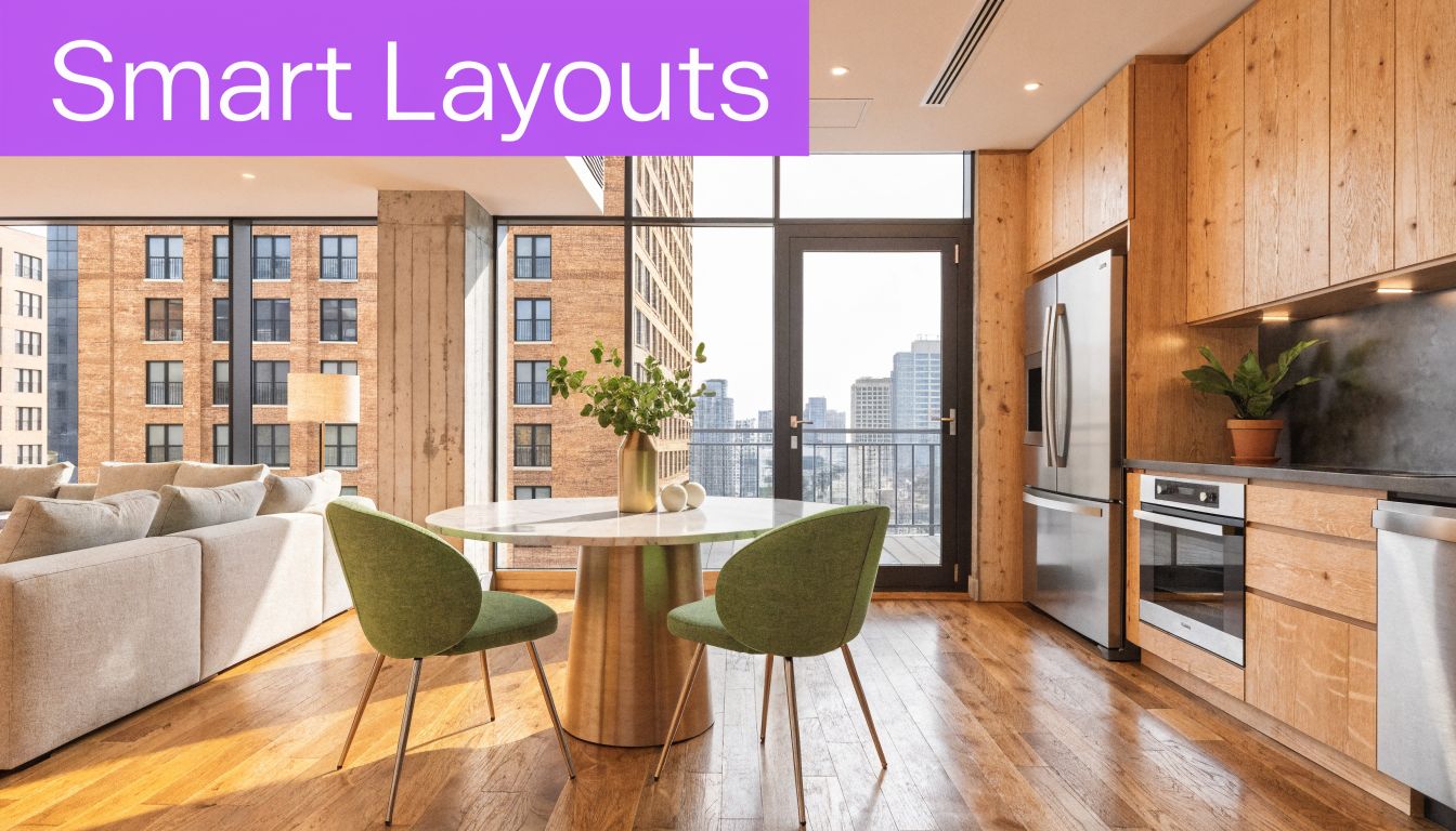
According to this review of modern apartment design challenges, 40% of new urban developments include non-standard layouts, and 65% of clients struggle with these geometries. That tracks with practice. Awkward rooms don’t need more decorating. They need better zoning.
How to read a difficult room
The first mistake is pushing everything to the perimeter. In an L-shaped room, that often creates a dead center and two weak zones. In a long narrow room, it turns the space into a corridor. In a room with a slanted wall, it exaggerates the odd angle instead of absorbing it.
Use this checklist before placing anything:
- Identify the strongest wall: Usually the one that can anchor the main furniture grouping.
- Mark the circulation path: Don’t let seating steal the natural route through the room.
- Decide the room’s primary job: Lounge, dining, work, sleep, or a mix.
- Use shape to your advantage: Odd corners can hold reading nooks, bar cabinets, plants, or compact desks.
For a deeper planning framework, this guide to interior design space planning is a useful companion to room-by-room testing.
Layout fixes that work in real apartments
L-shaped living rooms
Treat one leg as the main zone and the other as a secondary destination. The main zone might hold the sofa and coffee table. The smaller leg might become a reading corner, dining niche, or compact workspace. Don’t split the room into equal halves unless both halves have a clear purpose.
Long narrow rooms
Float furniture away from the walls. A sofa placed slightly inward, with a slim console behind it, can create a visual boundary without stopping movement. Round or oval coffee tables help because they soften the lane-like effect.
Slanted walls and strange corners
Use lower furniture near the awkward edge. Tall bookcases can make the angle feel more dramatic unless the fit is custom. A lounge chair, bench, pedestal table, or floor lamp often handles the area more gracefully.
In difficult layouts, the goal isn’t symmetry. It’s balance and usable floor area.
Test before you commit
This is one place where photo-based visualization is more useful than guesswork. With aiStager, you can upload a room photo and test layout ideas using dimension-true furniture from actual product links, then see the result as a photoreal image in the actual space. That matters when you’re deciding whether a compact loveseat leaves enough breathing room, or whether a round dining table solves a corner better than a rectangular one.
A good plan should answer practical questions before shopping starts:
- Can two people move through the room comfortably?
- Does the room still feel calm once storage is added?
- Is the focal point clear from the entry?
- Does each zone have a reason to exist?
If the answer to any of those is no, keep planning. Styling won’t fix a weak layout.
Choosing Your Color Palette and Materials
Color is where many apartments either come alive or become confused. People usually make one of two mistakes. They stay so safe that the room feels unfinished, or they add bold choices without enough structure underneath. A good palette needs hierarchy.
Build the room before you decorate it
One useful method is the 60-30-10 rule. Use it as a guide, not a law.
- 60 percent: the main field, usually wall color, large rug area, or dominant upholstery tone
- 30 percent: the secondary layer, often drapery, bedding, case goods, or a second upholstery finish
- 10 percent: the accent, where personality can push harder through art, smaller furniture, lamps, or pillows
The trick is to pair color with material. Olive green in velvet behaves differently than olive green in matte paint. Burgundy in lacquer feels sharper than burgundy in mohair. Chocolate brown in walnut reads richer than chocolate brown in flat synthetic laminate.
Current preferences support a stronger hand. In 1stDibs’ 2025 interior design trends report, 33% of designers selected maximalism as their primary design approach. The same report notes that chocolate brown and burgundy nearly doubled in popularity, while 28% prioritized colorful painted murals and 26% pointed to patterned wallpaper as a standout feature.
What modern color looks like now
This doesn’t mean every apartment should become dense and dramatic. It means modern rooms are allowing more personality back in.
A few combinations that work well in apartments:
| Base mood | Main materials | Accent direction |
|---|---|---|
| Soft modern | Warm white walls, pale oak, linen | olive green, blackened bronze |
| Urban tailored | Taupe upholstery, walnut, brushed metal | burgundy, cognac, charcoal |
| Collected modern | Plaster tones, textured wool, aged wood | chocolate brown, mural tones, deep red |
If you’re curious about broader room-by-room color decisions, this article on home design color is useful for comparing mood, light, and finish choices.
Test the bold move in the actual room
A daring color is rarely the problem. The wrong surface is.
Farrow & Ball wallpaper may look perfect on a sample board and overpowering on a full ceiling. A rich burgundy wall can feel elegant in a bright south-facing room and heavy in a dim entry. Even a subtle limewash changes dramatically depending on shadows, floor tone, and adjacent trim.
That’s why the sequence matters:
- Choose the dominant surface first
- Pair it with one natural material
- Add one contrasting finish
- Hold back small accents until the big relationship feels right
The room should feel intentional from across the room before it feels interesting up close.
Modern apartments benefit from texture because texture keeps minimalist spaces from becoming sterile. Use bouclé sparingly. Mix matte and reflective surfaces. Let wood carry warmth. Let stone or metal sharpen edges when needed.
What doesn’t work is treating color as a final accessory decision. In a well-designed apartment, color shapes the architecture of the room long before the throw pillows arrive.
Selecting and Scaling Your Furniture
Furniture selection is where many modern apartments lose proportion. The style may be right, but the scale is wrong. A sofa is too deep for the room. Nightstands are too small for the bed. The dining table leaves no room to move. None of these mistakes look serious on a product page. In the apartment, they control everything.
Why scale matters more than style
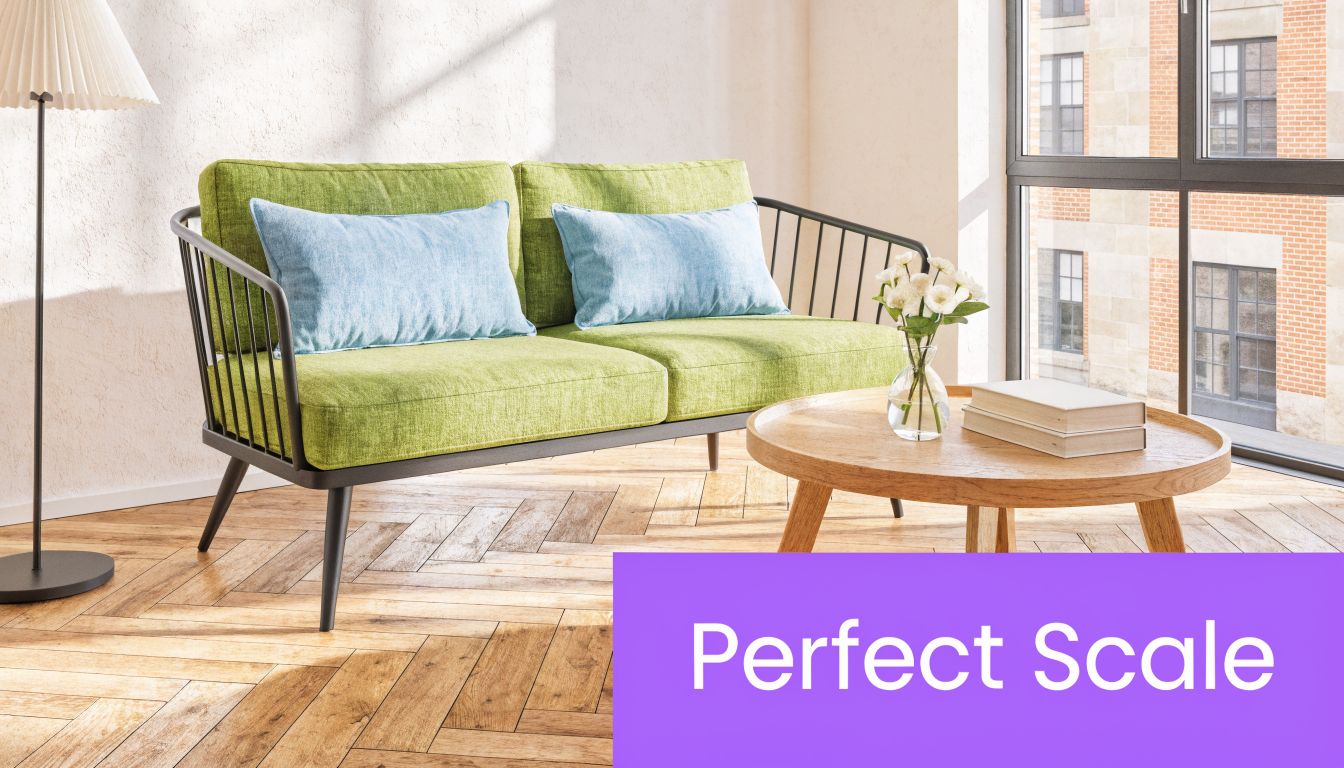
People often shop by silhouette first. That’s understandable. You fall for the profile of a low sofa, the warmth of a timber bed, the softness of a rounded armchair. But proportion decides whether the room works.
A few reliable checks:
- Sofa depth: Great in a large room, risky in a narrow one.
- Legibility from the doorway: Large forms should read clearly when you first enter.
- Visual weight: A solid plinth base feels heavier than open legs, even at similar dimensions.
- Height relationships: Coffee tables, side tables, headboards, and media units need to relate to one another.
If you want a concise primer before buying, this guide on scale and proportion in interior design gives a solid framework.
Compare real products, not generic stand-ins
Exact product testing changes the process. If you’re deciding between a sleek sofa from Article and a larger sectional from Restoration Hardware, the difference isn’t just aesthetic. It changes circulation, rug size, lamp placement, and how much visual mass the room can tolerate.
Using a room photo and a product link is more helpful than swapping in a generic “modern sofa” model. When the dimensions are accurate, you can compare:
- One sofa brand against another
- The same sofa in different fabric colors
- The same chair in leather versus fabric
- A dining table in alternate finishes
- How one bed frame changes the feel of the whole bedroom
For low-profile bedrooms, the Comfort Pure bed frame collection is a good example of pieces that can calm a room visually, especially when you don’t want the bed to dominate a compact space.
Choose anchor pieces first
Don’t furnish evenly across the room. Start with the item that does the most visual and functional work.
In the living room
Begin with the sofa or sectional. Then place the rug. Then determine whether the room can support a coffee table, ottoman, or nesting tables.
In the bedroom
Start with the bed, then decide whether the room can handle a bench, tall dresser, or wall-mounted sconces instead of table lamps.
In the dining area
Table shape matters more than table style. A round pedestal often solves movement better than four legs in a tight corner.
A quick visual example helps show how much furniture shape changes a room’s balance:
What works and what usually fails
| Good choice | Why it works | Common mistake |
|---|---|---|
| One generous sofa | Creates a clear anchor | Several small seats that clutter circulation |
| Wall-mounted lighting by the bed | Frees surface space | Oversized lamps on tiny nightstands |
| Closed storage in main sightlines | Reduces visual noise | Open shelving everywhere |
| Dining chairs with light frames | Keeps eating areas airy | Bulky host chairs in a compact apartment |
Buy fewer pieces with better scale. Small rooms rarely fail because they lack furniture. They fail because each piece asks for too much attention.
Modern interior apartment design depends on restraint at the furniture stage. Once the major pieces fit correctly, the room starts to look composed before styling even begins.
Mastering Modern Apartment Lighting
Lighting is one of the easiest ways to make a modern apartment look finished. It’s also one of the most common failures. Many apartments rely on a single ceiling fixture and a floor lamp, then wonder why the room feels flat at night.
Good lighting has layers. According to Rayon’s technical planning guidance, layered systems that combine ambient lighting at 300-500 lux, task lighting at 500-1000 lux, and accent lighting at 100-200 lux can achieve 25-40% energy savings in apartments. The same source notes that relying on a single source can create shadow zones and glare.
The three layers every apartment needs
Ambient light
This is your base illumination. Recessed downlights, flush mounts, cove lighting, or well-placed ceiling fixtures can all do the job. Ambient light should make the room readable without making it feel exposed.
Task light
This supports activity. A pendant over the dining table, an articulated reading lamp by a chair, under-cabinet lighting in the kitchen, or bedside sconces all belong here. Task lighting should be direct and useful, not decorative first.
Accent light
This is what gives a room depth. Picture lights over art, a table lamp washing light onto a wall, or a small spotlight into shelving can shift a room from functional to atmospheric.
A simple room-by-room approach
- Living room: Ceiling light for general illumination, table or floor lamp near seating, one accent source for art or shelving
- Bedroom: Soft ambient layer, bedside reading light, optional dresser or corner lamp
- Kitchen: Even overhead light, focused counter lighting, pendant if there’s an island or dining edge
- Entry: One attractive fixture plus a softer secondary light if the area is deep
Bad lighting makes good furniture look cheaper. Good lighting makes ordinary finishes look considered.
What to avoid
A few mistakes appear constantly in apartment work:
- Cool, harsh bulbs in warm interiors
- Fixtures that are undersized for the room
- One bright overhead source with no side lighting
- Decorative fixtures placed without considering function
Modern lighting should feel integrated into the room’s rhythm. In practice, that means deciding where shadows should exist, not just where brightness should land. A room needs contrast to feel calm.
If you’re planning fixture changes, renderings are useful because they let you compare how pendants, sconces, and lamps affect mood across daytime and evening conditions. That’s especially helpful in apartments where natural light changes dramatically from one facade to another.
Creating Smart Storage for Small Spaces
Storage has to do two jobs in an apartment. It has to hold your life, and it has to make the room feel less crowded while doing it. That second job is where many storage solutions fail. A room can be technically organized and still feel visually heavy.
Research summarized in this modern interior design guide notes that the strategic use of light color palettes, full-height cabinetry, and large glass openings can increase the perceived spaciousness of compact apartments by up to 30-50%. That combination works because it reduces visual interruption and carries light farther into the room.
Make storage part of the architecture
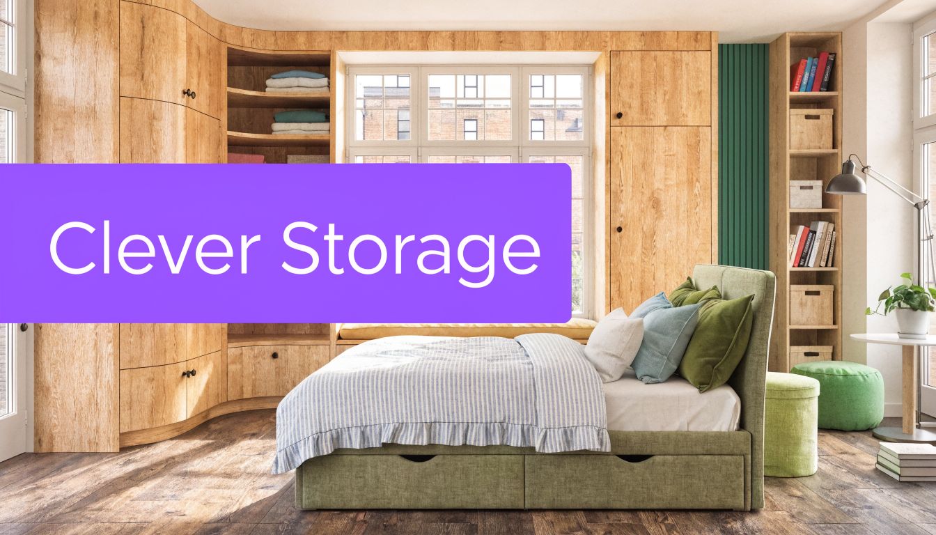
The most effective storage rarely looks like added storage. It reads as part of the room.
Think in these terms:
- Full-height cabinetry: Better than a mix of short units that chop the wall visually
- Tone-on-tone finishes: Cabinets close to wall color recede more gracefully
- Integrated pulls or touch latches: Less visual noise than busy hardware
- Mixed open and closed storage: Display only what earns the view
Where apartment storage often works best
Entry zones
A shallow cabinet, bench, or wall of hooks can solve daily clutter before it spreads into the living space.
Bedrooms
Tall wardrobes work harder than scattered dressers. If a room is tight, wall-mounted bedside shelves can free up floor area.
Living rooms
Media storage should hide enough to keep surfaces clear. Closed lower units with one open niche often feel calmer than fully open shelving.
For renters and homeowners trying to improve closet function without overcomplicating the room, MORALVE's innovative closet solutions offer useful ideas for organizing apartment storage in a cleaner, more systematic way.
Small-space storage choices that help a room breathe
| Better approach | Why it helps |
|---|---|
| Cabinets to the ceiling | Uses vertical volume and avoids a dusty visual gap |
| Light cabinet finishes | Keeps bulk from feeling too dominant |
| Storage under a window seat or bench | Adds function without introducing a new furniture piece |
| One larger unit instead of several small ones | Makes the room feel less busy |
A well-designed apartment hides effort. That’s especially true with storage. When every object is visible, the room has to work too hard. When storage is integrated, the apartment feels quieter, even before you edit anything.
Bringing It All Together Styling and Staging
Styling is where a room becomes specific. It’s also where many people overcorrect. After spending time on layout, furniture, and finishes, they start adding objects too quickly. The result is a room with good bones and confused detailing.
Modern styling works when it supports the architecture of the room. A styled apartment shouldn’t feel decorated all over. It should feel sharpened.
Styling for living and styling for market
These are not the same task.
Personal styling
This version should reflect routine and taste. Books, ceramics, textiles, framed work, and collected objects all matter here. The room should have friction in the right places. A sculptural lamp, a rough linen throw, or a stack of art books can keep the apartment from feeling too polished.
Staging
This version edits personality down and clarity up. Fewer objects. Cleaner surfaces. More emphasis on light, scale, and flow. The goal is to help another person imagine themselves in the apartment.
A good reference for people trying to curate unique spaces with art and collected character is this piece from Colorado Art Services. It’s useful when a room needs personality without becoming crowded.
A practical before and after mindset
Consider a common apartment living room. The before condition is familiar. One overhead light, mismatched storage, a rug that’s too small, and furniture arranged around available wall space instead of actual use. The room isn’t bad. It’s unresolved.
The after version usually doesn’t require more objects. It requires cleaner relationships:
- A rug large enough to connect the seating
- One defined focal point
- Lighting at different heights
- Less exposed storage
- Art scaled to the wall, not chosen in isolation
- Textiles that repeat the room’s palette instead of introducing random color
The finishing moves that matter
Styling should direct the eye, not scatter it.
A few reliable techniques:
Group objects by mass, not by count
Three items only work if they feel balanced together. A tall vase, low bowl, and stacked book can work. Three small unrelated trinkets usually don’t.Echo one finish If black appears in a frame, let it reappear in a lamp base or hardware.
Use textiles to soften modern lines
Wool rugs, linen drapery, and textured throws help modern rooms feel inhabited.Let one thing be memorable
A large artwork, an unusual chair, or a bold wall treatment is enough. Not every corner needs a moment.
The strongest apartment interiors don’t announce every decision. They feel settled. That’s the ultimate aim of modern interior apartment design. Not trend compliance. Not emptiness. A space that works hard, looks calm, and feels unmistakably yours.
If you want to test furniture, finishes, and layout ideas in your own room before buying, aiStager lets you upload a room photo and place real products from brand or marketplace links into the space as dimension-true, photoreal visuals. It’s a practical way to compare options, refine decisions, and see the room more clearly before you commit.