Mastering Rendered Site Plans for Real Estate
Understand rendered site plans: creation, real estate importance, types, workflows, and best practices. Your essential guide.
You’re probably dealing with a familiar problem right now. The design team understands the project. The civil engineer understands it. The architect understands it. Then you put a flat site drawing in front of an investor, buyer, planning committee, or leasing partner, and the room goes quiet.
They aren’t confused because the project is weak. They’re confused because 2D plans ask people to mentally build a place that doesn’t exist yet. Such visualization is often challenging, especially when the drawing is packed with lines, symbols, setbacks, grading notes, and parking labels. A rendered site plan fixes that gap. It turns technical intent into something people can read almost instantly.
From Flat Blueprints to Vivid Realities
A developer I once worked with had a strong mixed-use concept, good numbers, and a solid team. But every presentation kept stalling at the same moment. He’d point to the site plan and explain where the retail edge activated the street, where the resident drop-off sat, and how the green buffer softened the parking area. Investors nodded politely, but you could tell they were still trying to decode the drawing.
Then the team switched to a rendered site plan. The same information was there, but now the building massing, trees, paths, parking, and entry sequence all read in seconds. The discussion changed immediately. People stopped asking, “What am I looking at?” and started asking, “Can we shift the amenity lawn closer to the clubhouse?”
That reaction is why rendered visuals have become standard. Over 72% of real estate firms in urban areas now utilize 3D rendering, including site plan renderings, to visualize projects, and that realism is especially useful in marketing, investor pitches, and regulatory approval processes, according to 7CGI’s guide to 3D site plan rendering.
Why flat plans lose people
A flat plan is excellent for technical coordination. It is not always excellent for persuasion.
People often struggle with:
- Reading scale: They can see dimensions, but they can’t feel the size of the site.
- Understanding relationships: It’s hard to judge how parking, green spaces, buildings, and roads work together.
- Seeing the finished place: A line drawing rarely conveys mood, hierarchy, or curb appeal.
That’s where rendered site plans shine. They don’t replace technical drawings. They translate them.
A good rendered site plan doesn’t simplify the project by removing detail. It simplifies the project by making the detail readable.
If you want to see how a built vision becomes easier to grasp when shown visually, this custom home rendering in Camp Hill is a useful example of presentation quality and context working together.
What changes in the room
When the drawing becomes visual, the conversation gets more productive:
- Investors focus on opportunity
- Planners focus on compliance and circulation
- Buyers focus on lifestyle
- Design teams catch coordination issues earlier
That's the core value. A rendered site plan helps everyone look at the same project and perceive it uniformly.
What Exactly Are Rendered Site Plans?
Think of a rendered site plan as Google Maps plus Street View for a property that hasn’t been built yet. It gives you the overhead clarity of a site diagram, but with enough realism that people can understand the project at a glance.
A basic site plan may show boundaries, building outlines, driveways, and grounds features. A rendered site plan takes those same ingredients and turns them into a scaled visual scene. Instead of symbols for trees, you see trees. Instead of a hatch pattern for paving, you see paving. Instead of guessing where the front door feels prominent, you can judge the approach visually.
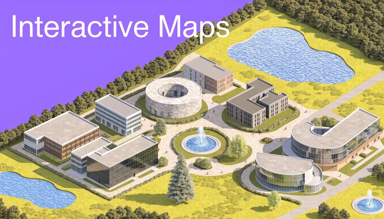
Rendered site plans are detailed, scaled 3D visualizations of site elements like building footprints, landscaping, parking, and access roads, and they guide construction while supporting compliance. Their move into photorealistic formats made them far more useful than flat drawings for showing spatial dynamics, scale, and environmental integration, as described in Xpress Rendering’s explanation of site plan renderings.
What you’re actually looking at
Most rendered site plans combine several layers of information into one readable image:
- Building footprints and massing: Where each structure sits and how big it feels on the site.
- Grounds design: Lawns, planting beds, trees, hardscape, water features, and buffers.
- Movement and access: Roads, drop-off zones, paths, service access, and parking flow.
- Site context: Adjacent streets, neighboring buildings, views, and terrain cues.
- Key amenities: Pools, clubhouses, playgrounds, terraces, outdoor seating, or retail frontage.
This is why they’re so useful in development meetings. A planner can inspect circulation. A marketing lead can evaluate curb appeal. A buyer can finally understand where the building sits in relation to open space and parking.
Why people confuse them with floor plans
This trips up a lot of clients. A floor plan shows what happens inside a building, usually from a horizontal cut through the rooms. A site plan shows what happens around the building across the property.
A quick distinction helps:
| Visual type | Main question it answers |
|---|---|
| Floor plan | How is the interior arranged? |
| Site plan | How does the whole property work? |
| Rendered site plan | What will the full property feel like when built? |
If you want a simple companion piece for that distinction, this article on rendered floor plans helps frame how interior layout visuals differ from broader property visuals.
Practical rule: If your audience needs to understand parking flow, open space, setbacks, entries, and the building’s position on the lot, you need a site plan, not just a floor plan.
For teams preparing proposals, this guide on how site plans impact your bids is also worth reviewing because it connects site clarity to business outcomes in a straightforward way.
Comparing Types of Site Plan Renders
Not every project needs the same level of rendering. Sometimes a clean color overlay is enough to win internal alignment. Sometimes you need a polished aerial hero image for a sales launch. And sometimes the only way to resolve questions is with an interactive model people can explore.
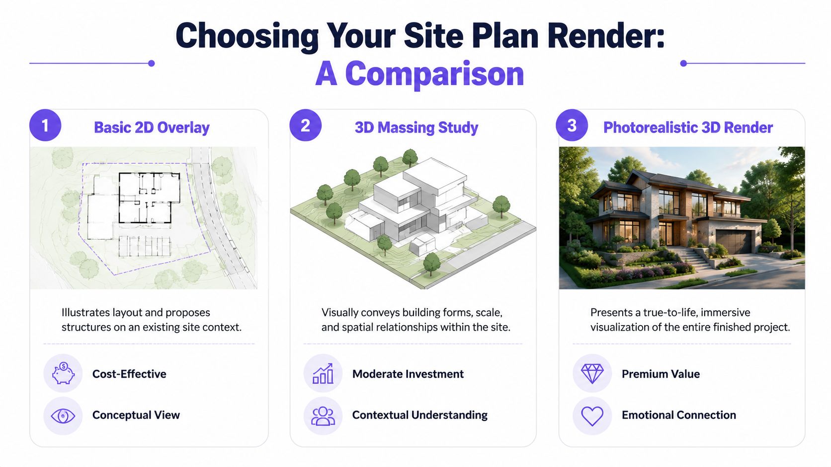
Three common options
Here’s the simplest way to think about them.
| Type | Best for | What it communicates well | Limitation |
|---|---|---|---|
| 2D color overlay | Early concept reviews, quick feasibility decks | Layout, zones, circulation, basic hierarchy | Limited emotional impact |
| 3D aerial render | Marketing, approvals, investor presentations | Scale, context, relationships, curb appeal | Fixed viewpoint |
| Interactive 3D model | Complex developments, stakeholder workshops, phased projects | Exploration, multiple angles, immersive understanding | More production effort |
2D color overlay
This is the lightest version. You start with a conventional plan and add color, texture cues, labels, and a cleaner graphic hierarchy.
It works well when the audience already understands drawings but needs help reading them faster. It’s also useful when the project is moving quickly and the design is still changing. You don’t want to pay for a highly polished image while building positions are still in flux.
A 2D overlay is like a good transit map. It won’t make anyone feel the place emotionally, but it will help them understand where everything goes.
3D aerial render
This is the workhorse for most development marketing. It usually gives you a bird’s-eye or angled overhead view with modeled buildings, planting, paving, and lighting. If you’ve ever watched a client suddenly understand a site, this is often the image that did it.
For many teams, this is the sweet spot because it balances readability and realism. It can show arrival sequence, amenity placement, open space, and street presence all at once.
If your project includes a broader master planning effort, this overview of master plans in architecture is a helpful companion because it explains how site-level visuals fit into the larger development story.
Interactive 3D model
This is the premium option. Instead of one polished still image, the audience can move through views, inspect different zones, and sometimes toggle design options.
It’s especially useful when multiple groups need different answers from the same model. Leasing teams may care about storefront visibility. Operations may care about service access. Designers may care about site feature sequencing.
The more complex the site, the more valuable interactivity becomes. Static images answer many questions. Interactive models answer follow-up questions without sending everyone back to the drawing set.
How to choose without overbuying
Use this filter:
- Choose 2D color overlay if the project is early and decisions are still fluid.
- Choose 3D aerial render if you need a persuasive asset for approvals, pitches, or listings.
- Choose interactive 3D if the site has many moving parts and multiple audiences need different views.
The best type isn’t the fanciest one. It’s the one that answers your audience’s questions with the least friction.
The End-to-End Rendering Workflow
To outsiders, rendered site plans can look a bit magical. In practice, the workflow is methodical. The artist or visualization team doesn’t invent the project. They assemble, model, light, and refine the information you already have.
The technical core is straightforward. The process involves importing site surveys and architectural drawings into software such as 3ds Max, extruding building footprints, generating terrain meshes, and applying PBR materials. According to Archivinci’s site plan rendering overview, this improves stakeholder comprehension by 40% to 60% over 2D plans and can reduce approval delays by up to 30%.
Step one gathers the right inputs
The quality of the final image starts with the quality of the inputs. If the team receives incomplete or conflicting files, the render may look beautiful while still being wrong.
Typical inputs include:
- Survey information: Boundaries, contours, topography, utilities, and existing conditions
- Architectural drawings: Building footprints, elevations, roof forms, and access points
- Site environment references: Planting intent, paving types, site furniture, lighting concepts
- Material references: Cladding, hardscape, curb, fencing, and signage ideas
- Context references: Adjacent streets, neighboring buildings, and important views
A helpful analogy is cooking. If the ingredients are missing or mislabeled, the plating won’t save the meal.
Step two builds the 3D model
Once the data is assembled, the modeler starts creating the site in three dimensions. Building outlines become volume. Contour lines become terrain. Roads and pathways gain thickness and edge definition.
This stage is where many clients first realize why renderings take time. A convincing image depends on accurate geometry. If the slope is wrong, drainage may read incorrectly. If the entrance is misplaced, the entire arrival story changes.
Don’t treat the model as decoration. It’s a spatial test of whether the project actually makes sense visually.
Step three adds materials and light
At this stage, the model ceases to appear abstract. Grass gets texture. Paving gets reflectance. Windows catch light. Trees begin to feel planted rather than symbolic.
Lighting matters more than many teams expect. The same site can feel premium, civic, residential, or dull depending on sun angle, shadow softness, sky condition, and material response. Good artists don’t just “make it sunny.” They use light to explain form, depth, and movement.
A strong lighting setup helps viewers understand:
- Entry emphasis
- Building depth
- Outdoor amenity hierarchy
- How open space relates to structures
Step four finishes the story
The final pass often includes entourage and image refinement. Cars, people, signage, benches, and subtle atmospheric adjustments help the site feel occupied and believable.
This stage is easy to overdo. A good render adds life without turning into a collage. You want just enough detail to make the place readable and desirable.
A polished site plan render usually answers three questions at once:
- Is the design clear?
- Does the site work?
- Can the audience picture the finished project?
If the answer to all three is yes, the rendering has done its job.
From Site Plan to Staged Interior with AI
A site plan can win confidence in the development. It shows where the building belongs, how the property functions, and why the layout works. But when you’re trying to lease units, market homes, or secure buyer commitment, people eventually zoom in. They stop asking about parking ratios and start asking a simpler question. What will it feel like to live, work, or shop inside this place?
That’s where the workflow often breaks apart. Teams spend heavily to visualize the exterior story, then fall back on generic interior moodboards or empty-room photos. The result feels disconnected.

Exterior clarity isn’t enough
A rendered site plan says, “This project makes sense.”
An interior visualization says, “This project fits real life.”
Those are not the same message. Developers and designers need both. If the exterior promises a clean, upscale, walkable community but the interior imagery feels generic or out of scale, buyers notice the mismatch immediately. It feels like two different brands talking.
This gets especially important in pre-sales, leasing campaigns, and furniture specification reviews. A team may know that a unit should appeal to a Modern Farmhouse buyer in one market and a Mid-Century Modern buyer in another. The challenge is showing those differences quickly and credibly.
A practical way teams are handling it
The most useful AI-based interior workflow right now is simple: upload a real photo of the room and test real products inside it.
That matters because product selection is where many presentations lose credibility. A moodboard may suggest “warm oak sofa” or “soft ivory sectional,” but the client wants to know whether a specific West Elm sofa works better than an Article armchair, and whether the camel leather option reads better than the performance bouclé version in that exact room.
With an AI interior staging workflow, teams can compare:
- Different brands of the same furniture category
- Different colors and finishes of the same product
- Different style directions for the same room
- Different layouts using the actual room photo as the base
This video shows the idea in action:
Why dimension accuracy changes the conversation
Many AI image tools can generate attractive rooms. That isn’t the same as creating a usable staging image. For developers, designers, and retail teams, the key issue is whether the furniture looks like it fits the room.
When dimensions drift, confidence drops. A sofa looks too deep. A dining table floats in the wrong perspective. A bed appears wider than the wall allows. Clients may not explain the problem in technical terms, but they can feel it.
That’s why the strongest interior workflows focus on hyper-realistic photos with true-dimension rooms and furniture objects. When the output respects scale, the image becomes useful for decision-making, not just inspiration.
If the exterior render earns trust and the interior render preserves that trust, your presentation feels coherent from the parking lot to the living room.
For US-facing projects, this opens up practical testing. A leasing team can show one unit with a cleaner California casual look, then swap in deeper walnut tones and sharper profiles for a more urban feel. A furniture retailer can place the same sectional in different finishes in the same photographed room. A designer can keep the shell constant and evaluate product fit in just a few clicks by using a room photo and a product link.
That connection between exterior context and interior reality is where visualization stops being a collection of pretty images and starts becoming a full project communication system.
Best Practices for Accuracy and Impact
A rendered site plan only works if it is both believable and useful. Some images look attractive but leave out the details that matter in planning and construction. Others are technically correct but so dry that nobody wants to engage with them. The best work does both.
According to BluEntCAD’s discussion of site plan drawing standards, expert workflows use 1:500 or 1:1000 scales, label elements such as property boundaries and setbacks, and accurate 3D renders can reduce RFIs by 25% to 35% during construction by clearly showing integrations like accessibility ramps and utility gradients.
Keep scale honest
Scale errors are the fastest way to lose trust. If trees are oversized, parking stalls feel loose, or pathways look wider than they should, the image may still look polished, but experienced viewers will sense that something is off.
Use a simple internal check:
- Compare cars to stalls
- Compare people to doors
- Compare trees to building floors
- Compare walkway widths to likely use
Design and technical teams should review together. The image needs visual appeal, but it also needs dimensional discipline. If your project also includes strong outdoor living or planting concepts, this article on AI for landscape design offers a useful adjacent perspective on visualizing exterior environments.
Choose a viewpoint with purpose
A camera angle is not just a stylistic choice. It tells the viewer what matters.
A high aerial view is good for circulation and overall organization. A slightly lower angled view is often better for helping non-technical audiences feel the hierarchy of buildings, streetscape, and the surrounding environment. The wrong viewpoint can flatten the project or hide the feature you most need people to notice.
A helpful question is: what decision should this image support?
| If you need to show | Favor this visual emphasis |
|---|---|
| Access and circulation | Clear overhead legibility |
| Amenity appeal | Angled view with visible depth |
| Compliance-sensitive edges | Clean labels and unobstructed boundaries |
| Branding and marketing | Warm light and human-scale context |
Add context, not clutter
Cars, people, benches, trees, and shadows all help. Too many of them hurt.
Use context to answer real questions. Is the plaza active? Is the path legible? Does the drop-off feel safe? Can someone understand where the main entry is? If an added element doesn’t improve understanding, remove it.
Field note: The best rendered site plans feel edited, not crowded. Every object should support the story of the place.
Don’t separate beauty from coordination
A strong render should help marketing and project delivery at the same time. If the image is persuasive enough for a brochure but useless for internal review, you’re leaving value on the table.
The highest-performing visuals usually do three things well:
- They honor the drawings
- They guide the eye
- They make decisions easier
That’s the standard worth aiming for.
How to Commission Your Rendered Site Plan
If you’re ready to commission rendered site plans, preparation makes the process smoother and the result stronger. Don’t start by asking for “a pretty aerial.” Start by gathering the materials that explain the project clearly.
Bring these items to your rendering partner:
- Current site plan files: CAD, BIM exports, PDFs, and any survey information
- Building references: Elevations, roof plans, and massing studies
- Material direction: Cladding, paving, planting intent, and lighting references
- View priorities: What must the image prove or persuade
- Audience context: Investor deck, planning submission, brochure, website, or leasing package
Ask practical questions early. How many revisions are included? Will they prioritize accuracy, marketing mood, or both? What file formats will you receive? Can the same base model support later views?
The best commissions begin with a clear brief, not a vague request. That saves time, reduces rework, and gives you a render that earns its place in the project.
If you’ve already nailed the exterior story and want the interior visuals to match it, aiStager is worth a look. It’s the only solution focused on generating hyper-realistic interior photos with true-dimension rooms and furniture objects, using a room photo and a product link. That makes it especially useful when you want to compare real products, test different sofa brands, or swap colors and finishes in just a few clicks without breaking visual credibility.