Spaces Interior Design: A Practical Explainer for 2026
Learn the fundamentals of spaces interior design, from layout and flow to using AI tools like aiStager for hyper-realistic, true-to-scale visualizations.

You buy a sofa you love online. The fabric is right, the color is right, and the reviews are glowing. Then it arrives, and the room feels wrong. The piece may be too deep for the walkway, too low for the window line, or too visually heavy for the ceiling height. Nothing is technically “bad,” but the space doesn’t work.
That’s where spaces interior design becomes different from decorating. Decorating adds objects and style. Spaces interior design studies how a room is shaped, how people move through it, and how furniture, light, and materials change the experience of being there. It’s less about filling a room and more about making the room behave well.
That difference matters more than ever. The global interior design market was valued at $136.12 billion in 2023 and is projected to exceed $228.01 billion by 2033, reflecting a CAGR of 5.29%, according to interior design market statistics. More people are investing in homes, workspaces, and property presentation, which means more people are running into the same question: why do some rooms feel easy and others feel awkward?
Beyond Decorating The Art of Shaping Spaces
A well-designed room supports the life happening inside it. That sounds abstract until you notice the signs. You can walk through the space without sidestepping furniture. A chair feels right near a lamp. A dining area doesn’t interrupt the kitchen path. The room gives you visual calm because the layout makes sense.
That’s the heart of spaces interior design. It’s the discipline of shaping layout, movement, scale, and atmosphere so a room feels natural to use. A homeowner may think they’re choosing a sectional. A designer sees a chain reaction involving traffic flow, conversation distance, sightlines, and storage.
Why rooms fail before the styling begins
Most disappointing rooms don’t fail because of taste. They fail because the planning was shallow. People often choose furniture first and ask spatial questions later. That’s backwards.
A room can carry many styles and still succeed. If you want to achieve contemporary coastal living room ideas, the style works better when the layout already supports openness, soft circulation, and a clear focal point. Style sits on top of space, not the other way around.
Practical rule: If a room feels crowded, empty, or oddly tense, the issue usually starts with space planning before it shows up in color, furniture, or decor.
What to look at first
When I assess a room, I start with a few basic questions:
- Movement: Where do people enter, turn, pause, and exit?
- Purpose: Is this room for quiet reading, family lounging, focused work, or resale appeal?
- Volume: Does the room feel low, tall, narrow, or oversized?
- Focal point: What should your eye land on first?
- Support: Where do lighting, storage, and materials help the room do its job?
If you want a broader foundation before sketching layouts, this guide to concept interior design thinking is useful because it connects the idea stage to practical decisions in the room.
The Core Principles of Designing Interior Spaces
Some rooms feel effortless because a few underlying principles are working together. You don’t need to memorize design jargon to use them. You just need to know what each principle does inside a real room.
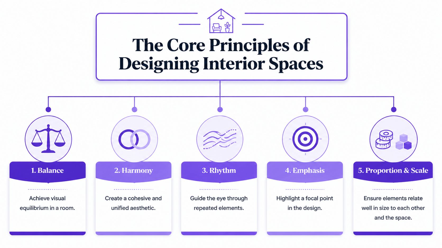
Layout and zoning
Think of layout as the room’s map. Zoning is how that map divides into useful territories. In an open living area, one zone may support conversation, another dining, and another a work corner. In a studio apartment, one rug and a floor lamp can define the living area without walls.
The key is intention. If every piece floats without logic, the room feels temporary. If each area has a clear role, the room feels composed.
One benchmark helps make this concrete. Approximately 80% of available floor area should be dedicated to living spaces, with 10% allocated to circulation passages and 10% to storage to optimize ergonomic efficiency, based on space planning guidance. You don’t need to measure every inch obsessively, but this ratio reminds you not to let storage or walkways swallow the life of the room.
Flow and circulation
Flow is how the body moves through a room. Good flow feels like a gentle current. You don’t bump into table corners, squeeze past armchairs, or cut across someone else’s activity area just to reach a doorway.
A common mistake is treating leftover gaps as circulation. Real circulation should be planned, not accidental. If the path from entry to sofa to kitchen twists around obstacles, the room feels stressful even if it looks attractive in photos.
A beautiful room that’s hard to move through will never feel finished.
A simple way to test flow is to walk your usual daily pattern. Carry a laundry basket. Pretend you’re serving drinks. Sit down and stand up from each seat. A room should support ordinary movement, not just look good from one angle.
Scale and proportion
Scale answers whether something fits the room. Proportion answers whether elements fit one another. Many spaces often go off track here.
A bulky sectional can overwhelm a narrow room. A tiny coffee table can make a large seating group look accidental. A short lamp next to a tall bookcase can feel visually lost. Even a great piece from CB2 or West Elm can look wrong if its dimensions fight the room.
Here’s a simpler explanation:
- Room to furniture: Does the piece suit the size of the room?
- Furniture to furniture: Do neighboring pieces make sense together?
- Furniture to architecture: Does the piece respect windows, doors, ceiling height, and wall length?
When these relationships align, the room feels settled.
Lighting
Lighting shapes mood, depth, and usefulness. It also changes how color, texture, and proportion are perceived. A room that feels flat during the evening often has a lighting problem, not a furniture problem.
Use lighting in layers instead of relying on one overhead fixture. In a living room, that might mean ceiling light for general illumination, a table lamp near a reading chair, and a floor lamp near the sofa. In a bedroom, bedside lighting changes how restful the room feels. In a kitchen, task lighting matters more than decorative drama.
Good lighting also supports zoning. A pendant can anchor a dining area. A lamp can make a forgotten corner usable. A wall sconce can pull attention to artwork or a textured finish.
Materials and texture
Materials do two jobs at once. They affect performance and they affect perception. Leather feels different from linen. Bouclé reads differently than velvet. Oak flooring grounds a room differently than polished concrete.
You balance use and emotion. A family room with kids and pets may need forgiving upholstery and tactile warmth. A formal sitting room might tolerate more delicacy. In both cases, texture keeps a room from feeling flat.
A quick mental checklist
Before you buy anything, ask:
- Does the layout support the room’s main activity?
- Can people move through it without interruption?
- Are the key pieces the right size for the room and each other?
- Will the lighting work both day and night?
- Do the materials match the way the room is used?
Those five questions catch most problems early.
Tailoring Design to Function and People
A room shouldn’t only look right. It should fit the people using it and the reason the space exists. A family den, a small office, and a staged listing may all occupy similar square footage, but their design priorities are different.
That’s why spaces interior design always starts with function before style. The same sofa that feels perfect in a busy home may feel too personal for staging. The same desk setup that helps someone focus at work may feel cold in a guest room.
Design priorities by space function
| Space Type | Primary Goal | Key Design Focus |
|---|---|---|
| Residential | Comfort and daily ease | Soft circulation, storage, durability, personality |
| Commercial or work | Focus and efficiency | Clear zoning, lighting for tasks, reduced distraction |
| Real estate staging | Broad appeal | Neutral styling, openness, easy sightlines, flexible furniture |
Residential spaces
Homes need to absorb real life. That means movement, mess, rest, conversation, and routine. A family living room might use an Article sofa because it feels approachable and relaxed, while the surrounding choices support practical living: side tables within reach, lighting near seating, and enough negative space to move comfortably.
There’s also a hard dimensional reality to respect. For functional furniture placement in residential settings, living spaces demand minimum widths of 12 to 15 feet (3.6 to 4.5m) to comfortably accommodate dual seating arrangements, such as two sofas and a coffee table, according to this residential space planning reference. If your room is narrower than that, forcing a full two-sofa arrangement can make the room feel pinched.
Commercial and work spaces
A work setting asks a different question: can people think clearly and move efficiently? The furniture can still be attractive, but the room has to reduce friction. Herman Miller task seating or efficient desks work because they support repeated use, posture, and organization.
In these rooms, visual quiet matters. Too many competing finishes or decorative interruptions can make concentration harder. You want a controlled palette, intentional lighting, and a plan that supports the task happening there.
Design judgment: A workspace should help people focus first and impress second.
Staging and sales environments
Staging isn’t about expressing one family’s taste. It’s about helping many buyers understand a room quickly. That usually means simpler furniture profiles, fewer personal signals, and a layout that highlights possibility.
Crate & Barrel style basics often work well in examples because the silhouettes are familiar and easy to read in listing photos. In staging, every piece should clarify the room’s use. If a buyer can’t tell whether a space is a bedroom, office, or sitting room, the layout has failed.
For a more detailed planning framework, this guide to interior design space planning connects room function to layout choices in a straightforward way.
Common Pitfalls in Spaces Interior Design
Most spatial mistakes are easy to describe once you’ve lived with them. The room looks fine at first glance, but it irritates you in small ways every day.
The too-small or too-big furniture problem
A junior designer once placed a delicate apartment sofa in a large suburban living room with tall ceilings and a wide fireplace wall. The result looked like dollhouse furniture. The room swallowed it.
The opposite happens just as often. Someone buys an oversized sectional, and suddenly every path through the room feels blocked.
Fix: measure wall length, depth, and clearance before shopping. Then compare the furniture not only to the room, but to nearby pieces and architectural features.
Invisible barriers in the layout
Another common issue is blocked circulation. A bench clips the front door swing. A coffee table sits too close to the sofa. Dining chairs scrape into the walkway every time someone gets up.
These aren’t dramatic mistakes. They’re tiring mistakes.
Fix: identify the room’s main paths first, then place furniture around them. If a path feels like an afterthought, revise the arrangement.
Lighting that flattens everything
I often see a nicely furnished room ruined by one bright ceiling fixture doing all the work. At night, the room loses depth and comfort. Materials that looked rich in daylight suddenly feel lifeless.
Fix: layer light sources at different heights. Add a lamp where you want warmth, another where you need a task light, and keep overhead light as support rather than the whole solution.
Materials that fight the room’s real life
A pale, delicate fabric in a hard-working family room can create stress instead of pleasure. A glossy surface in a glare-prone room can become visually harsh. A beautiful finish still has to survive the room’s actual conditions.
The right material isn’t just attractive. It helps the room age well.
Fix: match materials to traffic, maintenance habits, pets, children, and how often the room is used. If the room asks for resilience, choose resilience.
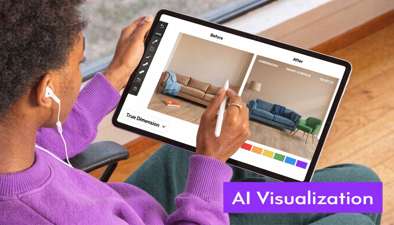
The AI Revolution From Idea to Hyper-Realistic Preview
Traditional visualization has always had a frustrating gap. Mood boards are helpful, but they’re flat. Floor plans can be precise, but many clients struggle to imagine the result. CAD models can solve part of the problem, but they often take time, technical skill, and a lot of back-and-forth.
That gap becomes painful in awkward rooms. A 2025 Houzz report notes 68% of homeowners redesigning awkward spaces cite furniture mismatch as their top issue, with 42% abandoning projects due to visualization challenges, as referenced in this discussion of awkward-space visualization. People often don’t need more inspiration. They need a reliable way to see whether a real product will work in their real room.
Why flat inspiration stops short
A Pinterest image can inspire a mood, but it can’t tell you whether a sofa arm will block a walkway or whether a walnut finish will feel too heavy against your flooring. A mood board can suggest a direction, but it can’t answer fit with confidence.
That’s especially true when comparing similar products. A homeowner may be deciding between a West Elm sofa and a Pottery Barn sectional. On paper, both seem plausible. In the room, one may sit better under the window line, leave a cleaner passage, or balance the coffee table more naturally.
What changes when the room becomes the test canvas
A more useful workflow starts with the actual space, not a generic model. One approach is to upload a room photo and test real products from retailer links directly in that scene. aiStager’s 2D to 3D workflow is built around that kind of process. You upload a photo, paste a product URL, and generate a photoreal preview that accounts for room dimensions and product scale.
That changes the design conversation. Instead of saying, “I think this sofa should work,” you can compare two sofas, two colors, or two finishes inside the same room image. You can see whether a lighter fabric softens the room, whether a darker wood grounds it, or whether one arm profile opens up circulation better than another.
Useful test: When you’re comparing products, don’t ask only which one is prettier. Ask which one gives the room better movement, balance, and visual weight.
This is also where non-standard rooms become easier to solve. Sloped ceilings, alcoves, narrow living rooms, and awkward corners are exactly the situations where a generic mockup falls short. A true-to-dimension preview reduces guesswork because the problem isn’t style alone. It’s fit.
A short demo helps make that idea concrete:
Practical uses in day-to-day design
This kind of visualization is useful in several ways:
- Product comparison: Swap similar sofas, dining tables, or beds from different brands without rebuilding the whole concept.
- Finish testing: Try cream, charcoal, cognac, oak, black, or brushed metal finishes in the same room photo.
- Client communication: Show a homeowner or seller what changes look like before ordering.
- Staging decisions: Preview a cleaner, broader-appeal layout for listing photos.
- Problem solving: Test pieces in rooms with odd geometry where intuition alone can mislead you.
The biggest shift is psychological. People make decisions faster when they can see the idea in context. Designers also spend less time defending abstract plans because the room itself becomes the evidence.
Future-Proofing Your Design Process
Good spaces interior design still depends on timeless judgment. You still need to understand flow, scale, light, and function. What’s changing is how quickly you can test those ideas before spending money, ordering furniture, or restaging a property.
That matters even more as lighting and presentation become more dynamic. A room doesn’t only need to work at noon. It needs to work in the evening, in listing photos, in proposals, and across different mood directions. A 2025-2026 NAR survey shows 55% of real estate listings with odd layouts underperform in evening views, yet night shots can boost inquiries by 32%, according to this report on awkward spaces and lighting context. Day and night perception can change how spacious, warm, or usable a room feels.
What durable design practice looks like now
The strongest process combines old and new habits:
- Start with principles: Know the room’s function, movement paths, and scale needs.
- Test before buying: Compare products, finishes, and layouts before committing.
- Review the room in multiple conditions: Daylight, evening light, and photo presentation can tell different stories.
- Design for people: A room succeeds when it supports its users, not when it only photographs well.
A smarter kind of confidence
The future of design isn’t less human. It’s more informed. A homeowner can experiment without guessing. A junior designer can validate instincts with clearer visual evidence. A real estate team can present spaces with fewer blind spots.
That’s the useful promise of better visualization. It doesn’t replace design thinking. It gives design thinking a faster, more accurate way to show up in practice.
If you want to test layouts, swap furniture from real product links, and preview rooms with photoreal, dimension-aware visuals, explore aiStager. It’s a practical way to check fit, finish, and atmosphere before you buy, stage, or present a space.